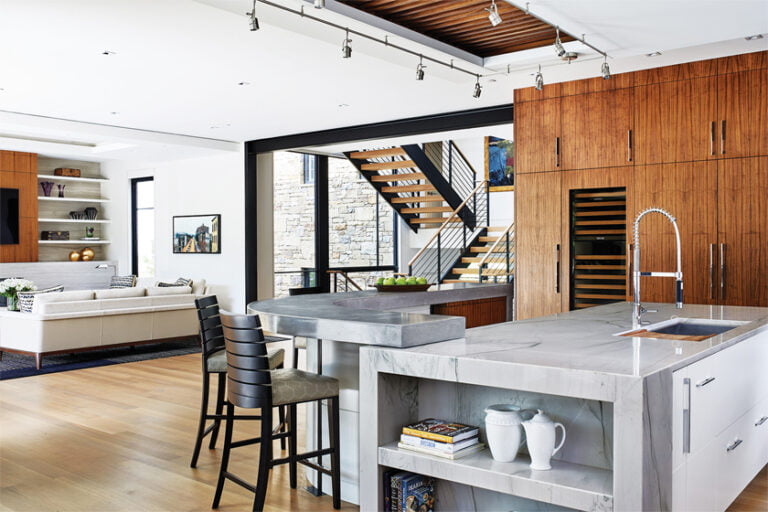
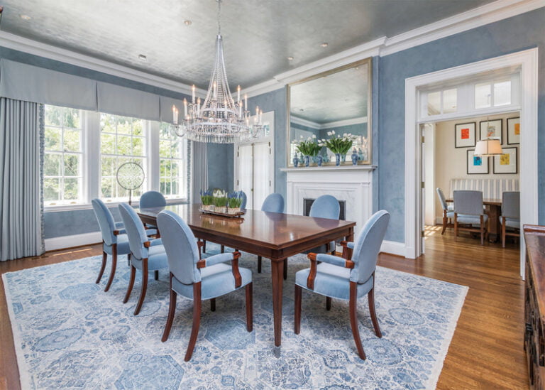
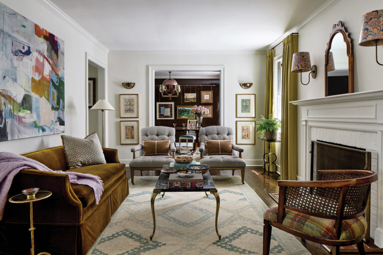
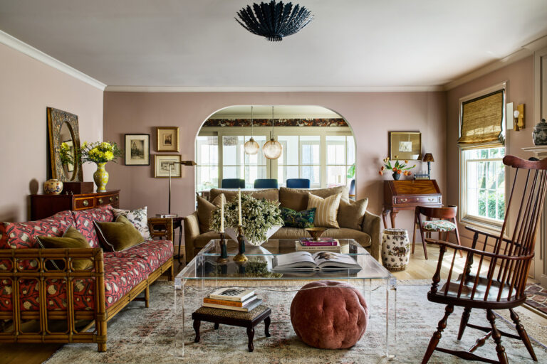
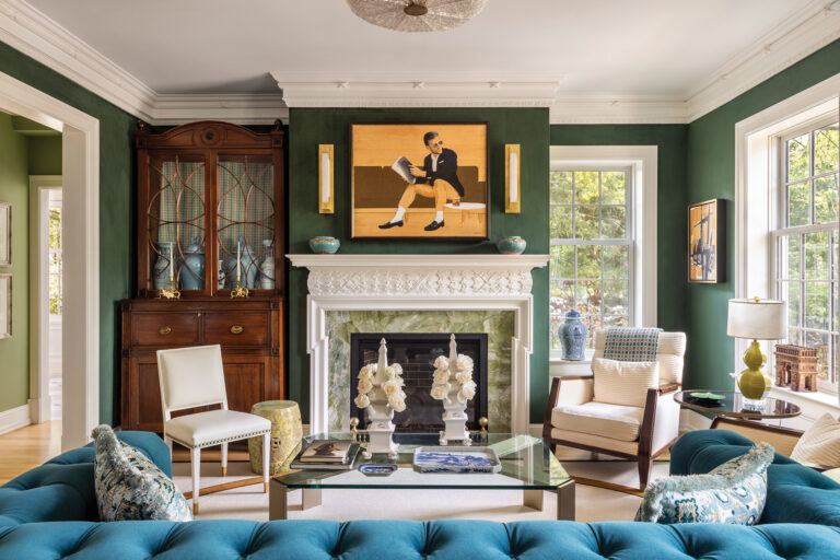
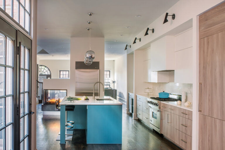
When a DC-based family of six left the city for the Maryland suburbs, they knew they wanted their Kensington home to convey a chic, cosmopolitan vibe. The couple met while attending Georgetown, which the wife followed with a stint as a fashion editor in New York City. She hoped to bring a touch of Big Apple glam to their new interiors—but with four kids and two dogs, the house also needed to strike a casual, unfussy note. So they called on interior designer Regan Billingsley, who’s known the husband since high school, to bring the right balance of sophistication and family-friendliness to the 4,027-square-foot, cottage-style home.
“They’re very close-knit, so they needed a lot of design moments where they could just hang out as a family, but also be able to throw large dinner parties,” explains Billingsley. “It had to be comfortable enough for the family to kick back, but presentable enough to entertain on the spur of the moment.” Here, a Q&A details how the designer delivered on both fronts.
Describe your aesthetic.
For me, design is about who the client is and how they live in and experience the space, not about how I think they should be experiencing it. Every project starts with the floor plan; we focus on symmetry, proportion and clean lines, then layer the client’s personality on top of that. Here, because of the wife’s background in fashion and her sparkly personality, we wanted to bring an element of glam to every room. For instance, there’s subtle shimmer in the living room drapery fabric and flecks of gold on the dining room ceiling.
The colors in this home work so well. How did the palette develop?
It was important to balance masculinity and femininity, while also making the house both kid-friendly and sophisticated. We brought in fabrics, wallpapers and rugs all centered around a palette of plum and navy blue with a little bit of black and some softer pinks, which we carried throughout the house. For example, the family room and primary bedroom are darker and more masculine, but if you were to put them next to the living room, which is lighter and feminine, they harmonize. Every room has something that is reminiscent of another room, and that’s how we keep the color flow consistent throughout the home.
What’s your secret for blending traditional and modern elements?
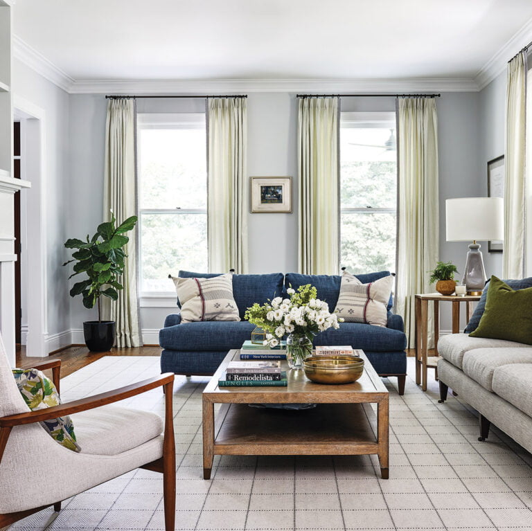
In every room we try to have something old, something unexpected and something black. The something old doesn’t necessarily have to be an antique, but an element that feels familiar or leans traditional. Those pieces offer a sense of timelessness. In the living room, we were working with existing furniture from their old house which had very traditional silhouettes. We like to reuse pieces when possible so we reupholstered everything. Then we brought in modern art to create a juxtaposition that feels fresh and of the times.
Highlight some ways you kept the design kid-friendly.
I never liked the concept of a museum house. I know that works for some people, but I find that very uncomfortable and stiff. That’s not how I want people to live. We used indoor-outdoor fabrics, wool rugs which have natural stain-guarding, and in the mudroom, wipeable paint that you can write on. Everything is really durable. Nothing is off limits. But there are whimsical touches, too. For instance, when we styled the den, we wanted to display the kids’ art. Kids have a voice, and I think that needs to be nurtured and respected.
What was the most rewarding aspect of this project?
This house was so special to me because the client allowed us to really push the design envelope and not play it safe. Some homeowners get nervous about straying from the norm—by that I mean doing something different from what their neighbors have or what they see on social media or in magazines. This house shows that when the finished interiors reflect who you are, not only does the environment feel more personal, but it also enhances your well-being because it’s a more comfortable place to exist.
Ask Regan
Who is your design muse?
Spanish designer Isabel López-Quesada is endlessly inspiring because her rooms are so classical and timeless, yet there’s a casualness about them that really invites you in. Aesthetically, they’re a breath of fresh air.
What’s your go-to dinner party soundtrack?
Pink Martini, because they pull from so many different musical genres. I think it’s perfect for any situation–dinner parties included.
Where do you source vintage wares locally?
I grew up shopping on Kensington’s Howard Avenue with my mom, and Goldsborough Glynn is my favorite spot there for beautiful antiques and accessories.
Name a film or TV set that’s inspired you.
The movie Roma: Because it’s shot in black and white, the absence of color draws your eye to all the amazing Mexican mid-century design details.
Interior Design: Regan Billingsley, Regan Billingsley Interiors, Chevy Chase, Maryland. Styling: Limonata Creative. Florals: Franklin Floral Design
What could a painting be if it could take any shape or form?
That question was circulating in the art-world air when Steven Cushner studied painting at the Rhode Island School of Design in the 1970s. Back then, winds were gusting toward conceptual art, which challenges the conventional notion that a material object is the goal behind a work of art.
“Once you open the door to conceptual art,” Cushner reasons, “the idea of making a painting or a picture of something doesn’t make sense anymore.” The artist went on to earn a master of fine arts degree from the University of Maryland, and was fortunate in his thesis advisor—renowned artist Sam Gilliam, whose response to the zeitgeist was brilliantly colored, draped canvases.
Where did it lead for Cushner? In graduate school, he discovered fellow painters and teachers, “who were going through the same thing I was going through—kind of inventing their own languages as I was trying to invent mine,” he remembers. It took 15 years for the DC artist to find a personal vocabulary, which has endured over three decades.
His paintings, large-scale and muscular, bristle with grand motifs that appear to float on textured backgrounds. These central subjects often reference landscape painting, flattened and simplified into abstract patterns. Color struts from brashly singular to rainbow-hued, or may be absent entirely, replaced by swirling black lines and drips. Dominant subjects are typically shown in pairs or in a symmetrical or orderly progression—illustrating raw energy in balance.
Periodically, Cushner revisits motifs that mirror his own patterns. “If you look at my paintings, you wouldn’t sense—because how could you—that I’ve been married to the same person for many, many years, lived in the same house for many, many years, do the same things day after day for many, many years. That’s just my nature. I like repetitive things,” he observes. “It’s hard-wired in me. And it’s in my paintings.”
Alert, bespectacled and slight in stature, the painter carries an outsized presence on canvas. To complete a commission for the American Embassy in Ankara, Turkey—his largest painting to date, reaching 30 feet high and 10 feet wide—Cushner borrowed a 10-foot ladder and attached a stick to extend the paintbrush. “I’m much happier working large,” says the artist, who credits post-war Abstract Expressionists for his love of physical painting gestures.
Cushner works simultaneously on big canvases and smaller paper. Moving back and forth between the two, he determines, among other decisions, “the kind of space I want to create for the subject to exist in.” To change things up, he might try out a new medium, like wood-cut printing, or one that he hasn’t used for a while, such as watercolor. His goal: “How do I translate something that I already know through a material that is a new challenge for me?” For inspiration, he’ll search through small sketchbooks, sometimes turning his doodles upside down. “Inevitably, it triggers something—‘Oh, I could do this pattern in this particular way,’” he reflects, “and that becomes the start of another painting.”
The artist invariably experiments as he works. Colors are tested out. He prefers thinned acrylic paint to prevent it from building up, and to retain what he calls “the feel of the canvas.” Still, a single piece may entail hundreds of paint layers, as prior decisions are rethought. “I’m putting down the line, and then I’m painting over the line. I’m correcting the drawing and the spacing. I like a sense of gesture, but I want to control the gesture. And when the painting is finished, I want it to look almost as if it just kind of happened,” he explains, adding that for him, “The best discoveries happen in the process of painting.”
A few years ago, Cushner began to wonder if the studio attached to the back of his house in DC’s Brookland neighborhood would be the last he would ever work in. He turned to a friend, architect David Jameson. Their collaboration produced a separate studio that now stands like a beckoning temple atop the hill behind his house. Its 14-foot-tall, projecting glass entrance faces a similar new glass extension on the back of the house, his former studio converted to a family room.
Jameson’s top priority was that the studio and house renovation “speak to each other,” he says. His design won a 2024 Award of Excellence from American Institute of Architects Northern Virginia.
Along the sloping site between the studio and house, Jameson placed huge stepping stones, “reminiscent of the repeated forms in Steven’s work,” the architect observes. A collector of Cushner’s art, Jameson finds their approaches similar. “I like the conceptual nature and singular vision of his work. It doesn’t stray too far from my own beliefs,” he notes, concluding, “You could consider us both conceptual minimalists.”
Cushner’s art is available through Hemphill in DC (hemphillartworks.com) and Reynolds Gallery in Richmond (reynoldsgallery.com). For more information, visit cushnerama.com.
After spending 30 years in California, doctors Taraneh Razavi and Stuart Schlisserman became bicoastal when they purchased a modest, circa-1950 rancher in Chevy Chase to live in part-time. Raised in the DC area with relatives nearby, Razavi had always pictured returning someday—but the allure of this particular abode was its location next door to her aging mother. “Family is important to us,” Razavi explains. “We wanted a gathering place for everyone near my mother.”
The rundown, 4,198-square-foot structure hadn’t been renovated since the ’70s, so an immediate redo was first on the agenda. The owners, who have grown children and grandkids, hired Landis Architects | Builders to achieve their vision. “They wanted to be close to family but still have a home that feels like California,” explains project manager Jim Caw. “They requested a high level of finishes, greater functionality and aging-in-place features that would allow Taraneh’s mom to navigate the space.”
The Landis team gutted and rebuilt the single-story house, removing portions of the foundation walls and replacing the roof. Conceived by project designer Chris Williams, a three-story, 4,928-square-foot residence took shape on the original footprint. “It was important to the owners that it fit into the neighborhood and not be out of scale, but they did prefer something more modern,” Williams relates. “So, although the rooflines and forms are traditional in terms of sizing, the building materials are contemporary.”
Nichiha siding—a durable, cementitious material—clads the exterior. The pre-finished, two-by-three-foot panels resemble blocks of sandstone and are stacked in front of a rain screen that creates a moisture barrier. Marvin windows were installed throughout, and a path flanked by sleek cable rails leads to an inviting front porch. An exterior plan by landscape designer Tomi Landis implemented extensive hardscaping and plantings in both front and back for a lush, welcoming feel.
A bump-out in front accommodates a flagstone porch that doubles as the main entry, imparting visual interest to the home’s front facade. The reconfigured main level boasts a center-hall layout, with a spacious entry leading to a dining room on one side and a powder room, primary suite and den on the other. Extending the rear wall of the structure by about four feet allowed for an airy great room at the back of the house; it contains a sitting area, a luxe kitchen and a breakfast nook within a bay. Sliding-glass doors open out to a flagstone patio equipped with an outdoor kitchen.
The project added on a full second story that accommodates four bedrooms; two are ensuite while the other two share a bath. The existing basement was finished and features a full bath and an exercise room equipped with a kitchenette. The garage remained at the side of the house, but its opening was shifted from the side to front-facing.
When it came to the interiors, Williams worked with staff interior designer Zulma Puhl to realize the clients’ wishes. “They wanted a high-end retreat that would be sleek and modern but also organic and soft,” Puhl recounts. “That combination really captured the essence of their California home.”
Clean-lined, airy rooms are full of natural light. Eight-foot-tall interior doors, trim-less windows with stone sills and wide-plank, white oak floors all contribute to a light, contemporary feel. A new staircase marries oak treads with iron balusters in a tuning-fork motif. Book-matched quartz slabs surround the fireplace in the great room, where vaulted ceilings elevate the sitting area and breakfast nook.
Williams designed the roomy kitchen lined with custom, solid and veneered white oak cabinetry by Henrybuilt. Puhl added Silestone countertops and backsplash along with flourishes such as fluted panels on the island front. Floating vanities with integrated stone basins grace the dwelling’s primary bath, where large-format porcelain tiles conjure a contemporary vibe.
Razavi selected what she terms “refined modern” furniture and lighting with an assist from Zahraa Alwash of ZEE architecture + interior design. Comfortable upholstered pieces in a neutral palette marry modern silhouettes with pops of color for warmth.
A main priority of the remodel was accessibility. With that in mind, Williams and his team installed an elevator that connects all three levels, situated the primary bedroom on the main floor and installed a curb-less shower and linear drain in the bathroom for wheelchair accessibility. And since the idea was to integrate Razavi’s mother into the household, a path now connects her home with the renovated one next door. “My mom likes her own space,” Razavi says. “This way we can always be close by.”
Architectural & Interior Design, Contracting & Landscape Design: Chris Williams (project design), Jim Caw (project manager), Zulma Puhl (interior design), Tomi Landis (landscape design), Landis Architects | Builders, Washington, DC. Landscape Installation: Great American Landscapes, Clarksburg, Maryland.
DRAWING BOARD
Q&A with Landis Architects | Builders
WHAT AMENITIES DO YOU RECOMMEND SPLURGING ON?
Zulma Puhl: Lighting and stone are a great splurge because they have a huge impact. Extending the stone to the backsplash made a dramatic statement here.
SHARE YOUR FAVORITE SIDING MATERIAL.
Jim Caw: I prefer durability, a longer life and no maintenance. We use a lot of Hardie products for that reason. They’re constructed with a cement-fiber base.
HOW OFTEN DO YOU ENCOUNTER SURPRISES ON A REMODELING JOB?
Jim Caw: Every project has a surprise that arises once you demo and see what’s there. After that, changes can be up to you instead of up to the house.
HOW SHOULD CLIENTS WEIGH BUDGET CONSTRAINTS?
Andrew Kerr, COO: I always start with the infrastructure. You need a solid foundation; you don’t want to put lipstick on a pig. I tell clients things can be done later if the right foundation is in place.
When North Potomac homeowners called on Anthony Wilder Design/Build to create a party-ready escape in their barren backyard, the team started by making a wish list with the clients.
“They imagined a retreat that was separate from the house, so we came up with an open-concept space that allowed for entertainment and relaxation all year round,” recalls principal Anthony Wilder, who designed the project with colleague and architect Sean Mullin.
Now complete, the pavilion with a grilling station—dubbed a “gravilion” by the crew—also houses a lounge area and a kitchen with custom cabinetry, a sink and a refrigerator. Hewn from Douglas fir using traditional joinery techniques, the structure is held together without screws or nails. “The mortise-and-tenon joinery adds to the beauty of the project,” Wilder reflects.
One challenge facing the team was how to hide wiring in the exposed timber ceiling. “The solution,” notes Mullin, “was to build up the roof cavity to accommodate the wires.” Four heaters angled down from the main beams warm the space in cooler months.
A raised, seven-person hot tub and a curved sectional centered on a fire pit complete the idyll. Connecting to the main residence, a stone walkway lined with large boulders accentuates the natural aesthetic.
FINALIST AWARD: Residential Exterior Over $200,000. Architecture & Contracting: Anthony Wilder and Sean Mullin, AIA (design); Joe Hensley and John Botkin (construction), Anthony Wilder Design/Build, Cabin John, Maryland.
A couple downsizing from a single-family home to a Reston condo decided to take the interiors of their new aerie in a playful direction. Namely, the avid fans of “Only Murders in the Building” wanted to replicate the exuberant, emerald green kitchen belonging to Steve Martin’s character on the popular Hulu show.
The owners tapped BOWA and architect TJ Monahan of Designed Happy to make their vision a reality. “It was great to have clients who wanted to push the boundaries, and I knew that BOWA would be able to execute the design,” notes Monahan. Lacquered cabinets were fabricated in a custom shade of green and trimmed in brushed brass. And BOWA discovered tile by Mirth Studio to match the show’s patchwork mosaic. The team selected Bianco Superiore quartzite for the countertops and backsplash; a built-in hood is concealed above the JennAir cooktop.
BOWA’s Kristin Ikenson spearheaded the makeover, which not only transformed the dated kitchen but also reimagined the apartment’s three bedrooms and upgraded the living area with a dramatic accent wall. Centered on a vapor fireplace, it’s framed in Fuchsite Green quartzite, echoing the adjacent kitchen’s signature palette. Despite the challenges of working in a condo building, she reflects, “the result is a sophisticated and functional home that embodies the homeowners’ style.”
MERIT AWARD: Residential Interior $250,000 to $500,000. Renovation Contracting: Kristin Ikenson, BOWA, McLean, Virginia. Renovation Architecture & Interior Design: TJ Monahan, AIA, Designed Happy, Kensington, Maryland. Appliances: Ferguson (ovens, cooktop); AJ Madison (fridge).
The residents of a Falls Church rancher decided it was time for the next chapter. They wanted to renovate the 2,200-square-foot, three-bedroom home and trade its lackluster interiors for a bright, new aesthetic that would still respect the structure’s traditional roots and neighborhood.
The owners enlisted Craver Architects and Atlas Moran Construction to expand the footprint and recast existing space—a program that would deliver extra room, improved functionality and renewed style.
The plan included a one-level addition spanning the back elevation; it houses a new kitchen, living room and primary bedroom, all with nine-foot ceilings to create an airy feel. Shaker-style cupboards and Carrara marble countertops grace the kitchen, which boasts an island and plenty of counter space. In lieu of upper cabinets, copious windows bathe the space in natural light. A second addition on the building’s left side accommodates a new office/guest room.
Existing interiors were also treated to a makeover. The old, dated kitchen was cleverly divided into a pantry, mudroom, laundry and powder room. The existing living room became the new dining room. And the owner’s former bedroom made way for an expansive closet and bath adjoining their upgraded quarters in the addition. The wife furnished the interiors to reflect the updated look.
Throughout the now-3,014-square-foot abode, fresh details, trim and built-ins—from storage cabinets in the living room to nickel-gap panels in the utility spaces—add functionality and elegance.
GRAND AWARD: Entire House under $500,000. Renovation Contracting: Atlas Moran Construction, Arlington, Virginia. Renovation Architecture: Craver Architects LLC, Alexandria, Virginia. Kitchen Design, Cabinetry & Tile: Mosaic Home Interiors, Alexandria, Virginia.
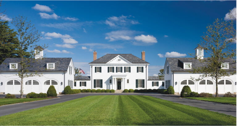
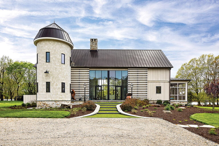
Perched on a strip of land along a tributary of the South River near Annapolis, this sprawling Shingle Style home was conceived to take full advantage of 180-degree views. “It’s a nice, deep lot right on the water, so we stretched the house out to get as much of an uninterrupted view as we could,” says architect James McDonald who helmed the project.
The clients, a family with teen-to-college-age children, desired a permanent waterfront residence that would evoke a distinctly New England sensibility, both indoors and out. “They wanted to bring the Nantucket-inspired exterior elements inside the house and keep the color palette and use of materials simple,” explains the architect.
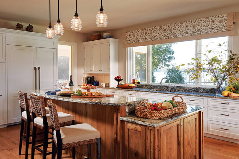
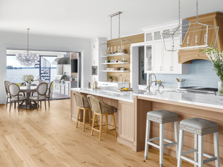
That casual, coastal aesthetic can be seen in the centrally located kitchen and breakfast nook, which open to the vaulted family room on one side and abut the cozy hearth room on the back. A neutral palette of grays and creams, natural materials and transparent light fixtures create a relaxed vibe while making sure the focus stays on the main attraction—that glorious waterside setting.
Architecture: James McDonald, James McDonald Associate Architects PC, Great Falls, Virginia. Interior Design: Samantha Sopp-Wittwer and Kelly Reese, Interior Concepts, Inc., Annapolis, Maryland. Builder: Joy Design + Build, McLean, Virginia.
A new 10,995-square-foot aerie clad in slate and handmade brick enjoys panoramic vistas of the Severn River. Architect David Neumann took inspiration from the William Paca and James Brice homes, both 18th-century, Georgian-style residences in nearby Annapolis. He adapted the plans to the waterfront site, noting, “It is largely one-room deep, allowing all major rooms to have light and views in two or more directions.”
Custom builder Winchester completed the project, which required a high level of craftsmanship. “Subtle, handcrafted detailing captures the historic context,” says project manager Mike Campbell. In the primary bedroom, custom bay windows by Tradewood are equipped with automated Lutron shades.
Interior designer Mary Nelson Barnett embraced the clients’ request for a peaceful retreat. “The Iatesta Studio bed is oriented so that the water is the first thing the owners see in the morning,” she enthuses. “And a chaise by Hickory Chair adds a relaxing spot for reading.” A light and airy color palette plays up the surrounding scene.
Architecture: David Neumann, FAIA, Neumann Lewis Buchanan Architects, Washington, DC. Interior Design: Mary Nelson Barnett, Harris Interiors, Atlanta, Georgia. Builder: Winchester, Millersville, Maryland.
A couple looking to relocate closer to their children’s school from the suburbs snatched up a 1931 stone abode in DC’s Spring Valley. They then faced the challenge of transforming the stately acquisition into a family home for their brood of three kids, then aged seven and under, plus a dog. “This house could easily turn very formal,” relates the husband, who works in the investment industry. “It goes back to a different era. I could picture a butler serving in the dining room.”
That vision didn’t jibe with the family’s reality, where the dining room is more likely to see Lego construction than silver service. The new owners needed help creating spaces that would honor the home’s provenance while supporting their relaxed, no-room-is-off-limits lifestyle. They knew designer Kristin Peake, who brought fuss-free panache to their previous roost, would be able to thread that needle.
“The house is magnificent, and they wanted that feeling to resonate throughout the whole interior as well,” recounts Peake. “But it had to function for their family and how they live.”
Her plan would enhance interior architecture and bolster functionality in strategic spots before instilling polished yet hard-wearing style throughout. The project scope soon expanded to include a rear addition that would serve as an indoor-outdoor hangout and entertaining space.
Today, the five-bedroom, 10,000-square-foot home welcomes guests into a foyer leading back to the dining room. To the right, the living room connects to the wife’s office. The family room, kitchen/casual-dining area and mudroom are housed to the left, now joined by the new extension. Upstairs sit the primary suite with his-and-her baths and the kids’ three ensuite bedrooms. The husband’s office and a playroom rest on the third floor, while the lower level comprises guest quarters, a lounge and a gym.
Although the home had been recently renovated before the owners’ purchase, its pristine interiors lacked the level of detail, not to mention color, the couple craved. “It was pretty much white drywall everywhere,” recalls the wife, a stay-at-home mom. Peake embellished that vanilla shell with ceiling treatments, painted built-ins, bespoke wall finishes and more.
As for furnishings, the owners decided to start fresh. Peake developed space plans and timeless schemes for every room on all four levels. “The aesthetic is traditional, but we mixed in bits and pieces of modern as well,” she notes.
In the long living room, back-to-back sofas create two gathering areas. All the seating comes in handy during big-game viewing parties, made possible by a large-screen television enclosed in a custom cabinet. The husband reveals, “We usually entertain informally because that’s how we like to roll.”
In the dining room, a hand-painted Chinoiserie wall mural lends a garden vibe. Red linen drapes and a sleek pendant keep stuffiness at bay. Providing the requisite durability, steel-blue performance fabric adorns the host chair, while neutral, easy-to-clean wool herringbone covers the side chairs.
“Everything Kristin selected stands up to the way our family operates,” enthuses the wife. “But this room dresses up really well too. It can look more formal when we want it to, but we’re not afraid to have the kids do Legos and eat pizza in here.”
The kitchen was relocated to an addition during the previous renovation. Its white-painted cabinetry and marble counters stayed put, and Peake added user-friendly furniture. In the nearby family room, navy-blue paint enlivened existing white built-ins.
To establish a stylish mudroom, Peake tricked out an empty back hall with bespoke, blue-painted cabinetry designed to meet the family’s specific storage needs. New, white oak ceiling beams lend character. “This space is a beautiful illustration of form following function,” the designer avers. “That’s really how we designed the whole house.”
Upstairs in the primary bedroom, new layers—from the charcoal-stained plank ceiling to the upholstered bed wall—create coziness. Though overhauled earlier, the his-and-her bathrooms received a few upgrades. In his, for example, Peake repainted the existing white vanity a deep blue-gray and hung new brass-and-leather sconces above it.
Visiting grandparents often stay in the lower level’s well-appointed bedroom. Peake redid the existing ensuite bath, specifying white oak cabinetry, a marble countertop and a custom, metal-framed shower enclosure. A practical-and-pretty kitchenette adds thoughtful function to the adjacent hangout.
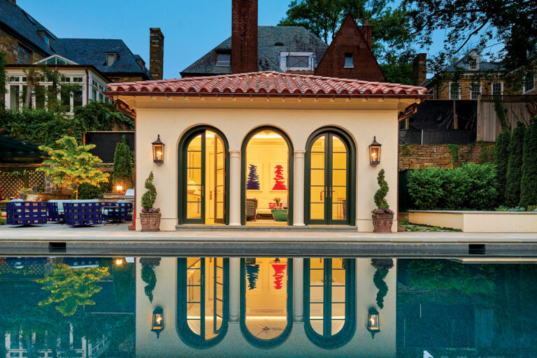
What was initially envisioned as a freestanding pool house ultimately morphed into a 700-square-foot, all-season extension off the kitchen. Architect Addison Nottingham presented plans for a timber-frame structure with a vaulted ceiling. Multi-fold, glass doors wrap around two walls for seamless access to the pool terrace. “We tried to make the space as open and glassy as possible,” he relates. “The doors fold and stack so they don’t interrupt the family’s enjoyment of the outdoor area.” Contractors Randal Fleming and Bill Saar executed the plan.
The addition channels a spirit of escape. Its interior is meant to transport family and friends to Maine, where the couple owns a vacation home. “Maine is our happy place,” shares the husband. “We wanted to bring some of that feeling to our DC life by making the porch a little rustic.” Dark-wood planks on the ceiling and walls, plus locally sourced stone around the fireplace, achieve the desired effect. The final result, he adds, “is a great party space.”
Then again, the family—and guests of all ages—enjoy every room in the house. As Peake sums up: “This home is made for living.”
Interior Design: Kristin Peake, Kristin Peake Interiors, Rockville, Maryland. Addition Architecture: Addison Nottingham, RA, LEED AP BD+C, ACG Architects, McLean, Virginia. Landscape Design: Sisson Landscapes, Great Falls, Virginia.
RESOURCES
THROUGHOUT
Interior Cabinetry & Built-Ins: lyndonheathcabinetry.com. Home Technology: bethesdasystems.com. Windows: marvin.com through wdshowplace.com. Folding Doors: centor.com through qualitywindowanddoorinc.com. Faux Finishing: artstarcustompaintworks.com.
LIVING ROOM
Sofas: Custom. Sofa Fabric: hickorychair.com; fabricut.com. Rug: carpetimpressions.com. Twin Table Lamps: jamieyoung.com. Wood Cabinet: lyndonheathcabinetry.com.
DINING ROOM
Table: Custom through highlandhousefurniture.com. Chairs: leeindustries.com; hollandandsherry.com. Chair Fabric: quadrillefabrics.com. Host Chair: hickorywhite.com. Host Chair Fabric: shellibreidenbach.com. Chandelier: urbanelectric.com. Drapery Fabric: kravet.com. Drapery Fabrication: gretcheneverett.com.
MUDROOM
Cabinetry Paint: Stone Cutter by benjaminmoore.com. Light Fixture: palecek.com.
FAMILY ROOM
Cabinetry Color: Hale Navy by benjaminmoore.com. Ottoman: hickorychair.com. Ottoman Fabric: samuelandsons.com. Rug: carpetimpressions.com.
HALL
Stair Runner: carpetimpressions.com. Round Table: Antique. Frame Chair: gabby.com. Frame Chair Fabric: ralphlauren.com.
PRIMARY BEDROOM
Headboard & Fabric: vanguardfurniture.com. Throw & Accent Pillows: legacylinens.com. Loveseat: hickorychair.com. Motorized Shades: hartmannforbes.com through abenetworks.com. Drapery Fabric: kravet.com. Drapery Fabrication: gretcheneverett.com.
PRIMARY BATH
Window Treatment Fabric: kravet.com; samuelandsons.com. Drapery Fabrication: gretcheneverett.com. Wall Color: phillipjeffries.com.
LOWER-LEVEL BEDROOM
Wallpaper: phillipjeffries.com. Bed: bakerfurniture.com. Nightstand: vanguardfurniture.com. Sconce: curreyandcompany.com. Accent Pillows: ralphlauren.com.
LOWER-LEVEL BATH
Vanity Top: caesarstoneus.com. Floor Tile: Architessa.com. Wallpaper: winfieldthybony.com. Shower Tile: waterworks.com. Ottomans: rogersandgoffigon.com. Dark Green Cabinetry: Andiron by sherwin-williams.com. Drapery Fabrication: everettdesign.com.
POOL HOUSE
Sectional & Woven Chairs: bakerfurniture.com; vanguardfurniture.com. Ottomans: rockvilleinteriors.com. Ottoman Fabric: perennialsfabrics.com. Chandelier: buzzellstudios.com. Backsplash: architessa.com.
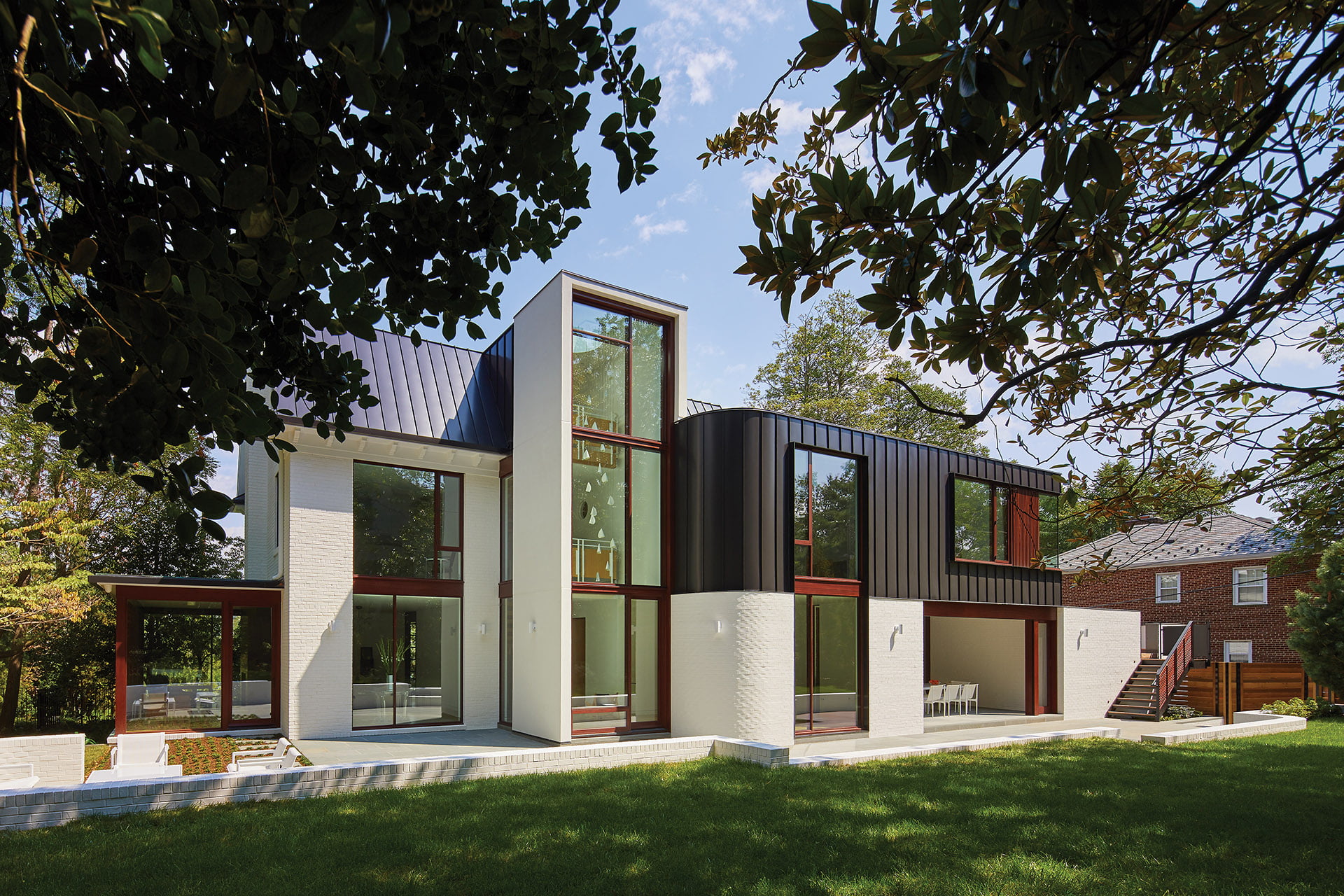
Outside DC, the Potomac River wends its way past Bethesda’s quaint Glen Echo neighborhood, where homes in a patchwork of architectural styles border tree-lined streets. Inclining uphill, one such byway is flanked mostly by modest Cape Cods—but a couple of years ago, a bold, modern abode joined the mix.
Owners Karen and Don Thibeau, a real estate agent and retired nonprofit executive respectively, had lived for 35 years at the top of the same street, in a mid-century residence that satisfied their penchant for contemporary design. They also owned a nondescript rental property just down the hill featuring a tiny, two-bedroom Cape. When they decided to build a new house for themselves, they selected that slice of land. “We loved our previous home, but wanted to design one where we could age in place,” Karen explains.
The couple envisioned a modern dwelling scaled to fit its modest neighborhood. They tapped Janet Bloomberg of KUBE Architecture to turn their vision into reality. Contractor HaighDeCastro and Campion Hruby Landscape Architects’ Stephen Makrinos also joined the team. Karen, who has a background in commercial design, decorated the interiors with input from Bloomberg.
On the small, 6,700-square-foot lot, a mature oak tree dominates the front yard. Houses are close in on three sides. “We tried to be as nonintrusive to the neighbors as possible,” says Bloomberg, “so maintaining the site naturally was really important.” She eschewed regrading and designed the structure around the oak, cantilevering it several feet over the tree’s massive root system. Utilizing the existing basement was a cost-saver that also minimized the impact of construction on the land.
The mandate was to devise an open, modern building that would offer privacy as well as indoor-outdoor flow. “The Thibeaus love the outdoors and that relationship,” Bloomberg recounts, “so one goal from the beginning was to create almost as much outdoor as indoor space.”
Now complete, the home measures 3,225 square feet, with four bedrooms and three and a half baths; courtyards extend its livable spaces. A central, two-story zone containing the kitchen and living area boasts 20-foot-tall expanses of glass on both front and back; multi-slide glass doors open to the large rear courtyard, creating one big indoor-outdoor space. The dining room and front entry lie on one side of the kitchen/living area. The main-floor owners’ suite, located on the other side, was designed with accessibility in mind. In the front-facing home office, a picture window frames the venerable oak. The building’s side walls are solid, save for clerestory windows that let in light but maintain privacy.
Upstairs are two guest bedrooms and a hall bath. Another bedroom and bath, plus a library nook, are reached via a catwalk that spans the living area below. East- and west-facing courtyards open out—one through a glass door by the stair and the other from the nook. The original basement is now a finished recreation room for grandkids. Crawl spaces under the new parts of the house provide storage.
Bloomberg clad the home’s glassy exterior with stucco and shou sugi ban, or charred wood. Inside, the floors are white oak, and black steel makes a statement in the living area where it forms the stair and integrates with the two-sided Viroc fireplace opposite. The upper-level railing wraps the space on three sides. This sculptural composition of steel panels, slats and screens also anchors the stair—and it’s a showstopper. Says Bloomberg, “We wanted to do something that would be like a piece of art, and relate to the owners’ modern art collection.”
Slats and panels are a theme outside as well. The main-level courtyard is protected by a fence of horizontal shou sugi ban panels, which conceal a hot tub. Slatted cedar screens, painted dark to match the charred wood, were crafted specifically for their locations around each courtyard, angled to answer privacy needs or for orientation to the sun.
Karen, who loves to cook, requested Bloomberg duplicate her previous kitchen in the new house—but with a welcome change from maple cabinets to easy-maintenance laminate. The sleek, black-and-white cabinetry was custom-made by Mersoa Woodwork and Design and is complemented by a wall of shou sugi ban. A fan of bright colors, Karen specified bold accent walls throughout. Most of the furniture and modern art was repurposed from the couple’s previous home.
Landscape architect Steve Makrinos designed a Japanese courtyard garden to complement the structure’s modern aesthetic. “Our goal was to maximize privacy while maintaining a light, open-courtyard atmosphere,” he says. Stands of bamboo create a privacy screen and planters filled with rough horsetail reflect a minimalist sensibility.
Despite its small footprint, the house lives large due to 10-foot ceilings that make spaces feel larger than they are. “We didn’t need a huge house,” reflects Karen. “We just needed it to work for us. This way, we can live here forever.”
Architecture: Janet Bloomberg, FAIA, principal; Jorge Concepcion, design associate, KUBE Architecture, Washington, DC. Contractor: Tim Haigh and Paulo DeCastro, HaighDeCastro, Washington, DC. Landscape Architecture: Stephen Makrinos, PLA, ASLA, principal, Campion Hruby Landscape Architecture, Annapolis, Maryland.
RESOURCES
THROUGHOUT
Fabrication: Metal Specialties; 540-967-4836. Cabinetry: mersoa.com. Countertops: countercollective.com; caesarstoneus.com through marblexinc.com. Appliances: subzero-wolf.com through adu.com. Pendant Lighting: moooi.com through illuminc.com. Plumbing Fixtures: totousa.com; duravit.us; hansgrohe-usa.com through build.com. Furniture: dwr.com; bludot.com. Windows & Doors: windsorwindows.com through thesanderscompany.com.
DINING ROOM
Paint: Aura Spice by benjaminmoore.com.
OUTDOOR
Gas Fire Pit: paloform.com.
A McLean property came with a luxurious home, but the small backyard patio left its new owners unimpressed. They turned to McHale Landscape Design to transform the one-plus-acre site into an amenity-filled landscape for their active family.
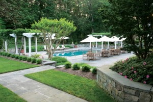
The owners’ wish list began with a pool, pool house and plenty of spaces to gather. To accomplish the project’s goals, the design team aligned clean geometries and sleek materials along a classical axis. Turkish travertine surrounds the pool, and ornamental crape myrtle trees encircle the lawn. Hydrangea, hellebores and other perennials soften stone retaining walls.
Today, a 50-foot pool abuts a lawn circle designed for volleyball and croquet; broad turf steps lead up to a white-columned pergola beside a pickleball court tucked amid the trees. Pathways through lush plantings link intimate garden spaces intended for reflection, relaxation or recreation. For shelter, there’s a full-service pool house.
A cluster of black planters creates a water feature that establishes the midpoint of the garden, while the pergola stands like a distant temple against a densely planted privacy screen. Below the surface, extensive piping and a catch basin ensure the slow release of runoff into the watershed. For senior landscape architect Anthony Cusat, who spearheaded the project, the craftsmanship of these unseen elements is essential: “We want to build it to last.”
Award: Grand for Outdoor Living Area. Architectural Design: Sandy Moffatt and Sam Dusenbery, McHale Landscape Design, Upper Marlboro, Maryland. Landscape Architecture & Contracting: Anthony Cusat, PLA; Dave Felton, PLA, McHale Landscape Design.
On an elegant property maintained by Wheat’s Landscape, precision is its own reward—even when creating clean lines and sharply defined features presents dynamic challenges.
The nearly two-acre landscape, completed in September 2024, belongs to clients who entertain frequently and wanted a pristine view from the rear of their two-story residence. After implementing an initial enhancement to the existing design, the Wheat’s team has preserved the serene grounds with twice-weekly visits for irrigation, pruning, mowing, fertilizing and lighting management. That program includes taming gravel paths and perennial beds, and coddling sweeps of lawn that abut travertine terraces. “It appears simple, but maintaining it takes a lot of effort you don’t see,” notes Wheat’s manager Matthew Gryskevich.
Spaces for contemplation and conversation include a fern garden and a raised gravel terrace graced by a fire pit, water feature and sycamore trees. The pool is bounded by coping stones that lie flush with the lawn, while pairs of lounge chairs sit on small flagstone patios surrounded by grass. In a sculpture garden showcasing a metal sphere by David Harber, boxwood hedges are kept low and absolutely level.
Such lush turf demonstrates the sweet spot in a constant care plan. To get the balance just right, Gryskevich admits, “We’re adjusting throughout the year.”
Award: Grand for Residential Maintenance. Landscape Design & Contracting: Joshua Dean, Matthew Gryskevich, Wheat’s Landscape, Vienna, Virginia.
A wooded, sloping lot in McLean made a smooth transition from dull yard to enticing gathering space with a few neat additions, including a rustic, stone-walled swimming pool with a travertine surround and a high-tech shade structure with louvers on automatic control.
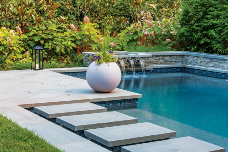
Working with a triangular site that’s just under an acre, landscape architect Oomer Syed of Fine Landscapes designed the partially sunken pool as a horizontal focal point, making the narrow yard appear wider. Two water features add visual and aural interest; the larger of them handily conceals pool equipment. In addition, a motorized aluminum StruXure pergola with automatic pivoting louvers is equipped with heaters, fans and bug-proof screens to ensure outdoor comfort.
Intentionally impactful plantings such as multi-stem Burford hollies bolster privacy on the owner’s side. Syed then added uplights to showcase the complexity of the holly trunks.
For seasonal color, Syed chose vibrant, long-blooming perennials including red drift roses, irises, Black-Eyed Susans, Shasta daisies and fall asters. To sustain the view through winter, he relied on evergreens for structure and interest. Low boxwoods edge the patio and back wall of the pool.
Says Syed, “I design with the worst part of the year in mind so that when you look out the window, there’s always something to engage the senses.”
Award: Grand forTotal Residential Contracting (Design/Build). Landscape Architecture & Contract- ing: Oomer Syed, PLA, ASLA, Fine Landscapes, Ltd., Sterling, Virginia. Photography: MPI360.
For landscape architect Jennifer Horn of Horn & Co., the success of a project on a tight lot in Northwest Washington turned on the fate of a century-old sycamore tree. The specimen rose between two recently joined properties, each boasting a house designed by architect Carmel Greer—a stone residence with a deck and pool, and a redwood guest house on the adjacent lot. Working with landscape contractor Justin Spittal of Planted Earth, Horn merged the two into a cohesive family compound through the use of unifying landscape elements.
The entire site measures less than a quarter-acre—and the goal of saving the sycamore was paramount. Horn designed a gravel terrace for the guest house around the roots of the tree. From there, stone-slab steps traverse the one-time setback zone between the houses, crossing the property line close to the tree. A retaining wall continues the original property line, framing an outdoor kitchen that faces the pool. Formal steps lead to the lawn and a second deck.
“The properties together have a homogenous feeling,” says Spittal. “Yet there is still some delineation.”
Natural and machine-cut stones mingle amid native ferns, grasses, red twig dogwood and a weeping redbud tree. “I wanted it to be clean and clear,” Horn notes, “but also organic.”
Award: Grand for Total Residential Contracting. Landscape Architecture: Jennifer Horn, Horn
& Co., Washington, DC. Landscape Contractor: Justin Spittal, Planted Earth, Sykesville, Maryland.
A two-bedroom unit in The Representative, a 1970s-era high-rise in Arlington, checked all the boxes for Ken Kero-Mentz and Neil Cannon. Downsizing from a home in DC’s Mount Pleasant, the couple sought a roomy pied-à-terre in a building with a 24-hour concierge, pool, gym and prime location near Metro and the airport.
Icing on the cake were “amazing views of the Capitol, the Washington Monument and the Potomac,” says Kero-Mentz, a retired foreign service officer.
But a less than optimal floorplan and outdated interiors cried for help. Despite enviable views, the apartment’s front door deposited guests at a dark, dead-end wall. Meanwhile, six-foot-wide French doors exposed the guest room directly to the living area. In the lackluster kitchen, a secondary entry door dominated one wall. And as for overhead lighting, there was none.
The owners acquired the property and soon enlisted architect/interior designer Charles Almonte to remedy the layout and refresh its dated aesthetic. He devised a plan that would largely gut the 1,600-square-foot home and instill it with better flow and functionality, lighting and storage. “Ken and Neil like to entertain and envisioned an open-concept scheme that would make the condo feel more spacious,” says the designer. “I wanted to go with a ‘Mad Men’ vibe in a nod to the modern architecture of the Brutalist structure.”
After investigating which walls could be altered without affecting building utilities, Almonte made some sweeping changes. “We removed a partition separating the entry and living area, which brought in daylight and views,” he explains. “We also closed off the doorway between the guest quarters and living room and took out a wall between the dining area and kitchen, creating the illusion of a larger space.”
Interior architecture and material selection also did the trick, establishing a clean slate where the owners’ furniture and art collections could shine. Old wall-to-wall carpet and glossy tiles gave way to pale, cork floors. “Cork makes the interiors feel brighter and more spacious—and provides sound insulation,” Almonte observes. Slatted-wood panels embellishing walls in the dining area and kitchen also reduce ambient noise; interior doors were stained to match the panels. “I chose these warm, natural elements so the apartment wouldn’t feel too stark,” says the designer.
Clever lighting solutions preserved crisp, new drywall ceilings that replaced passé popcorn. “We didn’t want extensive overhead lighting and since the building is concrete construction, we couldn’t really drill through the ceilings anyway,” Almonte reasons. “On walls and ceilings, we opted instead for recessed or embedded linear LED lights that only needed one inch of space.” Inlaid LED strips animate new hallways leading to the bedrooms. The system allows the owners to control lighting levels and colors to match their mood and even connects with their Spotify account to sync lights with their music playlists.
The redo also upped the ante in the now-sleek and efficient kitchen. German-made FORM cabinets in deep green and white rim the U-shaped space. Three-dimensional backsplash tiles reminiscent of tiny fish add playful movement. “The kitchen is a dream to work in—highly functional with everything just where it needs to be, whether we’re cooking meals for friends and family or just the two of us,” says Cannon, a retired attorney. A perch on the far-right countertop serves as a mini-office, with computer gear concealed behind closed cabinet doors.
In the nearby powder room, shades of green spring up on Farrow & Ball wallpaper that marries geometric and bamboo motifs. “We picked up the green from the kitchen and then found a sculptural, contemporary-looking vanity online,” says Almonte, who also revamped the home’s primary and guest baths.
Sleek, low-slung furniture helps realize the ‘Mad Men’ vision. An iconic Warren Platner table for Knoll and vintage Saarinen Tulip chairs make a statement in the dining room. In the living area, mid-century-style pieces from the clients’ previous residence, mostly sourced at Mitchell Gold + Bob Williams, create several conversation vignettes. “I wanted to convey a loungey feel in the living room,” Almonte explains. “Color-wise, we kept it neutral because they have a lot of artwork.”
The residents, who also share a second home in Europe, are thrilled with their Arlington aerie. “Charles was instrumental in helping us accomplish our goals, particularly because we have divergent styles,” Cannon admits. “Ken’s take was traditional and eclectic, while I preferred a minimalist, modern approach. Charles was able to integrate those visions, helping us create welcoming interiors with some groovy, ’70s Mod influences.”
Kero-Mentz concurs, “It’s the place we look forward to returning to every time we’re away.”
Renovation Architecture & Interior Design: Charles Almonte, AIA, ASID, Charles Almonte Architecture | Interior Design, Silver Spring, Maryland. Kitchen Design: FORM, New York, New York. Renovation Contracting: Pablo Souza, P. Souza Construction, Derwood, Maryland. Styling: Charlotte Safavi.
DRAWING BOARD
Q&A with architect/designer Charles Almonte
How do you determine if a condo is a good candidate for renovation?
Condo units have shared duct chases, plumbing walls, etc., so moving and reconfiguring walls needs to be carefully considered. We typically ask for blueprints so we can trace where utilities are located.
What’s your secret to narrowing down tile selections?
I tell clients to visit brick-and-mortar stores to see and feel tiles and take lots of photos. Then I help narrow down the options based on their style, preferences and lifestyle.
Identify amenities you recommend splurging on in a makeover.
The architect in me says find the best general contractor you can afford. With a skilled, creative and communicative contractor, everything will fall into place. The interior designer in me says well-made cabinets, appliances and plumbing fixtures are always worth a splurge.
Jodi Berger grew up in Potomac—so when she and her husband Adam returned to Maryland after six years in the New York area, it was a natural choice to rent a townhouse in her old stomping ground. After a couple of years, they purchased a 1988 Colonial a block away from the designer’s childhood home.
The 4,640-square-foot, four-bedroom house was in good shape, but its interiors were dated and traditional. Orange-hued cherrywood ran amok, from the kitchen and family room to the home office. Chair rails, wainscoting and heavy trim adorned nearly every room. Berger, whose taste runs contemporary, jumped right in.
“I gave myself a blank slate, painting the walls white and removing much of the millwork,” she recalls. “And I stained the red oak floors light, which gave me a start on the palette.” The kitchen immediately got a major facelift. The rest of the redesign happened piecemeal over six years, during which every room in the house was transformed. In the meantime, Berger and her husband welcomed two daughters, now one and three years old.
Reconfiguring the basement—home to the nanny’s quarters, a playroom and JLA Designs’ studio—is next. A Q&A details the design process so far.
Define your aesthetic and the ways it’s reflected in your home.
We call ourselves “classic contemporary with a twist,” which I think of as fresh, bright and modern. Here, I left enough traditional architectural details—for instance, the wainscoting in some rooms and the curved stairwell—to make it feel transitional. Keeping those elements allowed me to bring in modern influences. I replaced a classic, checkered-marble floor in the foyer with a large-format porcelain version in light gray and white, paired with an ombré stair runner and abstract wallpaper.
How did you modernize existing elements?
We kept the cherry built-ins in spaces like the family room and home office but simplified their trim and gave them a high-gloss lacquer. We replaced white-framed windows throughout the house with new Andersen ones and painted the wood frames black.
Describe your color palette and how it impacts the design.
I went with black, white and gray with gold accents to create drama through contrast. I gravitate to neutrals; I see color all day in my work and find it hard to infuse it into my own home.
Share your take on wallpaper.
I would put wallpaper in every room if I could! It adds so much depth and texture, it just completes a space for me. When I couldn’t find a wallpaper I wanted, I designed something and had my faux painter, Nicolette Capuano, create it. My designs are always watercolor-y and ombré, going from light to dark.
Detail the design of your living room, which exemplifies your style.
I think of it as my Chanel room—no kids’ toys or chaos. I designed the organically shaped rug, made by Carpet Creations, with all my colors. I chose a curved Jonathan Adler sofa and designed the cerused-oak coffee table. I saw the textural wall covering and was obsessed with it! I painted the ceiling black for contrast. Since our office is on site, we often use my home as a showhouse to help clients visualize what’s possible.
How did you formulate your plan for furniture and rugs?
This is our first home, so we bought everything new for it. A lot of the rugs and furniture are custom pieces I designed and had fabricated.
What changed in the kitchen?
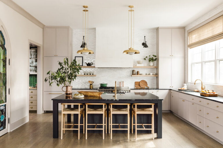
We used the existing footprint, but everything is new. I extended the island top for seating and added white cabinetry. I took down upper cabinets on one wall and extended the rest to the ceiling. A desk zone is now a pantry wall. The countertops, backsplash and shelves are quartzite; I’m a big fan of natural stone, which imparts a sense of history.
Explain your philosophy on decorating children’s rooms.
Kids’ rooms should have personality yet still be sophisticated enough to grow with your child—don’t put up alphabet wallpaper, for instance. In my older daughter’s room, we sponge-painted the ceiling in candy clouds and I designed a fluid pink stripe that’s painted on the walls.
Interior & Kitchen Design: Jodi Berger, JLA Designs, Potomac, Maryland. Kitchen Design: Amy Collins, Division12Design, Glen Echo, Maryland. Photo Styling: Charlotte Safavi.