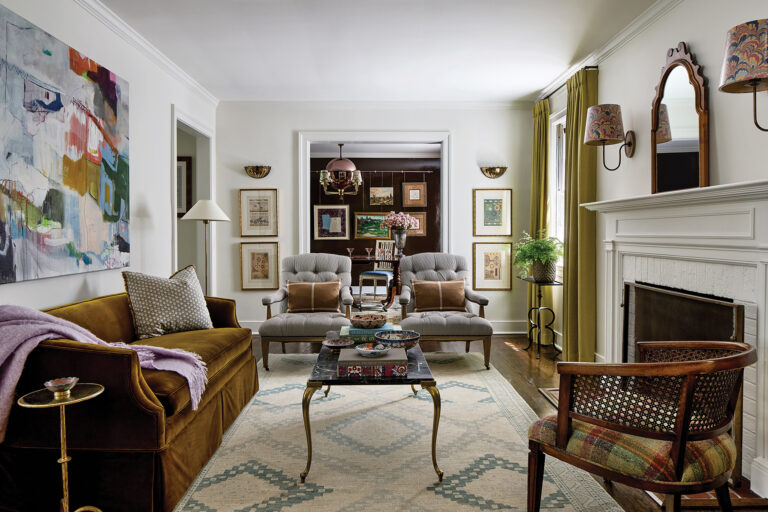
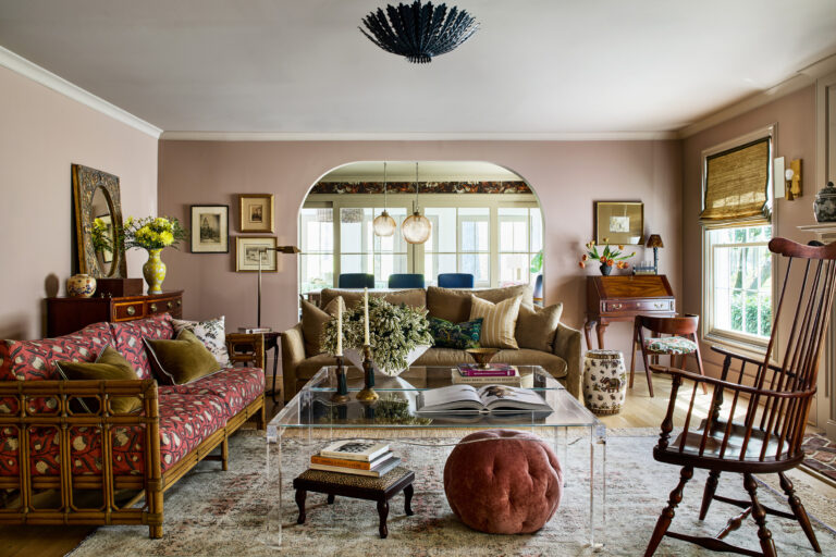
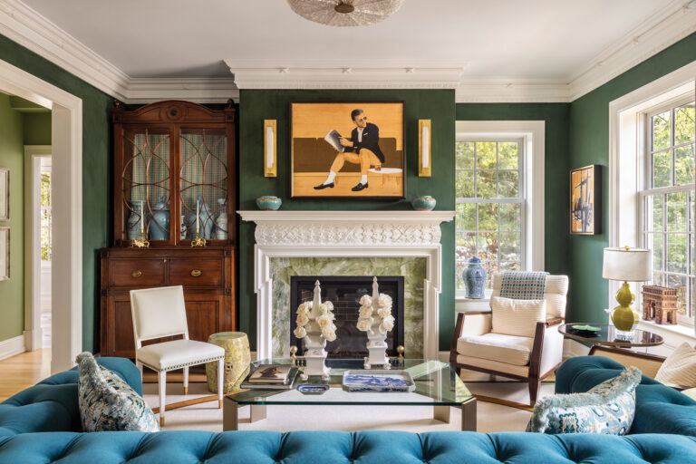
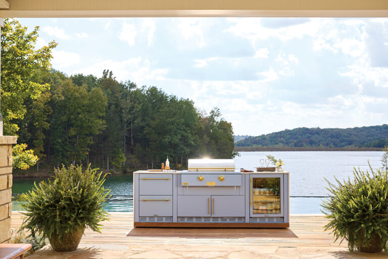
Starting a new chapter in life together spurred Timothy Price and Jerry Sealy to make over their Adams Morgan apartment. In 2016, Sealy sold his nearby loft and contemporary furnishings to move into the digs his now-husband had called home for more than two decades. The pair loved the conveniently located co-op building, a pre-War gem conceived by renowned DC architect Joseph Younger, and the character-filled bones of their completely renovated unit. Still, a change was in order.
“We wanted to make a space that was both of ours, that we each had input into, and elevate the design of the apartment at the same time,” reveals Price, a physician.
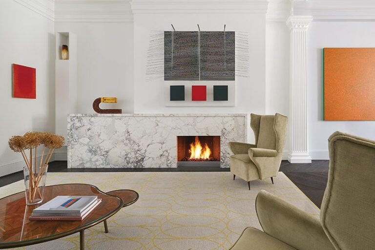
They found a style that resonated while touring the now-defunct DC Design House in 2016. To the couple, Josh Hildreth’s sumptuously layered library stood out. “It was a juxtaposition of colorful visual surprises in a traditional setting,” explains Sealy, a graphic designer. A year later, they were ready to launch their transformation and enlisted Hildreth, who in turn invited fellow designer Vivian Braunohler to assist.
Taking a “nonlinear” path, Hildreth began gathering special finds right away—before finalizing furniture plans. “I often describe my design process as soup-making,” he explains. “You go to the farmers’ market and you buy what’s good, even if you don’t know how you’re going to use it. You come upon something that wasn’t on the list but then it sort of organizes the whole meal.”
An early buying trip produced several too-good-to-pass-up pieces, including a deer-antler plant stand that, as the story goes, once graced Hearst Castle. It now sits in the couple’s dining room. “We didn’t have a sofa or a dining room table and chairs yet, so the plant stand was pretty esoteric,” Hildreth admits. “I sent Tim and Jerry pictures of things as I shopped and said, ‘Don’t worry if it doesn’t make sense now; focus on what’s appealing, because it’s those things that are going to get you to that feeling you described.’”
Throughout, the designers blended eras and styles with aplomb. The foyer’s collected vignette offers what Hildreth describes as “a good haiku” of their approach. It combines a 19th-century Chinese screen with a 300-year-old Flemish commode and a pair of vintage Brutalist lamps. As Vivian Braunohler points out, “There needs to be some sort of dynamic tension between objects in a pleasing way.”
A neutral backdrop, enhanced with decorative paint finishes in several spaces, showcases the curated trove as well as meaningful artwork. The clients’ shared love of photography is evident at every turn. For example, an arresting portrait by Danish photographer Trine Søndergaard punctuates a stippled, milk tea-toned wall in the living room. Artist Kyle Meyer wove strips of African textiles into a hand-shredded portrait to create the dining room’s mixed-media piece; his Interwoven series explores the challenges of homosexuality for men in Swaziland (now the Kingdom of Eswatini).
The design duo was careful to leave a little breathing room in their layered schemes. “We prioritized negative space around the varied collection,” explains Hildreth. “As much as we mixed things up, it never came at the cost of serenity and calm.”
Or livability, for that matter. Comfortable and practical new furnishings join the aged selections. Tailored upholstery, for instance, anchors the living room and spare-bedroom-turned-den. The couple’s bed and nightstands represent modern interpretations of 19th-century Aesthetic Movement designs.
The couple took refuge at their Delaware beach house for three weeks during minor construction work (a door leading directly from the den to the hall bathroom was closed off), painting and installation. They got their first look at the reimagined apartment during a big reveal orchestrated by the designers. “We walked through the door and were blown away by how beautiful it was and how reflected we were,” recounts Price. “It came together in ways that we could not have imagined.”
To thank their team, the pair hosted a dinner party. It was Josh Hildreth’s “greatest reward” to witness his clients in their element. “As a guest, I got to observe them living happily and comfortably together in the space,” he says. “Great design isn’t just beautiful—it also serves a purpose. It lifts up and celebrates living.”
Interior Design: Josh Hildreth, principal, Robert Cox, design director, Josh Hildreth Interiors, Washington, DC; Vivian Braunohler, Braunohler Design Associates, Washington, DC. Contractor: Ken Tarter, International Wall Designs, Gaithersburg, Maryland.
RESOURCES
LIVING AREA
Sofa: Lee Jofa through kravet.com. Sofa Fabric: pierrefrey.com. Small Table: vintage. Pillow Fabrics: vintage; janeshelton.com. Cocktail Table: Guiseppe Scapinelli. Skirted Chairs: billybaldwinstudio.com. Skirted Chair Fabric: pierrefrey.com. Chair Pillow Fabric: fschumacher.com. Pedestal Table: design by joshhildrethinteriors.com. Wooden Stool: vintage through jfchen.com. Cane-Backed Chair: quintushome.com. Corner Chest: vintage. Lamp on Chest: vintage through David Bell Antiques; 202-965-2355. Drapery Fabric: hollandandsherry.com. Roman Shade: conradshades.com. Drapery Fabrication: Pilchard Designs; 202-362-4395. Floor Lamp: vintage. Rug: Custom by dorisleslieblau.com. Sisal: starkcarpet.com. Shelf Units & Bench: Custom design by joshhildrethinteriors.com. Art above Bench: Trine Sondergaard. Screen: 19th Century Chinese Paper Hand Printed Screen. Chest of Drawers: 18th Century Flemish Commode through marstonluce.com. Wooden Chair: 18th Century Swedish through dienstanddotter.com. Paint: Mahogany by farrow-ball.com. Lamp: vintage Harry Balmer. Silk Lamp Shades: jimthompsonfabrics.com.
DINING AREA
Rug: custom by dorisleslieblau.com. Chairs: quintushome.com. Chair Fabric: us.loropiana.com. Chandelier: jonathanburden.com. Sconces: ironwareinternational.com. Art between Sconces: Kyle Meyer. Drapery Fabric: lisafinetextiles.com. Drapery Fabrication: Pilchard Designs; 202-362-4395.
FAMILY ROOM
Drapery Fabric: jimthompsonfabrics.com. Drapery Fabrication: Pilchard Designs; 202-362-4395. Ottoman: ferrellmittman.com. Ottoman Fabric: mooreandgiles.com. Sofa: ohenryhouseltd.com. Sofa Fabric: larsenfabrics.com. Sofa Pillow Fabric: lewisandwood.com. Chest by Sofa: antique. Art above Sofa: Elger Esser. Mirror: Owners’ collection. Table under Mirror: vintage. Armchair Fabric: Brunschwig & Fils through kravet.com. Wooden Pedestal table: us.julianchichester.com. Upholstered Chairs: arudin.com. Upholstered Chair Fabric: hollandandsherry.com. Console: vintage. Rug: starkcarpet.com.
BEDROOM
Bed: aestheticdecor.com. Bedding: peacockalley.com. Table Lamps: vintage. Art above Bed: Karl Blosfeldt. Chair & Drum Table: vintage. Window Seat Design: joshhildrethinteriors.com. Window Seat Fabric: brentanofabrics.com. Window Seat Pillow Fabrics: cec-milano.us; us.loropiana.com; Hodsoll & McKenzie. Wall Paint: Slipper Satin: farrow-ball.com. Roman Shade Fabric: rogersandgoffigon.com. Roman Shade Fabrication: Pilchard Designs; 202-362-4395. Bureau: owners’ collection; restored by greenconservation.com. Lamp on Bureau: marstonluce.com. Sconce: vintage. Bottom Rug: starkcarpet.com. Top Rug: antique through abchome.com.
In 2019, a couple with three children bought a dated, 1986 red-brick Colonial in Bethesda, lured by its two-acre lot and swimming pool. Their initial idea was to renovate the upstairs bathrooms and leave the main and lower levels largely intact. But as often happens, their growing wish list snowballed into a complete home renovation and expansion.
Hired for the job, architects Paul Davey and Rachel Drummond of Studio Z Design Concepts ultimately conceived an amenity-laden residential resort, complete with an outdoor tennis court and a catering kitchen. “You could comfortably entertain 100-plus people,” says Davey. “They really wanted a destination for family and friends—a great spot for a staycation.”
To accomplish their goals, the architects designed an addition on the left side of the home that nearly doubled the living space from 4,977 to 9,866 square feet—not counting a pair of new garages. Three ensuite children’s bedrooms occupy the second-floor addition, while the existing primary bedroom, also on the second floor, was upgraded with a new walk-in closet and a family lounge area; removing the original closet made a soaring, two-story foyer possible. Meanwhile, the finished basement more than doubled in size to accommodate a new wine cellar, tasting room, vintage arcade games and copious storage. An existing guest suite and gym, also on the lower level, were enlarged.
But the home’s crown jewel is the 20-by-55-foot main-level family entertainment center, which combines the original garage with the addition to create 1,100 square feet of open space. Among the highlights: a billiard lounge, an espresso bar, a media area and a high-top table with bar stools overlooking the patio.
When it came time to decorate, the wife, who left a career in fashion to raise her children, leaned toward “a transitional look with clean lines and no clutter,” she says. Her husband, a medical marketing entrepreneur, favored classic but modern design. The couple hired Erica Burns after seeing her work on Instagram.
“They had images from hotels they’d visited, so I knew they wanted a hospitality feel that leaned a bit contemporary,” Burns says. “But it was less about sleek lines and more about creating interesting, memorable spaces for family and friends.”
Against a backdrop of white walls and hardwood floors on the main level, the designer deftly layered in pale rugs, predominantly neutral furnishings and window treatments fabricated by Gretchen Everett. Punctuating these understated elements, big, bold paintings—“the jewelry of the house,” Burns declares—grace nearly every room, most of them sourced at Merritt Gallery.
Color also played a major role in the redesign. Swaths of deep blue crop up throughout, from Fromental wallpaper and Arabel draperies in the sophisticated dining room to a saturated blue hue covering nearly every surface of the husband’s library—a space he says drew high praise during covid-era meetings with Zoomers.
Pops of hot color and shiny metallics in varying scales also prevail. In the living room, three wedge-shaped Lee Industries poufs are covered in playful yellow while faux gold-leaf paint steals the show in the powder room as it seems to drip down from the ceiling to partially cover dark grass-cloth wallpaper by Phillip Jeffries.
The entertainment space presented its own challenge: How to make it feel cozy rather than like a massive rec room. Furthermore, the husband wanted a high-style bar, “not for drinking, but a Sunday-morning-sit-around coffee bar,” he says. “I also wanted a pool table. And I didn’t want any of this in the basement.”
Burns solved the coziness issue by creating intimate gathering areas within the space. Now brightened by large windows, the former garage shelters a custom Billiard Factory x-base pool table covered in blue felt. Burns designed a zinc-topped bar and ceiling-height cabinetry. Guests perch on leather Fabricut stools before repairing to the living room or to the patio where the husband and fellow chefs often fire up the gas grill and pizza oven.
Both the bar front and the niche facing it—sheltering a banquette and bistro tables—are clad in sleek, vertical wooden slats. In another seating area, a giant, wall-mounted TV is easily visible from plush gray sofas and blue chairs.
The other end of the room is anchored by a high-top table and chairs, perfect for homework, games or buffet-staging. A two-sided gas fireplace throws heat and light into the entertainment area as well as the adjoining family room, which the wife dubbed “the listening room” owing to a turntable atop a cabinet filled with vinyl discs.
Beside the family room, the once-all-white kitchen was updated by Division 12. The kitchen design firm reworked the layout, which incorporates new Brookhaven cabinets, while Burns weighed in on finishes. The Wolf range is topped by a gleaming statement piece: a custom brass hood by AK Metal Fabricators. The reimagined breakfast area, with views of the patio and gardens, now boasts a banquette clad in durable faux leather and a capacious table and chairs.
Throughout the 13-month project, Burns says, she focused on “bringing home that feeling you have when you’re on vacation.” Clearly, her efforts paid off.
Renovation Architecture: Paul Davey, AIA; Rachel Drummond, LEED GA, Studio Z Design Concepts, LLC, Bethesda, Maryland. Interior Design: Erica Burns, Erica Burns Interiors, Bethesda, Maryland. Renovation Contractor: O’Neill Development, Gaithersburg, Maryland. Kitchen Design: Division 12 Design, Glen Echo, Maryland. Landscape Design & Contractor: Chick Landscaping Inc., Burtonsville, Maryland.
RESOURCES
LIVING ROOM
Bench: arteriorshome.com. Art Above Bench: tombollesart.com through merrittgallery.com. Round Table: madegoods.com. Yellow Poufs: leeindustries.com. Pouf Fabric: pierrefrey.com. Rug: coecarpetandrug.com. Drapery Fabric: rogersandgoffigon.com. Drapery Fabrication: gretcheneverett.com. Gray Chairs: thayercoggin.com. Gray Chair Fabric: larsenfabrics.com. Art Above Sofa: huntslonem.com through merrittgallery.com. Floor Lamp: cb2.com. Sofa: arudin.com. Sofa Fabric: pierrefrey.com. Pillow Fabric: S. Harris through fabricut.com. Coffee Table: bakerfurniture.com. Paint: Simply White by benjaminmoore.com.
STAIR HALL
Art: Ashley Andrews through merrittgallery.com. Paint: Simply White by benjaminmoore.com.
LIBRARY
Millwork Design: ericaburns.com. Millwork Fabrication: division12design.com. Paint: Evening Dove by benjaminmoore.com. Desk: dwr.com. Sofa & Sofa Leather: hancockandmoore.com. Pillow Fabric: hollandandsherry.com. Coffee Table: theodorealexander.com. Rug: kaleen.com through coecarpetandrug.com. Craig Allen through merrittgallery.com. Chandelier: arteriorshome.com. Roman Shade Fabric & Fabrication: hartmannforbes.com.
DINING ROOM
Wall Covering: fromental.co.uk. Drapery Fabric: larsenfabrics.com; arabelfabrics.com. Drapery Fabrication: gretcheneverett.com. Chandelier: apparatusstudio.com. Table: danparishltd.com. Chairs: bakerfurniture.com. Chair Fabric: perennialsfabrics.com. Ceiling Wallpaper: kravet.com.
POWDER ROOM
Vanity: marblesystems.com. Plumbing Fixtures: waterworks.com. Wall Covering: phillipjeffries.com. Sconces: urbanelectric.com. Mirror: mirrorhome.com.
FAMILY ROOM
Chairs: kravet.com. Chair Fabric: cowtan.com. Rug: coecarpetandrug.com. Ottoman: Custom by michaeljamesfurniture.com. Ottoman Leather: hollandandsherry.com. Paint: Cornforth White by farrow-ball.com. Drapery Fabric & Trim: hollandandsherry.com. Drapery Fabrication: gretcheneverett.com. Chandelier: olystudio.com. Wall Sculpture: Matt Devine through merrittgallery.com. Drink Stands: madegoods.com.
BREAKFAST AREA
Banquette: Custom by stewartfurniture.com. Banquette Fabric: pindler.com. Table: rh.com. Chairs & Chair Fabric: kravet.com. Chandelier: visualcomfort.com. Wall Covering: christopherfarrcloth.com.
KITCHEN
Cabinets: division12design.com. Pendants: riloh.com. Hood: akmetalfab.com. Bar Stools: leeindustries.com. Countertops & Backsplash: fernandosmarbleshop.com. Range: subzero-wolf.com. Paint: Simply White by benjaminmoore.com.
The two-acre site facing Battery Kemble, a national park in Northwest Washington, was a tangle of bamboo and invasive weeds when the developer assembled a design team. For architect Wouter Boer, Campion Hruby Landscape Architects and the building company Zantzinger, the challenge began with a steep, eroding slope and ended with two boldly contemporary houses and a modern landscape complementing a 270-degree view of the treetops.
On a recent morning, sunlight illuminated the high modern achievement: a white stucco-and-glass house set into a slope bristling with native grasses. In form, the dwelling resembles randomly stacked boxes, their flat roofs topped with sedum.
Boer, principal of his eponymous Dupont Circle firm, leads a tour of the first of two houses he designed on the site. Completed in 2021, this one is not yet occupied (and is on the market for $11.95 million). The second is occupied by the project’s developer, Bryce Arrowood of Cliveden Group, LLC, who walked over to join the tour. Both men are unapologetic about departing from the classic Tudor-and-azalea persona of the surrounding Wesley Heights neighborhood.
“I wanted it to feel modern for today,” says the architect. Over the years, he contributed his share of historically styled residences to the cityscape in partnership with architect David Jones. But since Jones retired in 2020, Boer has given license to his own Bauhaus leanings. “I’ve always had a passion for modern architecture,” he says. “Mies van der Rohe is sort of my hero architect.”
For this house, Boer drew inspiration from Mies’ iconic 1945 Farnsworth House. A masterpiece of white steel and glass, the weekend cottage in Illinois contains just one room. In contrast, Boer’s homage boasts 8,600 square feet of pristine plaster and floor-to-ceiling glass, with six bedrooms and seven and a half baths; its four levels are linked by a steel-and-glass staircase with floating oak treads (plus an elevator).
Boer calls the house “sparsely detailed,” yet the material palette is anything but spartan. Portuguese limestone paves the main level, warmed by radiant heating, while white oak flooring prevails elsewhere. Gleaming accent walls and kitchen cabinetry are teak veneer. The primary bedroom closet bears 17 layers of high-gloss white lacquer. As Boer observes, “modern architecture is all about the quality of the materials”—and in this case, luxurious surfaces are more than a sleek backdrop. “The [lack of] ornament becomes the ornament,” the architect explains.
Anodized aluminum doors on the two-car garage shimmer in the morning light. From the spare entry court, a three-story, glass-walled hall leads to a dramatic, 65-foot-long rectangular living space. A floating teak partition holds a two-sided-fireplace. The room’s long, west-facing wall offers floor-to-ceiling glass overlooking the adjacent park. Beyond, a streamlined kitchen with Calacatta Covelano marble counters opens to a terrace nearly 30 feet above grade.
Four of the six bedrooms are organized on the second floor, while the top level is devoted to a private study with a terrace set above the tree canopy. A lower floor with extra bedrooms, a 1,000-bottle, glass-walled wine cellar, a yoga studio and gathering space gives way to a terrace and a 25-foot-long, infinity-edge pool. In the living room, Boer points out slim steel columns that almost disappear in alignment with the silvery window frames. Not visible is the footing—15 feet wide and eight feet deep beneath the pool—which stabilizes the entire house. “It takes a lot of structural finesse to make it look so simple,” the architect affirms.
Before this project even began to take shape, an existing house had to be demolished and the street extended to enable access. (That spur is now a private drive to the two houses Boer designed, as well as a third dwelling in a transitional style.)
“We literally had to carve each lot out of the woods,” recalls Zantzinger construction manager Gavin Stannard, who spent three years on site during construction. Landscape architects Kevin Campion and Stephen Makrinos planted 40-foot-tall pin oaks to screen a barely visible neighbor to the south while also dealing with stormwater interventions. Managing the flow opposite a national park engaged the Army Corps of Engineers and required multiple bioretention features. A six-foot-wide swale filled with 80 tons of large gray rock snakes along the drive in front of the houses.
“It’s not a small amount of water,” points out Makrinos, who was pleased that there was a budget for plantings to make the area look more natural. “There is an allée of river birch coming out of the grasses; it feels modern, like the architecture.” Golden groundsel, blue camassia and amethyst blazing star soften the hardscape surrounding the house.
Flat roof surfaces, visible from within, were planted with sedum by Furbish, a Baltimore green-roof specialist. “Aesthetically, you’re bringing the landscape up to the house,” Makrinos says. “All you see is green.”
As for realizing Boer’s vision, the challenges appear to have been met. Stannard observes that in modern architecture, “All the conventions, everything you know about making a house, go out the window.” Specialized craftsmen are required, tolerances are small and framing must be precise. If everything is ordered carefully, it all works. In Stannard’s opinion, this project was close to flawless. “Wouter Boer,” he concludes, “is an artist.”
Architecture: Wouter Boer, AIA, principal; Phillip McGee, project architect, Wouter Boer Architects Inc., Washington, DC. Landscape Architecture: Kevin Campion, ASLA, principal; Stephen Makrinos, senior associate, Campion Hruby Landscape Architects, Annapolis, Maryland. Builder: Zantzinger, Inc., Washington, DC. Structural Engineer: Ehlert Bryan, Washington, DC.
RESOURCES
Windows: westernwindowsystems.com through thesanderscompany.com. Upper & Lower Level Wood Floors: classicfloordesigns.info. Kitchen Range: subzero-wolf.com through build.com.
When a young couple toured a five-bedroom McLean home, they saw beyond the traditional, builder-grade embellishments of its 2008 vintage—the mahogany-brown wood floors; copious molding and trim; stacked stone fireplaces; dark-timbered ceilings with fussy corbels; and uninspiring, all-white kitchen. They purchased the 6,567-square-foot residence with a major renovation in mind.
“My wife is from LA; I’m from New York,” says the husband, who is CEO of an IT company. “We wanted to give the house a more modern touch—a sleek, contemporary feel that would reflect the urban environments we come from.”
They quickly assembled the team that would make their vision a reality: interior designer Celia Welch; builder Devin Nasvaderani of Marvel Homes; and Sarah Kahn Turner of Jennifer Gilmer Kitchen & Bath, who worked her magic on the kitchen, basement bar and bathrooms.
“Our clients’ aspiration was a home with their very modern aesthetic, but it was important that we acknowledge its traditional style and neighborhood,” explains Welch, who has a knack for simplifying overdone interiors in the best possible way. “We started by stripping away all the interior trim details, as they felt heavy and fussy without imparting character. Then we thoughtfully added back some architectural elements to evoke the passage of time. We took inspiration from the exterior, which has some French manor house characteristics.”
The first dramatic change transformed the foyer. Previously, guests entered a tight, paneled space lit by a nondescript chandelier set in a tray ceiling. The route to the staircase was blocked by a corner wall that had to be rounded; just as awkward, the stairs ran from the rear of the house to the upper floor. “It was a problematic entry—narrow and not welcoming, with the staircase crammed in the back,” recalls Welch. “And there was no through-view to the backyard.”
Welch, Nasvaderani and architectural engineer Steve Backus set out to overhaul the entrance and reverse the staircase. The resulting space conveys an expanded sense of entry; new sightlines to the backyard bring the outdoors in.
A gallery runs along the rear façade, opening to the living room, kitchen and family room. Welch scrapped its outdated paneling and replaced its trio of French doors with sets of floor-to-ceiling, Arcadia Custom steel-and-glass doors that bring structure, gravitas and light into the space. As the designer observes, “Our aim was to give the home an uncluttered feeling and a sense of ease.”
Her plan also refinished dark floors in a white oak stain, traded brass hardware for bronze and revamped the fireplaces—for example, a timeless mantel in French limestone now graces the living room. Welch updated all the lighting, selecting dramatic fixtures for key spaces—including an Alison Berger fixture that cascades from the second floor all the way down to the foyer.
In a nod to the traditional architecture of the home’s Virginia locale, the designer applied moldings to the dining room walls, seeking “a sense of history,” she says. But rather than going ornate, she specified a clean-lined profile. She also enveloped some spaces in bold colors or, in the case of the breakfast nook, wallpaper. The living room walls and trim are finished in deep blue while the dining room is cloaked in a café-au-lait hue, with the ceiling covered in tone-on-tone wallpaper. Window treatments combine curtain panels and Roman shades in a mixture of linen and wool in neutral tones.
“The home’s palette is mainly soft white, but there are moments of depth, with welcoming blues and rusts,” Welch notes. “When using a deeper color, I often wrap the room in it and eliminate the high contrast between moldings and walls.”
The living room, like the rest of the house, features a mix of modern Italian and bespoke furnishings, contemporary in feel yet sumptuous. Think lush, rounded forms upholstered in tactile linens and velvets. Rugs are hand-knotted wool. In addition to stone elements, leather also found its way into the scheme, cropping up on the kitchen chairs and the lower level bar cabinets.
“The basement design was inspired by California wineries, blending that relaxed lounge vibe with industrial materials,” Welch explains. “We used wood planks on the ceiling and a mixture of metals and industrial elements, but kept them refined and elegant.”
In the kitchen, Kahn Turner preserved the overall floorplan while upgrading dated finishes and cabinetry. “We wanted a classic look, but still casual and livable,” she says. “The black-and-white palette is warmed up with finishes like oiled walnut and natural soapstone for the countertops.” La Dolce Vita quartzite clads the island top and breakfast bar. Meanwhile, open stainless-steel shelving in a blackened finish stretches eight-plus feet across the wall opposite the range, which features a black metal hood.
The intention was to keep things “light and bright” in Kahn Turner’s words, to create a smooth transition to the adjacent family room. This bustling space is outfitted with two L-shaped velvet sectionals fronting a steel fireplace with a light wood mantel matched to beams that have been simplified and restained.
Now the parents of two young children, the owners are thrilled with the home’s new personality. As Welch reflects, “The family wanted a house that felt like home.” Kahn Turner, who worked on their previous residence and initially introduced designer and clients, agrees, “I felt Celia was the perfect match for the owners. I knew she’d be able to mix the existing character of the house with the right elements to achieve the desired transformation.”
Renovation & Interior Design: Celia Welch, Celia Welch Interiors, Chevy Chase, Maryland. Renovation Contractor: Devin Nasvaderani, principal; Steve Backus, architectural engineer, Marvel Homes, Bethesda, Maryland. Kitchen & Bath Design: Sarah Kahn Turner, Jennifer Gilmer Kitchen & Bath, Chevy Chase, Maryland. Styling: Stylish Productions.
RESOURCES
DINING ROOM
Chandelier: brabbu.com. Table & Chairs: contemporaria.com. Drapery Fabric: romo.com. Ceiling Wallpaper: hollyhunt.com; zakandfox.com. Study: holocene-design.com. Paint: Palisade by sherwin-williams.com.
FOYER
Bench: olivyastone.com. Paint: White Dove by benjaminmoore.com.
LIVING ROOM
Sofa: dmitriyco.com. Pillow Fabric: kravet.com. Chairs: thefutureperfect.com. Chair Fabric: kravet.com. Drapery Fabric: barthalpern.com. Paint: Providence Blue by benjaminmoore.com. Pedestal: westelm.com. Brass Floor Lamp: rh.com. Fireplace: francoisandco.com.
KITCHEN
Stools: industrywest.com. Chandelier: lindseyadelman.com. Cabinets: qcci.com. Wood Butcher Block: glumber.com. Countertops: gramaco.com; soapstoneva.com; stoneandtileworld.com. Hood & Hood Fabrication: amoredesignfactory.com. Refrigerator & Freezer: subzero-wolf.com. Metal Shelf Design: Sarah Kahn Turner for gilmerkitchens.com. Metal Shelf Fabrication: premiercb.com. Hardware: topknobs.com. Faucets: brizo.com. Backsplash Tile: architessa.com.
BREAKFAST ROOM
Chairs: boconcept.com. Drum Light: urbanelectric.com. Wall Covering: brewsterwallcovering.com. Shade Fabric: jlambeth.com. Rug: chilewich.com through dwr.com.
FAMILY ROOM
Coffee Table, Sectionals & Sectionals Fabric: rh.com. Paint: White Dove by benjaminmoore.com. Roman Shade Fabric: jlambeth.com.
TERRACE
Round Table: rh.com. Lounge Chairs: janusetcie.com. Dining Table: rh.com. Dining Chairs: janusetcie.com. Sconces: frenchmarketlanterns.com. Fan: lumens.com.
UPPER HALL
Hanging Light: alisonbergerglassworks.com through hollyhunt.com. Paint: White Dove by benjaminmoore.com.
OWNERS’ BEDROOM
Bed: dmitriyco.com. Light Fixture: ochre.us. Chairs & Chairs Fabric: rh.com. Pedestal: dwr.com. Paint: Chantilly Lace by benjaminmoore.com.
BATHROOM
Paint: Chantilly Lace by benjaminmoore.com.
LOWER LEVEL
Sectional: trnk-nyc.com. Ottoman: fourhands.com. Bar Stools: roomandboard.com. Light Fixture: boydlighting.com through hinescompany.com. Living Room Paint: Most Etna by Sherwin-williams.com. Bar Paint: Silver Satin by benjaminmoore.com. Pedestal: westelm.com. Table & Countertop Design: Custom by Sarah Kahn Turner for gilmerkitchens.com. Table & Countertop: gramaco.com. Table & Countertop Fabrication: stoneandtileworld.com. Cabinets: premiercb.com. Backsplash: Antique mirror.
It all began with a spec house in Chevy Chase, Maryland. In 2007, a couple with two kids purchased the Craftsman-style abode while it was still under construction, tapping designer Skip Sroka to help them upgrade and customize the interiors.
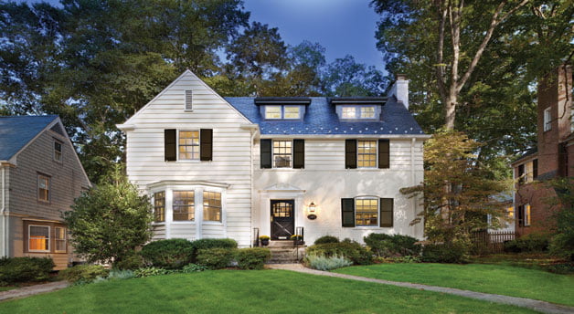
Fast forward to 2017. The owners—he’s in healthcare finance and she’s a retired CPA—were ready for a change. “We wanted to modernize, to relieve some of that Craftsman heaviness,” the wife relates. They turned to Sroka again and he, along with colleague Liz Bausch, formulated a plan for contemporizing the home—both inside and out. The exterior now boasts a clean-lined farmhouse aesthetic while a light color palette, simplified millwork and sleek, sophisticated details and finishes prevail in the interiors.
“It’s an ‘urban sophisticate’ aesthetic,” says Sroka. “Glam chic, but understated.” On the following pages, the designer reveals the process behind the décor.
Q&A
What elements did you retain from the home’s previous iteration and why?
We bought much of the art during the first renovation and it has transcended both redos. It’s modern and goes with everything. In fact, we redesigned the fireplace in the living room to accommodate a canvas by Johnnie Winona Ross that the clients love.
How did minimizing millwork and moldings impact the interior spaces?
It really lightened them. The woodwork was extensive and heavy—in the living room, for example, there were nine ceiling coffers. Now, it’s a simple cove ceiling with concealed lighting that’s a nice surprise. We also altered the size of the moldings between rooms and eliminated some built-ins in favor of custom pieces.
How did the color scheme evolve?
We weren’t looking to make the house a definitive color. We just wanted a neutral background, which tends to be more modern anyway. We gravitated to soft, warm grays that would showcase the art. I had installed dark-stained, rift-cut oak floors the first time around, so we lightened them to a pale hue.
Overscaled lighting plays a big role here. How did you make your selections?
Because we had reduced all the moldings and taken things away, we now needed architectural focal points. I chose the lighting so you’d notice it, to give extra dimension to each room. For instance, the Visual Comfort fixtures in the hallway are meant to lead you to the living room.
Describe the kitchen alterations.
Working with Lobkovich, Inc., we remodeled the whole kitchen. We framed sections of the white cabinetry with cerused, ebonized mahogany to create focal points. In an all-white kitchen, this is a tool you can use to add interest. Oversized Tech Lighting island pendants also catch the eye.
Share your methods for enlivening a neutral space.
I lean into textures and finishes, such as the hair-on-hide rug and wood-look wallpaper by Elitis in the dining room, or the Phillip Jeffries wall covering in a herringbone pattern that I put up on the living room ceiling.
Explain your furniture-selection process.
I never think my job is to just install furniture. It’s about adding that extra level of creativity that elevates a space. For instance, I repeated the herringbone ceiling surface on the doors of two custom cabinets in the living room and trimmed them with satin-brass edging. You have to notice the details.
How do accessories elevate a space?
Accessories offer points of interest that keep a room from feeling staid. We bring in a lot of items and see what clients respond to.
What changed in the upstairs spaces?
Each bedroom got a makeover and its own bath. The owners’ bedroom, which used to have a lot of wasted space, has been reconfigured to allow for two closets. In the owners’ bath, we built a niche to fit a Waterworks soaking tub, with beautiful carved marble tile behind it. They enhance each other.
Current favored finish?
Brushed bronze. I apply it to table legs, edges, cabinetry—anywhere I want to add a soft sheen.
Rule of thumb for using textures and finishes?
I try not to do the expected thing, but I’m also careful not to overdo it. If I have a strong pattern that looks amazing on a sofa, I won’t put it on more than one piece. I also don’t want a room that looks uniform, like a furniture store.
What style is coming back?
I think the ’70s are making a comeback. I love ’70s style—it mixes well with mid-century, which is so popular, and there’s a little glam to it. I’m seeing recycled pieces made from plexiglass and metal on 1stDibs.
Design pet peeve?
People who follow trends too much. I see it with HGTV hosts all the time. They think something is the new rule and they apply it indiscriminately whether it fits a house or not. Farmhouse modern interiors are a good example.
How does this house reflect your design philosophy?
Interior design is much like making a painting when you might ask, “What is it I want to see? What do I want to feel?” My interiors tend to be warm, calm and inviting. I create the house you want to come home to, to recharge your batteries in. Imagine taking a bath in the tub upstairs! Perfect.
Renovation & Interior Design: Skip Sroka, ASID, NCIDQ, IDAA, principal; Elizabeth Bausch, project designer, Sroka Design, Inc., Washington, DC. Renovation Contractor: Alliance Builders, LLC, Annapolis, Maryland. Kitchen Design: Lobkovich, Inc., Tysons, Virginia. Home Automation: A.B.E. Networks, Rockville, Maryland.
A fascination with air travel convinced a couple to buy a condo with runway views of Reagan National Airport. “We were sitting in the car at Gravelly Point watching the planes land and I said as a joke, ‘We should get an apartment nearby so we don’t have to sit outside,’” recalls one of the homeowners.
The light-hearted comment led to the 2013 purchase of a two-story, 2,700-square-foot condo in Crystal City, Virginia. Soon after, the owners—who then worked for an international refugee agency—were whisked off to their final assignment in Thailand.
While overseas, they rented out the three-bedroom, two-and-a-half-bath dwelling and plotted their retirement—and a remodel. “The space was fantastic; we’d purchased it with a view to its eventually being our forever home,” one partner explains. “But though the previous owner had done some renovations, it was stuck in time.”
A professional referral and a series of interviews led the couple to hire interior designer Kathryn Ivey, whose firm recently relocated from Alexandria to Paris. “The building dates back to the 1980s, so it needed an update,” recounts Ivey. “They wanted to freshen it up, to make it suitable for their retirement.”
Because it’s a condominium, no major structural changes were possible. But the wish list was still ambitious. It included revamping the kitchen, adding built-in shelving in the living room and removing two half-walls that separated it from the dining area. The owners' bath would get a major overhaul while other custom design and decorating tweaks touched nearly every space of the condo.
Ivey sketched out the design for the main-level living areas and upstairs bedrooms and also spearheaded the décor. She recommended Tom Gilday, founder of Pinehurst Design Build, to take on the renovation. Melanie Morales, an architect on his team, prepared the construction drawings and another colleague, kitchen designer Ellen Witts, also joined the project. “It was a real collaboration between the two firms,” observes Gilday.
The design process began in October 2019 and finished in March 2020—just before covid shut the building down. Construction finally commenced in July when the homeowners were still in Thailand. First on the agenda: refinishing the wood floors to remove their red tones. Once the living room’s half-walls were gone, the team designed custom built-ins made from ebony-stained red oak to frame the TV and linear fireplace, as well as shelving for art and accessories. Walls around the staircase were removed, banisters were replaced and treads and risers were refreshed.
Overhauling the outmoded kitchen was Witts’ job with an assist from Ivey. The tasks included removing an awkward peninsula that blocked traffic flow. Dark-wood cabinets gave way to custom blue-painted cabinetry paired with Silestone countertops and backsplash in the same hue. In a nod towards aging in place, the homeowners eschewed upper cabinetry.
The chic, monochromatic kitchen now centers on a roomy island; a custom-designed pantry cupboard made of quarter-sawn oak offers additional storage and paneled Bosch appliances contribute to a streamlined look.
Upstairs, the primary suite also underwent a makeover. The bedroom was softened by silk wall covering and a plush, upholstered headboard. The bathroom’s awkward layout made way for a more functional configuration; a suspended ceiling was removed to create a sense of space and height. The original oversized soaking tub was traded for a spacious shower. A clerestory window near the ceiling overlooks the stair; light pours in through an existing oculus skylight positioned over the stairwell.
When it came to decorating the interiors, “we felt it was a huge opportunity to create an aesthetic from the beginning,” relates the homeowner. “We were able to build a framework for our art pieces. The condo is designed to reflect
a particular look.”
With that aesthetic—dubbed “modern Asian” by the clients—in mind, Ivey established a coherent feel throughout with a neutral palette accented by pops of color. “The clients weren’t coming back with any furniture, so we were starting from scratch,” notes the designer. She conveyed an Asian sensibility via the lines of the furniture and the use of dark, rich woods.
Art and other treasures picked up on the clients’ travels created the finishing touches—including “a woven fabric that we used as a jump-off point for the color palette,” Ivey remembers. The fabric was transformed into a three-dimensional triptych that eventually made the journey from Thailand to the dining area wall.
Despite the challenges of covid and the far-flung locations of the decision-makers while the job was underway, both design team and clients are delighted with the outcome. Says Ivey, “The homeowners are surrounded by the things they’ve accumulated and reminded of the joyful time they had traveling abroad.” The fabulous airport runway views are just a bonus.
DRAWING BOARD
How do you pull off a design theme that’s unrelated to a home’s location?
Katherine Ivey: You don’t want to be too thematic. Wherever a home is, it needs to be connected to the local vernacular. There are ways to bring in influences through art, fabric and prints. In this project, we relied on the design of furniture and dark, rich woods.
How did you collaborate while the homeowners were half a world away?
Tom Gilday: A lot of the decisions were already made, so it was a matter of filling in the details. We sent three-dimensional drawings by email, so distance wasn’t much of a factor.
How does a condo makeover differ from the renovation of a detached home?
Katherine Ivey: You’re working with concrete walls, ceilings and floors so in terms of what you can do structurally, it’s very limited. There are support beams and plumbing holes you can’t move. And the logistics of getting in and out are challenging.
Renovation Architecture: Melanie Morales; Renovation Contractor: Tom Gilday; Kitchen Design: Ellen Witts, Pinehurst Design Build, North Bethesda, Maryland. Interior Design: Kathryn Ivey, Kathryn Ivey Interiors, Paris, France. Styling: Stylish Productions.
Shawna J. Dillon, ASID, NCIDQ Snaidero DC Metro | Jennifer Gilmer, CKD Jennifer Gilmer Kitchen & Bath, Ltd. | Tracy McGuinness, CKBD Kitchen Encounters | Larry Rosen Jack Rosen Custom Kitchens | Julia Walter Boffi Georgetown
THEN | NOW |
| Previous, poorly conceived renovations retained the compartmentalized floor plan while erasing character and layering on historically incompatible architectural detailing. | Emerson reconfigured the ground floor, creating an airy, open plan. Extraneous architectural elements were streamlined or removed, which resulted in a spare, uncluttered look. |
| Tucked into the center of the house, the dated kitchen was dark and windowless, flowing into a family room at the back. A covered rear porch limited natural light. | The new plan replaced the old kitchen with a sleek kitchen system by Henrybuilt; additional storage is tucked into a large pantry and separate bar. The back porch was enclosed and opened up to the family room. Rear window walls let in the light. |
| A jumble of wood and tile flooring made the interiors feel disjointed. The original staircase lacked interest. | Wide-plank white oak floors grace the main level. White oak treads and glass-and-steel railings adorn the modern staircase. |
Renovation Architecture: Elizabeth Emerson, AIA, EL Studio, Washington, DC. Renovation Contractor: Added Dimensions, Inc., Takoma Park, Maryland.
THEN | NOW |
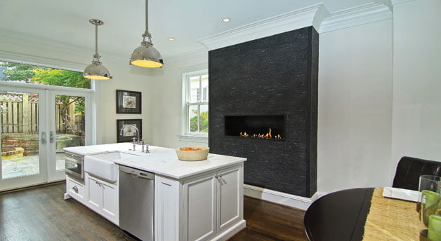
A French Country aesthetic—complete with ornate cabinetry, terracotta-look floor tile and granite countertops—felt outdated. | Embracing classicism, the designer installed clean-lined, ceiling-height custom cabinetry, coupled with honed-marble countertops and floors, for a timeless look. |
An overabundance of millwork framed the windows and covered the hood, making the room feel heavy and cluttered. A palette of cream and gold was muted enough to be dull. | The millwork was pared down in favor of unadorned windows. A plaster hood with simple wood molding creates a focal point. Cabinets, walls and trim in Sherwin-Williams’ Snowbelt and a glazed-ceramic-tile backsplash seem to sparkle. |
The soft angles along the cabinet corners encroached on valuable square footage in the room, as did an unused window seat. | Right angles opened the space up, conveying a cleaner sensibility. The window seat is gone, making way for a café table and chairs with a view. |
Kitchen Design: Tanya Smith-Shiflett, NKBA, Unique Kitchens & Baths, Washington, DC, and Great Falls, Virginia. Renovation Contractor: CarrMichael Construction, Oakton, Virginia.
THEN | NOW |
The 2,977-square-foot, one-and-a-half-story Cape Cod-style house was too small to accommodate the owners’ growing family. | The renovation expanded the home to 4,240 square feet; the second floor contains three bedrooms and there is a third-story home office above. |
A shallow screened porch on the front greeted visitors. A one-story addition on the back was conceived in modern style and looked out of place. | Winn reconstructed the front porch to accommodate gatherings while a rear addition was built up to house a second-floor primary suite. |
The white siding and brick on the front façade looked dated and boring. Without rhyme or reason, the rear of the house was clad in beige stucco. | Dark-gray, vertical Hardie panels conjure a modern, Scandinavian feel, enhanced by knotty pine accents that add warmth and lighten the massing. The rear addition is clad in knotty pine with dark-gray accents that unify it with the rest of the home. |
Renovation Architecture & Contracting: Michael Winn, Winn Design + Build, McLean, Virginia.
THEN | NOW |
Dilapidated flagstone was laid piecemeal in the back and side yards, flanked by straggly garden plots that wouldn’t grow due to too much shade and the obstructive root system of a nearby tree. | A crisp, new flagstone patio makes the backyard more usable. The side yard was regraded with a layer of soil that allowed grass and shrubbery to take root. |
The backyard had no style and was bordered by a prominent, unattractive wooden fence. There was no place to gather or entertain. | Straight angles and neat beds create a formal aesthetic. The fence is painted gray to blend with the stone; a stone fireplace provides a focal point. The patio accommodates both lounging and dining areas. |
There were no plantings to speak of because of the shade. | Shade-loving European hornbeam, boxwood, hydrangea and hosta bloom in different seasons, creating year-round interest. |
Landscape Design & Installation: Angela Rodrigues, Xtra Care Landscaping & Design, Inc., Damascus, Maryland.
As kitchens evolve, both functionally and aesthetically, designers look to bring drama, interest and a new level of customization to their projects. Capacious, furniture-style islands, move over: Statement hoods, which embrace unusual materials and finishes, are introducing a whole new level of creativity and pizzazz.
“We’re mixing metals and finishes, from copper and iron to natural and bronzed steel or polished and matte metal. Right now, we’re doing three in plaster,” notes designer Barry Dixon, who says that these days, he’s designing a statement hood a month.
“They’re driven by the overall aesthetics of a project,” adds kitchen designer Emily Neifeld of Lobkovich Kitchen Designs. “We love doing statement hoods because they are unique and bring a sculptural element to the kitchen.”
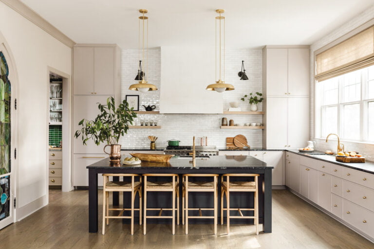
SCULPTURAL PROFILE For a Great Falls custom home, Deb Eastham, a designer at Lobkovich Kitchen Designs, collaborated with interior designer Martha Vicas on an eye-catching statement hood inspired by origami. AK Metal Fabricators crafted this sculptural creation, welding folded-steel pieces to a layer of wood to produce darkened seams that conjure an origami effect.
Kitchen Design: Deb Eastham, Lobkovich Kitchen Designs, Tysons, Virginia. Interior Design: Martha Vicas, Allied ASID, M.S. Vicas Interiors, Washington, DC. Architect: James McDonald Associate Architects, Great Falls, Virginia. Builder: Artisan Builders, McLean, Virginia.
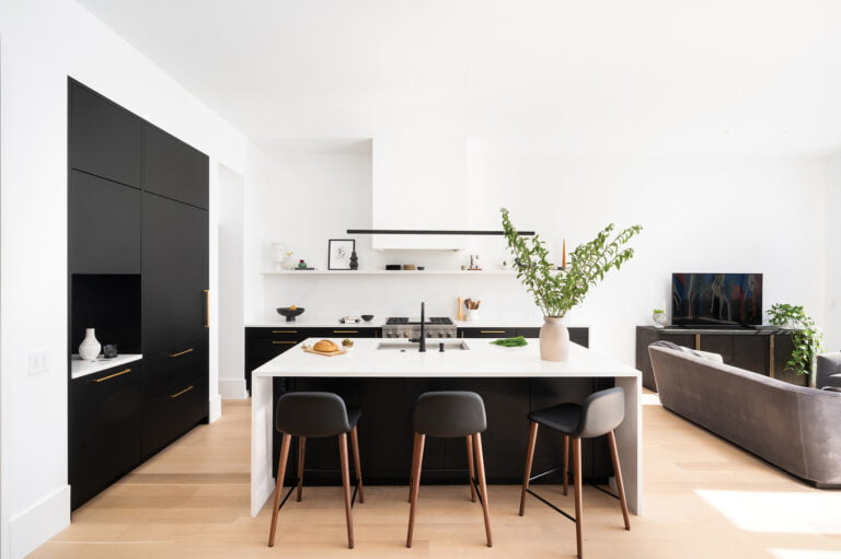
WIDE EMBRACE While designing a spacious McLean kitchen separated into front and rear zones, Emily Neifeld of Lobkovich Kitchen Designs carved a niche into the dividing wall and tucked the 48-inch range into it. She conceived an awning-style, blackened-steel hood with brass accents that stretches the wall’s width. “To expand the wall visually, I wanted clean lines with no upper cabinets,” she relates. Hickory trim frames the niche, clad in Macaubas Fantasy quartzite.
Kitchen Design: Emily Neifeld, Lobkovich Kitchen Designs, Tysons, Virginia. Architecture: WCRA, Chantilly, Virginia. Builder: Thorsen Construction, Alexandria, Virginia.
BACK IN TIME Tasked with designing a kitchen for Medieval history buffs, Barry Dixon recalled the fairy tale Old King Cole as illustrated by Maxfield Parrish—and conceived a massive hood with scalloped crenellations that conjure the ramparts of a castle. Measuring 10 feet wide by eight feet tall, it’s made of bronze-coated steel and heavy-gauge copper and conveys “a handcrafted look that harkens back to earlier times,” Dixon observes. Plaster support brackets by Ornamental Plaster Works were faux-finished by Warnock Studios to look like stone.
Interior & Kitchen Design: Barry Dixon, Barry Dixon Interiors, Warrenton, Virginia. Hood Fabrication: Kelly Metalwork, Cooksville, Maryland.
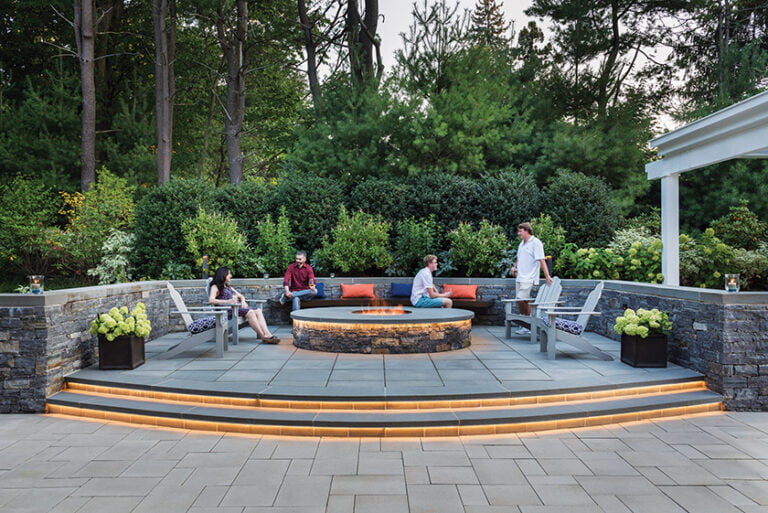
With the needs of his young family in mind, landscape architect Jordan Crabtree turned to his own backyard, located in Annapolis’ historic district. He and his wife had recently purchased their late-1700s abode, which “was a disaster when we moved in,” he recalls. Among the issues: a porous, granite-block foundation that caused frequent flooding.
While the home’s renovation was underway, 12 tons of soil were excavated or amended from the site to create room for drainage that would flow into groundwater. Crabtree established an infiltration basin six feet underground that catches runoff. He then designed a minimalist oasis for kids and adults alike, with room for both play and relaxation. “We needed to create a space to be with our family,” he says. “We love it.”
andscape Architecture: Jordan Loch Crabtree, PLA, ASLA, Loch Collective, Annapolis, Maryland. Landscape Contractor: Solidago Landscapes, LLC, Church Hill, Maryland. Lighting/Irrigation: Terra Nova Design, Crofton, Maryland.
When embarking on a custom-home project with Mid-Atlantic Builders, the owners hired Marika Meyer to mastermind the interiors. Though the plans called for a Craftsman-style exterior, the clients envisioned something more modern and sophisticated inside—embodied by a palette of chic purple and blue hues ranging from eggplant to plum to lavender, with navy thrown in.
“When you work in purple, think about how to make it rich, interesting and modern,” Meyer observes. “I leaned into the eggplant family of purples and set the backdrop with those tones.” She leavened their impact with silver-gray fabrics and rugs, then layered in yellow, teal and green accessories. Says the designer, “It was a deep dive into color.”
Interior Design: Marika Meyer, Marika Meyer Interiors, LLC, Bethesda, Maryland. Architecture & Construction: Mid-Atlantic Builders, Rockville, Maryland.
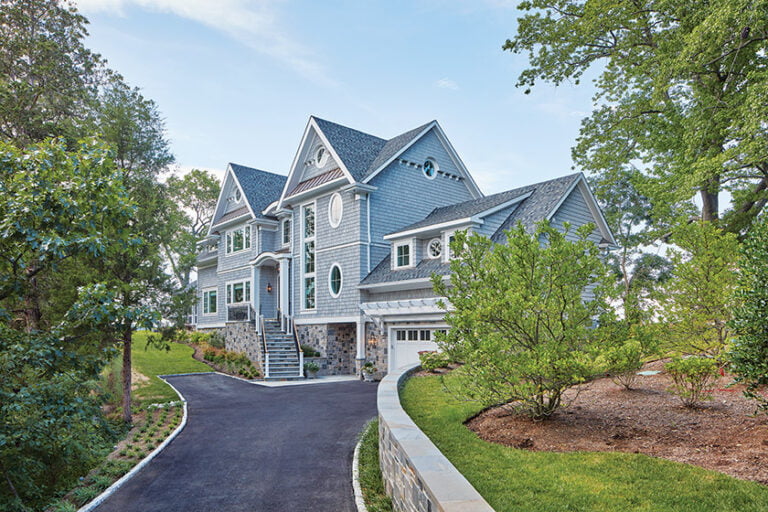
When Ruben Santos returned with his wife and children to the house he grew up in, his mother was still living there—so he devised a plan that would allow them all to coexist under the same roof. “We decided to make it a two-family home,” he explains.
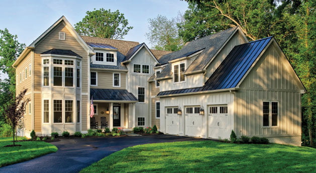
His plan—which doubled the size of the dwelling to 4,200 square feet—created a modern addition to the traditional center-hall Colonial. A two-story structure with a front bay contains the mother’s digs on the ground floor with Santos’ home office above. A connective volume features separate entrances. Shifting the front door to the addition “makes the original house look secondary,” the architect notes. “This way, the addition isn’t just an add-on. It’s cohesive.”
Renovation Architecture, Contracting & Landscape Design: Ruben Santos, AIA, principal, Convene Architecture, Alexandria, Virginia.
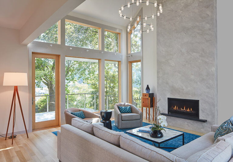
When clients purchased a five-acre property in Ashton, Maryland, the burned-out remains of a 1970s home remained on site. Asked to design a new, custom home in its place, KUBE principal Janet Bloomberg envisioned a streamlined, modern abode that, she says, “reimagines the suburban house as open, interconnected, filled with natural light and integrated with its site.”
Working with builder Added Dimensions, Bloomberg developed a plan that would utilize the original home’s footprint, extending portions by cantilevering them. Two volumes overlap in the home’s two-story core, with the front volume more solid and the rear one transparent. A steel bridge overlooking the main living space and kitchen connects the two. A wall of folding doors opens to a rear deck and pool. Industrial materials, warmed by wood, recall the clients’ previous urban dwelling.
Architecture: Janet Bloomberg, FAIA, KUBE Architecture, PC. Builder: Added Dimensions, Inc. Landscape Architecture: Campion Hruby Landscape Architects.