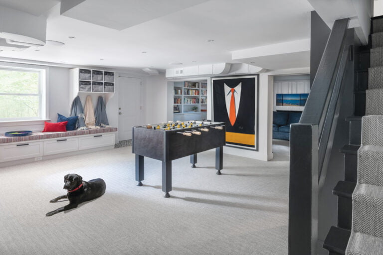
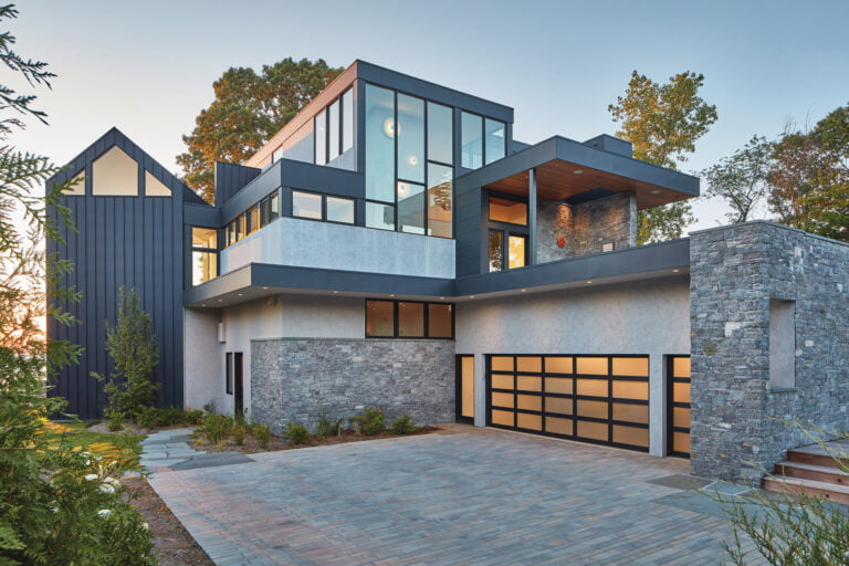
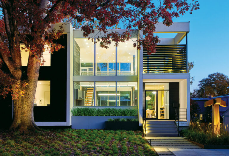
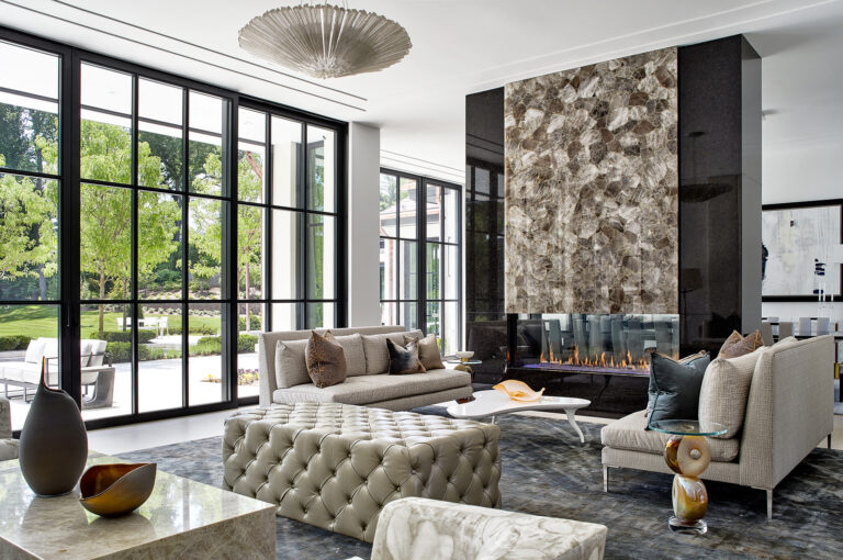
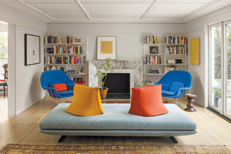
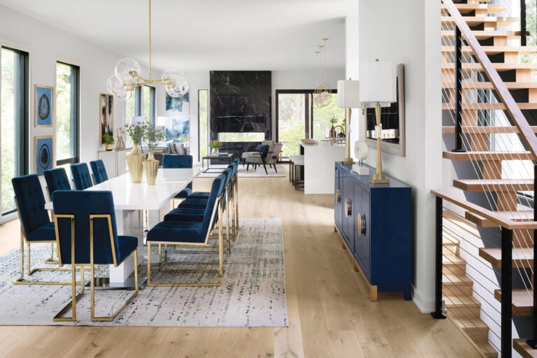
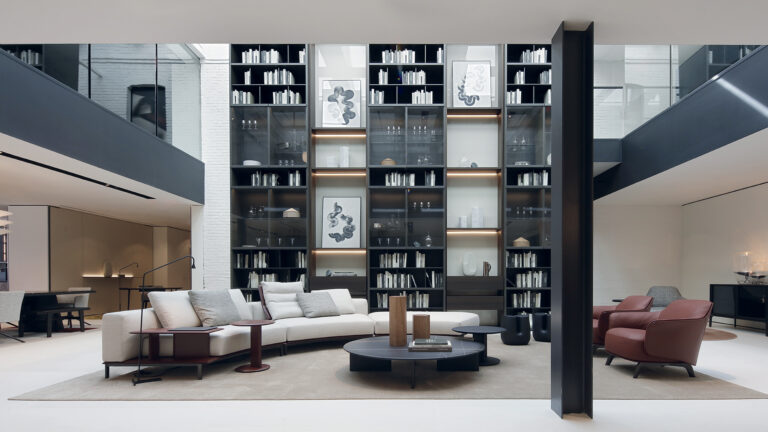
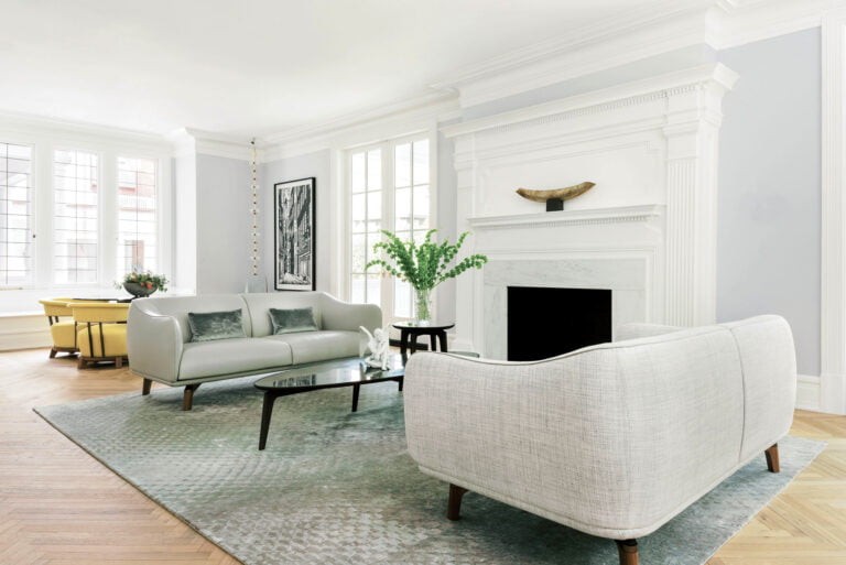
About 15 years ago, a visit to Frank Lloyd Wright’s iconic Fallingwater instilled Ali Manesh with a fascination for modern architecture and design. Later, the dentist, who had put down roots in the DC area, began to consider building a home of his own. “I envisioned something basic because I thought that’s what my budget would allow,” he recalls. “Then my practice grew, and I found I could afford to be creative.”
Manesh purchased a one-third-acre property in McLean, intending to replace the nondescript, 1955 abode on site with a dynamic, contemporary home. He discovered architect Zahraa Alwash, whose firm, Zee Design, leans modern. The two turned out to be a potent team. “I showed Zahraa pictures of favorite projects, including Mies van der Rohe’s Barcelona Pavilion and the Kaufmann house in Palm Springs by Richard Neutra,” Manesh relates. “I tapped into something emotional in this process. I really didn’t know how interested I’d be.”
He described his vision for the property as “hard and closed-off outside but open and expansive inside.” With this in mind, Alwash devised a modernist structure characterized by clean geometry, indoor-outdoor flow and soaring spaces. Because the lot backs up to a bucolic slice of county-owned land, she was able to open the rear elevation to a courtyard while keeping the front private.
Easy-maintenance, cream-colored porcelain slabs and contrasting dark-metal vertical panels clad the exterior. “We wanted massive windows beside the three-story stairwell,” Alwash notes. “But the stair faces the street, so we installed wood-look aluminum slats that let in light but ensure privacy.”
At 7,200 square feet, the six-bedroom, six-and-a-half-bath abode “aligns with the clean, minimal look Ali wanted, with a focus on connecting with nature,” the architect notes. Twelve-foot ceilings on the main floor impart airiness, while thin-profile windows, spare baseboard reveals and flush trim contribute to a sense of simplicity. Large-format, concrete-hued porcelain tiles ground the main-level floors.
The home’s open plan encompasses the foyer, dining and living zones, and a sleek kitchen. A spare bedroom and bath lie off to one side, while a sculptural, three-story stair made of steel and reclaimed white oak occupies center stage in the foyer; it was designed by Alwash and fabricated by Gutierrez Studios. Floor-to-ceiling sliders line the living and dining spaces, beyond which a pool and patio await.
The second floor houses a luxe primary suite and three more ensuite bedrooms. A glass-railed balcony overlooks the dining area, which boasts a soaring, double-height ceiling. The basement level is anchored by a glass-enclosed gym; a home theater, bedroom, bath and sauna are also part of the mix.
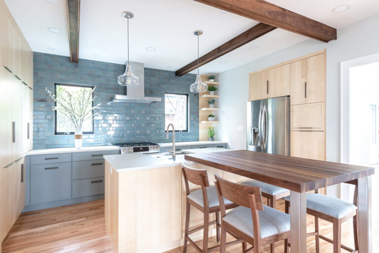
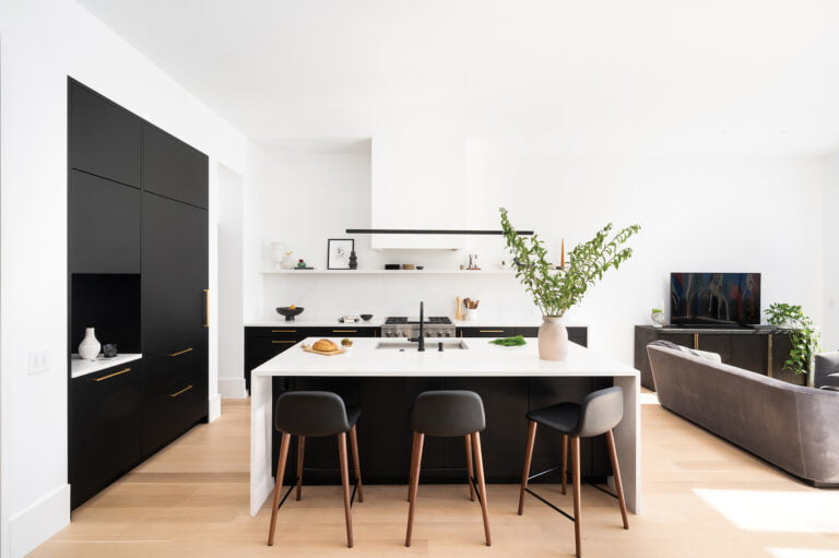
In the kitchen, cabinetry by the German brand Leicht combines dark-gray lacquer and walnut veneer, topped with thick Dekton counters that mimic the color of the floor tile. “It was important to simplify the palette,” Alwash explains. “And get everything tucked away for a cleaner look.” A walk-in pantry and adjacent mudroom keep surfaces clear of clutter.
When it came time to furnish the home, Manesh specified mid-century classics. “I originally fell in love with that era, but I ended up going contemporary on the architecture,” he points out. “It seems like with Mid-Century Modern furniture I am bridging the two.” Though Alwash and colleague Mariana Duarte Leo veered away from the mandate in the living room with Roche Bobois’ Mah Jong sectional wearing playful Missoni fabric, most of the furnishings are a salute to iconic mid-century designers, from an Eero Saarinen dining room set and Womb Chair to Marcel Breuer’s Cesca counter stools.
In the courtyard, a grotto-like swimming pool creates a soothing, serene refuge. It required some finessing, says Alwash, who first made sure to address backyard grading so the pool would sit on level with the house. “It needed to be elevated so as to be seen and to flow from indoors,” she explains. The patio—hosting loungers and diners with ease—is grounded by porcelain pavers that resemble the indoor tiles, reinforcing the indoor-outdoor connection.
Manesh thoroughly enjoyed the home-design process and hopes for another opportunity in the future—but is thrilled with his current residence. “I am more and more appreciative of this space,” he observes. “I do root canals every day, looking through a microscope with a narrow perspective. I wanted my environment to feel large and expansive.”
Architecture, Interior & Kitchen Design: Zahraa Alwash, AIA Associate, NCARB; Mariana Duarte Leo, interior design assistant, Zee Design, Vienna, Virginia. Styling: Kristi Hunter.
RESOURCES
KITCHEN
Island Stone Top: cosentino.com. Cabinetry: leicht.com. Appliances: mieleusa.com. Cooktop: pittcookingamerica.com. Counter Stools: knoll.com. Island Faucet: kohler.com. Art: linaalattar.com.
EXTERIOR
Materials: emilamerica.com.
DINING AREA
Table & Chairs: knoll.com. Chandelier: vibia.com/us/usa.
FAMILY/LIVING ROOM
Sectional & Coffee Table: roche-bobois.com. Blue Chair: knoll.com. Fireplace: flarefireplaces.com.
SITTING AREA NEAR KITCHEN
Striped Chair: bebitalia.com/en-us. Built-In Fabrication: ar2designstudios.com.
STAIRWELL
Stair Fabrication: gutierrezstudios.com.
PRIMARY BATH
Tile: tilebar.com. Faucets: kohler.com through grofusa.com. Soaking Tub: badeloftusa.com.
PRIMARY BEDROOM
Wallpaper: elitis.fr/en. Round Sconce: hennepinmade.com.
I always know we’ve done a great job when I don’t want to leave,” confides interior designer Lauren Hurlbrink about her recent project: a large family compound in Baltimore County’s Caves Valley. “A client who trusts you completely makes great things possible.”
Captivated by the seclusion and space afforded by the region’s rolling pastureland and surrounded by family and friends nearby, the owners who have four pre-teen children desired a legacy home where they could host holiday dinners and special occasions. Born and raised in Mississippi, the wife had long fantasized about living in a Southern farmhouse with all the authentic touches—including horse stables—but none of the clichés.
She and her husband assembled a dream team to make their new home a reality. In addition to Hurlbrink, the group included architect David Myers, builder Matt Kurrle and landscape designer Andrew Thompson.
Despite its size—11,000 square feet—the finished home “lives smaller than it actually is,” notes Myers. Instead of one continuous and visually overwhelming mass encompassing the main house and its attached horse barn/garage, he tweaked the footprint to connect the two structures at an angle, with a guest suite situated in its own wing. This delivered efficient circulation from room to room and created the warm and welcoming quality the owners envisioned. “A large home does not need to feel cavernous,” he adds.
Kurrle incorporated architectural and construction elements such as plaster walls, weathered siding, reclaimed stone and antiqued timber framing and brick throughout. These materials, notes the builder, “imbue the property with history and unique character. It’s not just another new build. It’s what you’d expect to see on a 19th-century rural homestead.”
Outbuildings including potting and sports sheds, a pool house and a sports court, extend from the main residence and barn. The home and its gardens sit on seven acres of lush green space landscaped to enhance privacy and visual appeal. An apiary, orchard, specimen trees and a multitude of pink and white flowers, boxwood and container plantings evoke a Southern country meadow.
Designed for entertaining, the main level houses a dining room, chef’s-grade kitchen, family room, sunroom and study spaces for the kids, along with a guest suite. Six bedrooms with ensuite baths, including the primary, await on the second floor, while the casual lower level is reserved for crafts, movies, fitness and indoor games.
From the front entryway, an arched and glass-paned doorway opens into a hall where the low ceiling suggests older-home proportions. To the right, custom bookcases displaying family mementos line a cozy niche housing an heirloom grand piano and an original painting of Southern magnolia blossoms.
To the left, the dining room is set with an ethereal blue ombré wall covering and a custom-made walnut table. An antique painted mirror with British pedigree hangs above a white Chinese Chippendale-style sideboard, reflecting the delicately curved sconces and chandelier.
In this child-centered home, there is no formal living room. Instead, a spacious family hub welcomes everyone with durable but elegant furnishings and a tall fieldstone wood-burning fireplace with an antique chestnut mantel.
The bright circular sunroom nearby is an ultra-feminine space bedecked with tasseled poufs and softly rounded settees in shades of pink and white. Drawing the eye up to the skylit ceiling are the antique timbered beams seen throughout the home.
The eat-in kitchen, conveniently off the mudroom, features refined Shaker cabinets, a farmhouse sink, quartz countertops and a backsplash of handmade ceramic tiles. A deep center island topped with oak sits beneath two painted lantern pendants for a vintage look.
Upstairs, the primary suite continues the farmhouse theme with stained and distressed white oak box beams on the pitched ceiling. An Old World patina adorns the bed tables; nickel gap paneling lends texture behind the bed. In the bath, tall, built-in armoires flank a statement tub overlooking the gardens below.
All told, design and construction of the farmhouse, outbuildings and landscaping took three years, spanning the covid crisis but, thankfully, presenting only a few logistical complications. The family finally moved in at the end of 2022.
It was more than worth the wait. “We were very lucky because everyone involved instinctively understood what we wanted,” reflects the wife. “I think the property feels so cohesive because every design element plays up our backstory. There are moments that are beautiful and works of art—but all of it feels like home.”
Architecture: David C. Myers, Jr., AIA, Myers Greene Architects, Baltimore, Maryland. Interior Design: Lauren Hurlbrink, Lauren Hurlbrink Interiors, Lutherville, Maryland. Builder: Matt Kurrle, Case Builders, Lutherville, Maryland. Landscape Design: Andrew H. Thompson, Foxborough, Inc., Street, Maryland.
RESOURCES
FOYER
Rug: hasanrugs.com. Paint: Chantilly Lace by benjaminmoore.com. Art: Custom by lionsmyth.com.
DINING ROOM
Table: Custom. Chairs: hickorychair.com. Chair Fabric: schumacher.com. Host Chair Fabric: thibautdesign.com. Mirror Paint: wallcraftpaints.com. Chandelier: visualcomfort.com. Sconces: Aidan Gray. Drapery Fabric: pindler.com. Drapery Fabrication: draperycontractors.com. Sideboard: modernhistoryhome.com. Wallpaper: schumacher.com.
FAMILY ROOM
Sectional, Sectional Fabric & Armchairs: hickorychair.com. Pillow Fabric: kravet.com; schumacher.com; thibautdesign.com. Armchair Fabric: schumacher.com. Rug: Custom through jaipurliving.com. Coffee Table: centuryfurniture.com. Chandelier: curreyandcompany.com. Drapery Fabric: thibautdesign.com. Drapery Fabrication: draperycontractors.com. Side Table: hickorychair.com. Table Lamps: Legends of Asia. Wall Paint: Chantilly Lace by benjaminmoore.com. Ceiling Paint: First Snowfall by benjaminmoore.com.
SUNROOM
Chandelier: Custom through mclainwiesand.com. Ottomans, Coffee Table & Upholstery: hickorychair.com. Sofa & Ottoman Fabric: hickorywhite.com. Skirt Trim: samuelandsons.com. Rug: nashvilleruggallery.com. Table Lamps: visualcomfort.com.
KITCHEN
Cabinets & Butcher Block: dovetailwoodworks.net. Cabinetry Color: Chantilly Lace by benjaminmoore.com. Island Fixtures: visualcomfort.com. Countertops: rocktopsfabrication.com. Tile: chesapeaketileandmarble.com. Stools: centuryfurniture.com. Stool Fabric: kravet.com. Appliances: fergusonhome.com. Hardware: topknobs.com. Chairs: hickorychair.com. Chair & Banquette Fabric: thibautdesign.com. Walls: Venetian Plaster by wallcraftpaints.com. Wall Paint: Chantilly Lace by benjaminmoore.com. Ceiling Paint: First Snowfall by benjaminmoore.com.
MUDROOM/BACK ENTRY HALL
Flooring: chesapeaketileandmarble.com. Chandeliers: visualcomfort.com.
PRIMARY BEDROOM
Bed: vanguardfurniture.com. Bedding: legacyhomefurniture.com. Walls: Venetian Plaster by wallcraftpaints.com. Wall Paint: Chantilly Lace by benjaminmoore.com. Rug: stantoncarpet.com. Nightstands: modernhistoryhome.com. Table Lamps: International Shades. Chair, Ottoman & Drapery Fabric: thibautdesign.com. Ceiling Fan: montecarlo.us.com. Drapery Contractors: draperycontractors.com.
PRIMARY BATH
Cabinetry & Cabinetry Fabrication: dovetailwoodworks.net. Tub: vandabaths.com through tsconline.com. Faucet: brizo.com through tsconline.com. Rug: hasanrugs.com. Walls: Venetian Plaster by wallcraftpaints.com. Wall Paint: Chantilly Lace by benjaminmoore.com. Light Fixture: visualcomfort.com.
POOL HOUSE
Chaises, Chaise Fabric, Chairs & Chair Fabric: summerclassics.com. Sofa Fabric: schumacher.com. Pillow Fabrics: serenaandlily.com. Ottomans: potterybarn.com. Coffee Table: bernhardt.com.
OUTDOOR KITCHEN
Grill: subzero-wolf.com through fergusonhome.com. Countertops: rocktopsfabrication.com. Sconces: bevolo.com. Cabinets: naturekast.com.
After designer Sara Swabb furnished a couple’s Nantucket getaway, she was called back to tackle their Colonial Revival-style home in Chevy Chase, Maryland. At 8,000 square feet, the newly built, six-bedroom residence conceived by Studio Z Design Concepts boasted gracious proportions and a modern take on traditional style.
Knowing the owners and their two children well, Swabb enhanced the interior architecture to accommodate the family’s lifestyle. “When a client trusts you,” she notes, “it gets the ball rolling very quickly.”
Her plan layered in design elements—from bespoke cabinetry and millwork to furnishings and textiles—in a relaxed, transitional aesthetic that reflects the owners’ fondness for New England style. Awash in soft neutrals and rich blues and greens, interiors feature a mélange of textures that add dimension and personality. “We made sure everything was comfortable, but still really pulled-together,” says Swabb.
The following Q&A sheds light on the project.
Explain the overarching goals of your plan.
My goal for every home is complete cohesion, so you never feel surprised by anything as you walk from one space to another. But there were some fun things that we played with, from unique tile to trim detail.
How did you adapt the kitchen to meet your clients’ needs?
Like many new builds, the plans called for a massive kitchen that didn’t make sense for the way the family lives. Both parents have demanding jobs and their kids have crazy sports schedules. I was afraid that the big, open kitchen would look messy and wanted to give them a place to cook, then close the door. We carved out a catering kitchen and a hidden scullery so when they entertain, the main kitchen looks nice and tidy.
Describe how the custom details you designed lend the home its unique character.
It was exciting for me to bring in elements such as the transoms over the kitchen’s pocket doors. We also created a beautiful alcove enclosing the range, which makes the room feel more sophisticated and collected. In other spaces, we jumped into a lot of crown molding and big, chunky base trim. Trim color can make a space more interesting without impacting budget. For example, we painted the powder room’s base trim in Benjamin Moore’s Sharkskin for an exciting effect.
Explain how textural layers make the home feel timeless and lived-in.
We leaned into woven materials and selected a number of vintage rugs, which instantly add age. Sisals, which are less expensive, create additional texture. And we splurged on café curtains in the breakfast room; without them, the space would fall flat.
What inspired the kids’ office?
The owners want their home to be in a state where they don’t have to clean up and can welcome guests any time. We created a dedicated space for the kids to do homework and take music lessons, outside of the kitchen.
How did the powder room come together?
I fell in love with the vintage sconces with milk-glass rods. The marble sink with its fluted edge plays nicely with them. And I had been eyeing the wallpaper—Scrolling Fern by Soane—for a while. It looks like kelp or seaweed and feels very coastal.
What drove your furniture selections?
We wanted the home to feel super-classic with clean lines. And I think that was accomplished by making sure everything was tailored—down to the slip covers in the living room.
What ingredients make a house feel like home?
Knowing your client’s priorities and understanding how they want to live and feel in their home are key. Asking the right questions is really important. Our initial process sets the foundation for a project to go in the right direction.
What treasure in your home is most special to you?
An oil lamp that was my grandmother’s. My parents had it electrified and installed in their dining room. Now it’s a fixture in my foyer.
Share a favorite local haunt for vintage finds.
Daphna Peled at Pillar & Post in Georgetown is a great curator. She’s always going on trips to the UK and mostly sources pieces in England, which is lovely.
Reveal a wallpaper that you’re excited to try.
I’m obsessed with Wallflower wallpaper in Woad Blue by Morris & Co. It’s got great, modern movement to it. I’m probably going to hang it in my house.
Name a designer from any period whom you’d like to meet.
Josef Frank, the Austrian-born architect. I love his lighting designs; he really mastered the art of making functional lighting beautiful.
Interior Design: Sara Swabb, Storie Collective, Washington, DC. Architecture: Studio Z Design Concepts, Bethesda, Maryland. Contractor: Chase Builders, Silver Spring, Maryland.
While scouring Washington, DC, for a vintage row house to buy and remodel, a young couple came across a 1911 dwelling in Mount Vernon Square that fit the bill. “We were going for a Parisian aesthetic, where the walls are all original, but everything is modern inside,” recalls the wife. “We were looking for high ceilings and light.” The chosen abode had undergone a builder-grade remodel in the 1990s and was sorely in need of an update—but architectural flourishes remained.
Architect VW Fowlkes of Fowlkes Studio guided the duo in their search, then tackled the design process along with colleague Josh Eager. “We wanted modern elements that would feel like they were lifted in, not battling with the original bones of the architecture,” Fowlkes explains.
The project’s original scope was limited to the main level, but partway through the design phase, the wife discovered she was pregnant with their second child; she and her husband, a business strategist, decided a more extensive redo was in the cards. The 3,355-square-foot finished home boasts a reconfigured first floor containing dining and living rooms and the kitchen. The second level houses the nursery, husband’s office, their three-year-old’s bedroom and two baths. The primary suite occupies the third story. A carriage house on the property features an in-law suite with a kitchen and bath.
To achieve functionality and a chic, modern sensibility, Fowlkes Studio and contractor Triumph Custom Homes gutted much of the interior while retaining walls embellished with moldings and trim. Weather Shield windows were installed throughout. The main floor’s drab wood and tile flooring made way for wide-plank white oak. Plumbing, electrical and HVAC systems were replaced and spaces reconfigured.
On the main level, the kitchen was relocated from the back of the house to the middle, with the dining room in front and the living room at the rear. “Since everyone hangs out in the kitchen, this design activates the center of the home,” the architect observes.
A marble-topped waterfall island dominates the room, lined with custom oak cabinets. A walk-in pantry keeps sleek surfaces clear.
A short, wide passage connects the kitchen and living room, delineated by arched openings that echo the home’s Victorian-style front windows. The passage overlooks the brick-walled side yard and provides access to the powder room and pantry. “We indulged in more modern detailing in back,” relates Fowlkes, “so the trim disappears, the window surrounds are sleek and a big window wall in the living room faces the courtyard.” An integrated door opens out to a minimalist patio and grassy yard, with the carriage house beyond.
On the second floor, door locations shifted to accommodate a laundry room. The remodel overhauled the third-floor primary suite, enlarging the bathroom by taking space from former closets. “A pop-up wall in the bedroom now conceals a walk-in closet behind it,” Fowlkes notes. A glass-and-steel partition creates the entrance to the room; it channels light from an existing picture window over the stairwell while maintaining an acoustical barrier.
The design team not only retained but also enhanced the home’s architectural details. “It’s not infrequent for us to create a fiction of the backdrop so it looks even more period than it is,” Fowlkes says. Playing off built-up moldings and trim, the husband, who was born in Italy, worked with architect and principal Catherine Fowlkes on furnishings and finishes, sourcing contemporary Italian pieces and mid-century classics.
Now a family of four, the owners are thrilled with their home’s transformation. “It’s a completely different house,” the wife comments. “It absolutely fulfilled our vision. We love it—and the space it provides us to be with friends and family.”
Renovation Architecture, Interior & Kitchen Design: VW Fowlkes, AIA, principal; Catherine Fowlkes, AIA, principal; Josh Eager, AIA, project manager, Fowlkes Studio, Washington, DC. Renovation Contractor: Triumph Custom Homes, Bethesda, Maryland. Landscape Design: Jennifer Del Guercio, Pine Design, Washington DC.
Mark Kelner’s art responds to the world around us. Not in the typical way that painters might interpret people or nature, but instead as commentary on America’s consumer culture—from strip-mall signs along the roadway to the value of art itself.
Guiding a visitor through his spacious studio in Mt. Rainier, Maryland, Kelner reflects on the inspiration for his latest series, Barcodes. “My experience with the dissemination of mainstream art news is: ‘This is the $450 million DaVinci. This is the $195 million Warhol.’ That is a complete perversion of what art is supposed to be,” he says, “how it has become so objectified, so commodified.”
Barcodes’ haunting images outline the contours of multi-million-dollar paintings: “Francis Bacon, Basquiat, Boticelli,” Kelner ticks off, as he pulls his versions, arranged alphabetically, from cabinet drawers. Onto a heavily textured surface of white acrylic paint, the artist superimposes black lines; each line is tailored to suit the form of the original painting.
As part of the series, Kelner assembled a catalogue identifying the before (auction data) and after (Barcodes) for 40 paintings; it lists sale dates, prices and buyers’ names. “Because,” the artist explains, “I really want to get to the root of who a $450 million painting is for. Why does it cost $450 million? And will it ever be seen in public again?”
Kelner considers his work to be conceptual art, where the idea behind each piece is as important as the art itself. While humor initially attracts audiences to his work, its meaning runs deeper. Contemplating a room filled with his paintings, Kelner suggests, “can get real dark, real fast.”
The artist’s outlook derives in part from his Soviet heritage. Born in Cleveland, he is the child of immigrants who arrived in Ohio from Moscow in 1974. When Kelner was two, his father, a celebrated Russian writer and his mother, a physician, moved the family to Rockville—a suburban merchandising mecca that would eventually surface in the artist’s work.
After graduating from George Mason University as an English major, he found a job at an art gallery in Reston. His first exhibit brought together works by Soviet artists, all of whom Kelner knew. On his way to becoming an artist, he spent two years learning printmaking at Dennis O’Neil’s Handprint Workshop International in Alexandria. Barcodes grew out of that experience. “It’s the idea of painting with screens that comes from a printmaker’s instincts,” he says.
In 2024, American University Museum displayed Kelner’s previous series, New American Landscapes. Based on real places—from Langley Park, Maryland, to Las Vegas—the 36 strip-mall paintings represent composites, or as the artist puts it, “greatest hits.” Starting with photos, he meticulously rendered sections of the signage using carefully leveled masking tape, searched online for fonts that reproduced actual typefaces, and digitally sized letters before stenciling them on, line by line. Minor imperfections alert viewers to the handmade quality of these roughly five-by-four-foot paintings, which took four years to complete.
“Traditionally we talk about the sun, water, trees as being of the natural world,” Kelner explains. “But when I started photographing strip-mall signs, I recognized this as my version of nature.” By isolating these attention-grabbers from cars, buildings and trees, he created paintings that, the artist notes, “by their very isolation become something else. That’s interesting to me.”
Kelner traces a major influence on his art to 1980s material culture, an era when possessions were equated with status. He also credits Soviet artists, especially the duo Vitaly Komar and Alexander Melamid, whose amusing and mordant art simultaneously ridicules Soviet and American cultures. Reaching back earlier in the 20th century, Kelner studied the pioneering work of Soviet artists Kazimir Malevich and El Lissitzky, and turned examples of their abstract art into letters, including on a wall relief that forms the Levi’s logo.
Beginning in 2016, the artist also launched a series of paintings called Text Without Words. Among that group, Eight American Reds presents titan brands in a lineup of red panels—specifically MAGA, Marlboro, Coca Cola, Levi’s, McDonald’s, Campbell’s, Ford Mustang and Heinz ketchup. “It became a real exploration of symbols of national identity, which is where I’m at right now,” Kelner observes. “Young people today are getting only how much things cost,” he continues. “Nuance is over. That’s really a shame, because I operate in nuance. And I want to see where this art can go.”
For more information, visit markkelner.com.
Vessels & Voids, an experimental exhibit open through September 28 at VisArts in Rockville, examines the connection between fluidity in architecture and the ceramic arts.
New technologies inspired curator Rebecca Cross to put together the show. “Advancements in computer-aided design have given rise to buildings that can take on any form, while livable dwellings can be 3D-printed from clay,” she marvels. “These parallel breakthroughs open up possible new approaches to architecture, while artists who work in clay can offer inspiration to architects to think in a more plastic vocabulary.”
The exhibit presents drawings, sketches and concept studies by 13 local architects: Ankie Barnes, Melinda Becker, Janet Bloomberg, Wouter Boer, Olivia Demetriou, Phil Esocoff, David Jameson, Michael Marshall, Mark McInturff, Robert Sponseller, Dhiru Thadani, Amy Weinstein and Christian Zapatka.
In tandem, a display of clay vessels and sculptural works by a host of ceramic artists mirrors the expressive and structural possibilities of organic architecture. “I’m hoping visitors will see the dialogue between architects’ drawings and the shapes of the ceramic vessels that might inspire new forms in the future,” explains Cross, who collaborated on the exhibit with emerging curator Storm Bookhard. visartscenter.org
Every two years, the Washington Mid-Atlantic Chapter of the Institute of Classical Architecture & Art holds a design competition recognizing fine classical work in the region. The awards are named after John Russell Pope (1874-1937), a New York-based architect who designed significant classical buildings in Washington, DC, including the Jefferson Memorial and the National Gallery of Art.
Selected by a jury of architects, the 2025 award-winning projects were announced at a gala held on May 2 at The Sulgrave Club in Washington. This page showcases residential awardees and list non-residential winners. For more information, visit classicist-washington.org.
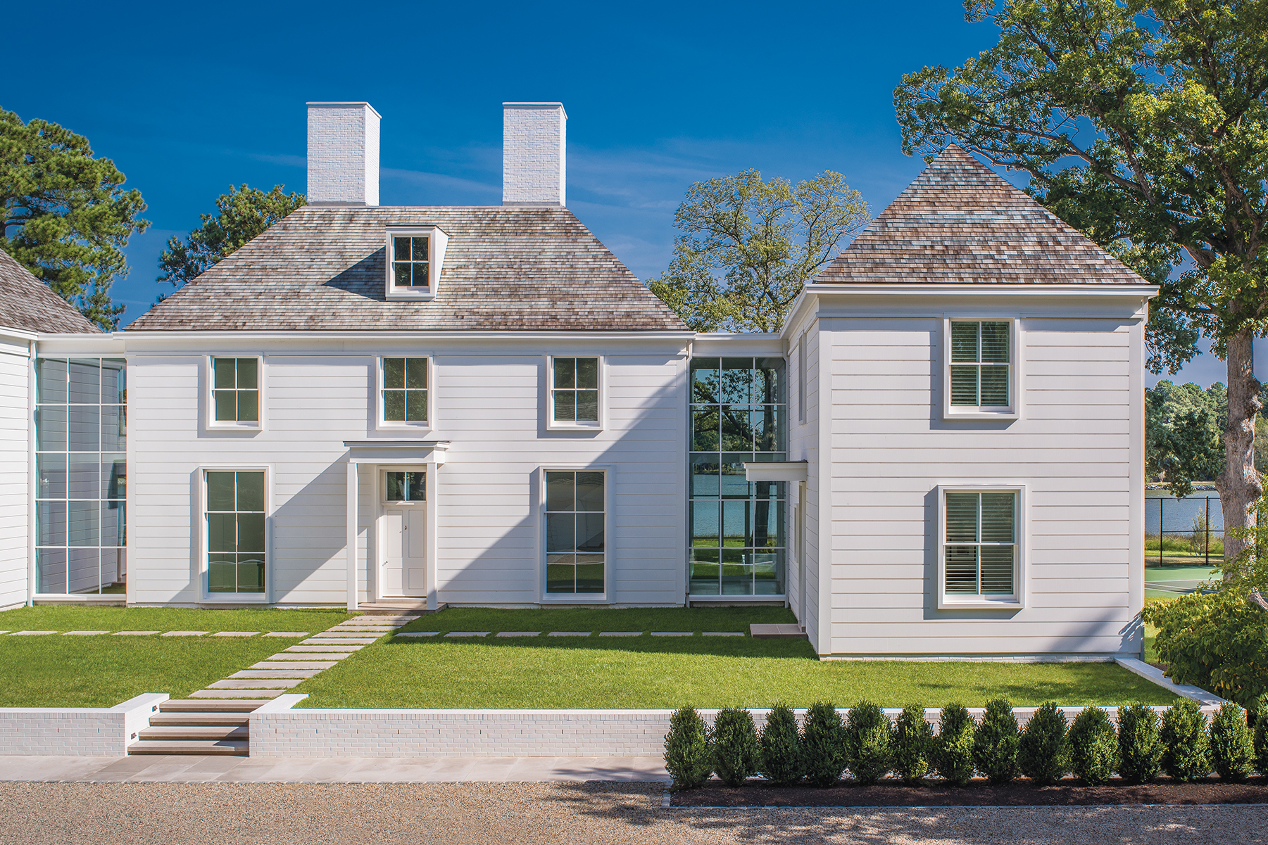 | Residential, New Construction over 5,000 square feetWouter Boer Architects Inc. |
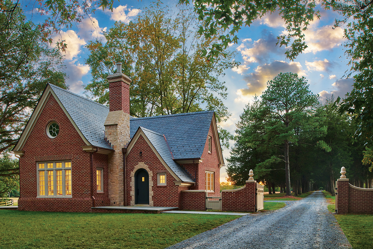 | Residential, New Construction under 5,000 square feetWiedemann Architects LLC. |
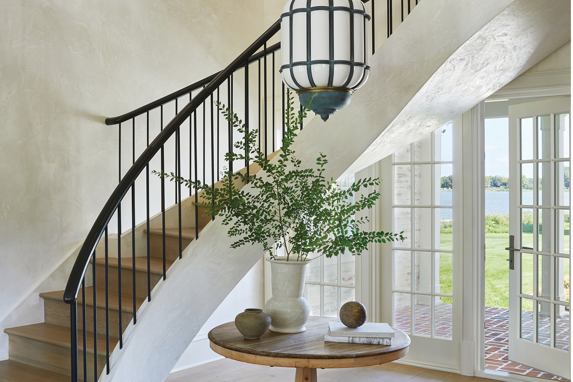 | Residential RenovationCharles Paul Goebel, Architect, Ltd. |
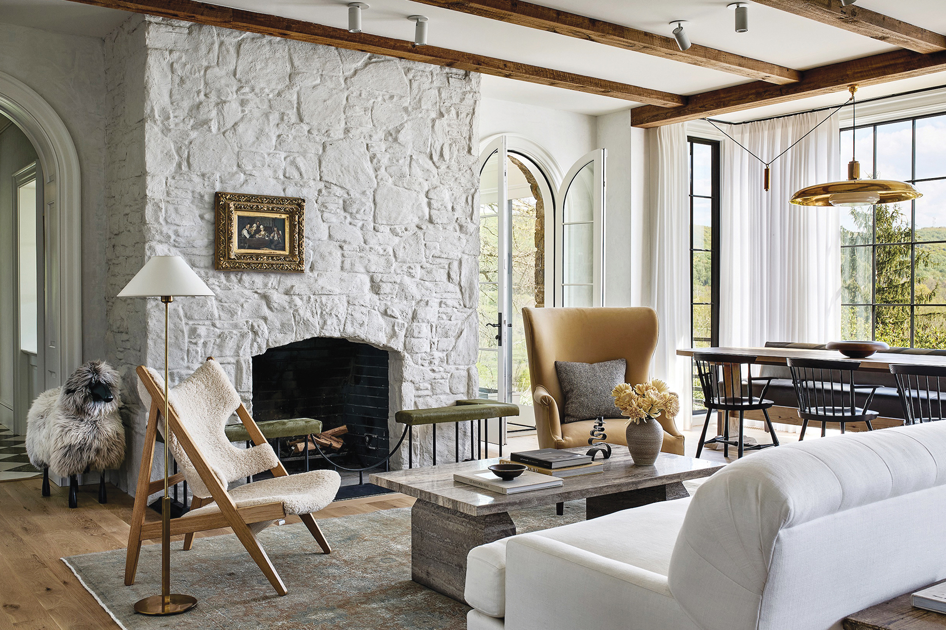 | Interior Design, ResidentialErica Burns Interiors. |
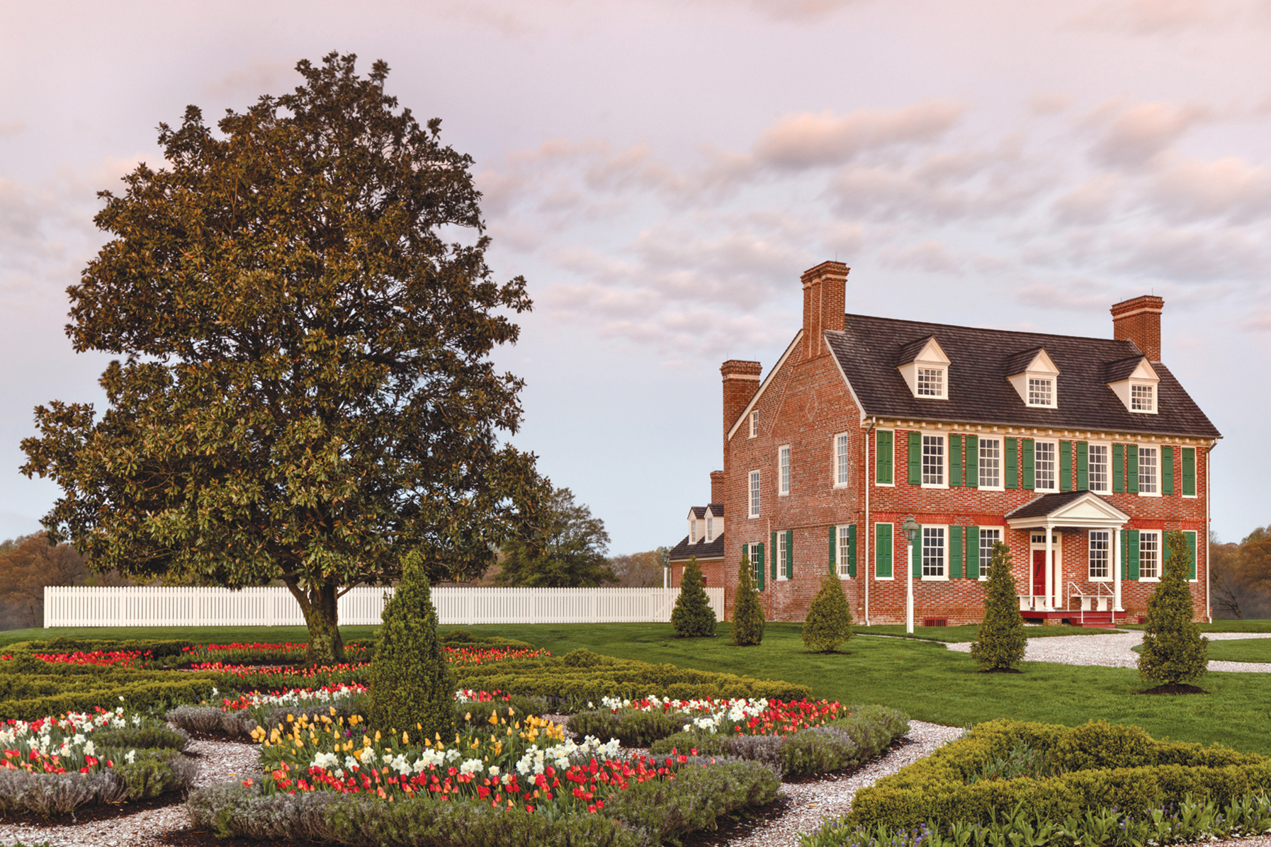 | LandscapeKimmel Studio Architects. To honor the history of Cloverfields, a Colonial Maryland estate built in 1705, the Cloverfields Preservation Foundation undertook an extensive renovation of the site. Archaeological findings and even the use of ground-penetrating radar informed the restoration of the estate’s once-lost garden. Reflecting classical design principles, the project successfully recreates the estate’s garden at its peak in 1784 with nearly 700 boxwoods, over 6,000 perennials, 85,000 bulbs, topiary fruit trees and medicinal plants. Restoration Contractor: Lynbrook of Annapolis. Landscape Installation: McHale Landscape Design. Photo: Jennifer Hughes. |
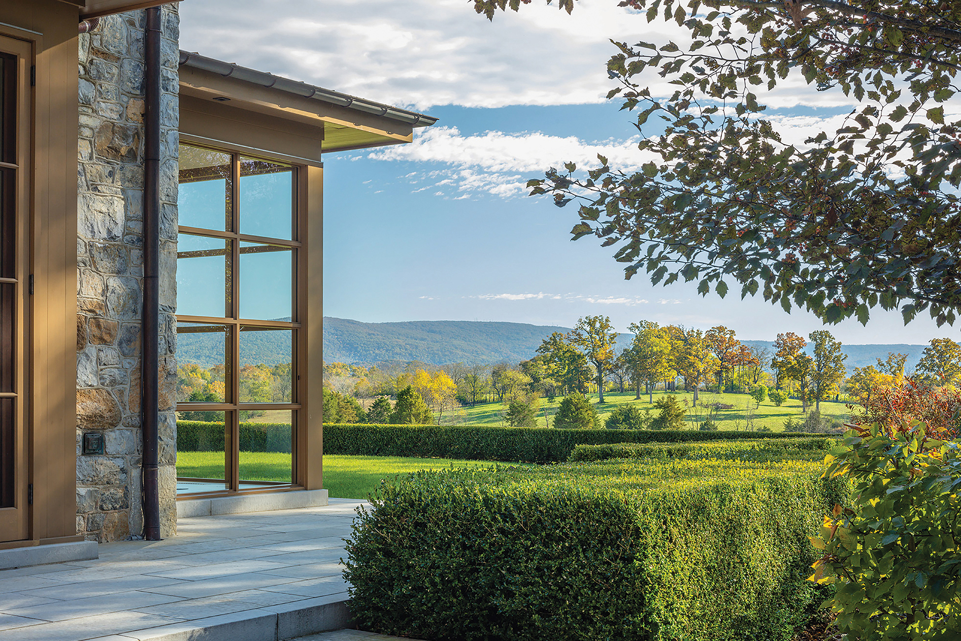 | LandscapeArentz Landscape Architects. A 160-acre farm in Clarke County, Virginia, is comprised of an equal mix of cattle pasture and rolling woodlands with the Blue Ridge Mountains looming in the distance. To marry a contemporary stone home to this bucolic setting, a meandering drive winds through wooded lands before arriving at the entry; additional gardens were added by the pool and rear of the property. Scaled for entertaining, the outdoor spaces form a seamless connection between interior and exterior. Architecture: Carter + Burton Architecture, PLC. Builder: Horizon Builders. Photo: Roger Foley. |
McCrery Architects; Baptismal Font at the Church of the Holy Spirit
Pellettieri Stone Carving; Decorative Stone Carvings on the Façade of St. Rita Catholic Church
David M. Schwarz Architects; The Orion Amphitheater
John Canning & Co., Ltd.; Mellon Auditorium Restoration
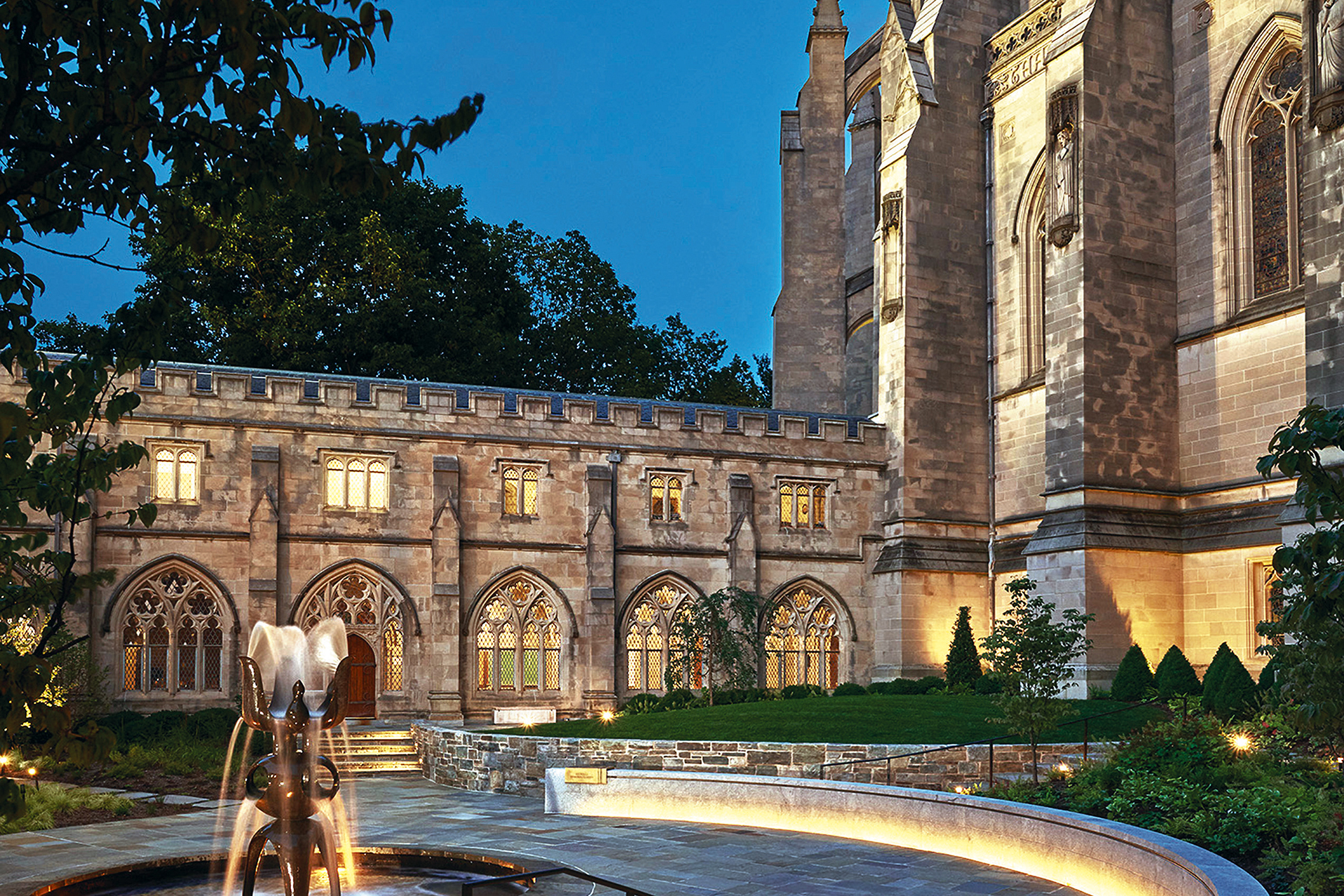 | EcclesiasticalRichard Williams Architects. |
Steven W. Spandle Architect LLC; The White House Tennis Pavilion
3North; Warm Springs Pools
Thomas Pheasant Interiors; The Benjamin Franklin State Dining Room Redecoration
Perkins Eastman Architects; Garvey Hall
Michael Watkins Architect; West Weber
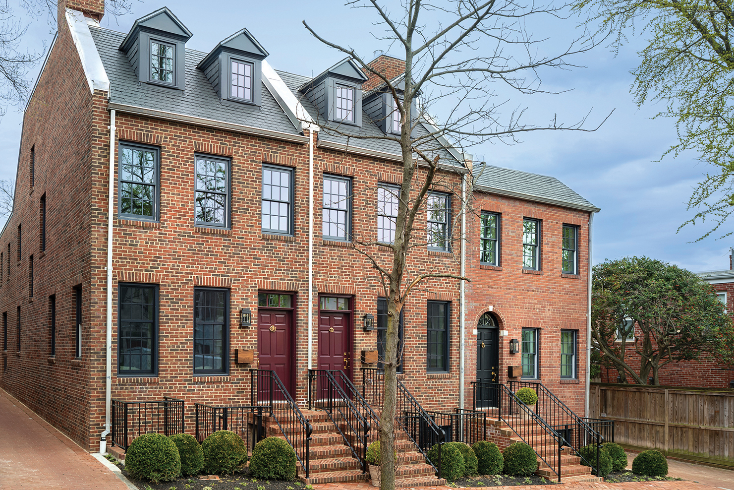 | Urban DesignChristian Zapatka Architect, PLLC. |
Strolling past ordinary row houses in Washington’s Pleasant Plains neighborhood, it would be easy to overlook the newest home on the block. But turn into an unmarked alley and you’ll glimpse a bold, industrial-style abode. With an exterior of corrugated metal, cinderblock and oxidized steel, it reads more SoHo or Tribeca than buttoned-up DC.
The modern dwelling started out as an unassuming, one-level brick warehouse built in 1900, probably part of an old helicopter factory. It later became a woodshop, then fell into disrepair—until architect and designer Patrick Brian Jones decided to rescue the structure and convert it into his own studio and the home that he now shares with husband Rajeev Ramchand and their Tibetan Terrier, Parker.
Fate also came into play. Before the pandemic, a developer had hired Jones to design a two-story spec home on the site, using the 1,500-square-foot warehouse as a base. But when covid struck, the developer pulled out of DC. Thinking fast, Jones decided to adapt the project as a personal one. After all, he and Ramchand had outgrown their two-bedroom condo and the carriage house in Shaw where Jones kept an office had been sold.
“We've always wanted to live in an industrial-type space but that kind of housing stock in DC is rare,” explains the architect. “When this came up, we knew it was a once-in-a-lifetime opportunity so we had to do it.”
Doing it was easier said than done. One of the walls was about to cave in. Though present, plumbing lines were not connected. And the 12-inch-thick concrete roof would need major reinforcement to support an upper floor.
But Jones overcame these challenges to make his visionary plan a reality. On the main level of the now-complete, 2,600-square-foot residence, a lofty space with 14-foot ceilings encompasses his studio, living and dining areas and kitchen; a small stair leads to a powder room and garage. Meanwhile, a floating steel-and-white oak staircase leads to the upper floor, housing the primary suite; two guestrooms (one doubles as a home office for Ramchand, a psychiatric epidemiologist), a guest bath, laundry and terrace courtyard. Above it all, a roof deck delivers expansive city views.
From the street, the original warehouse is barely discernable. On its brick façade, Jones added two windows to echo existing ones. Even larger, black-mullioned windows punctuate other exterior walls. The building’s once-angled corner was squared off with a vestibule clad in patinaed Corten steel.
“I’m a big fan of artist Richard Serra, who inspired the entry,” says Jones. “My intention was to create something sculptural and intriguing. A lot of people have no idea that there’s a home behind the walls.”
Inside the vestibule, doors lead into the main living area or the studio, which can be closed off by a frosted-glass, pocket-door system from Boffi. An edgy interior palette sets the vibe, from custom-tinted concrete floors to exposed ductwork, black-painted steel beams and the original concrete ceiling.
However, Jones countered the raw with the refined. “When designing an industrial space, you don't want it to feel too cold,” he avers. “Warmer woods, furniture, artwork and even the use of drywall instead of exposed walls create a polished look to offset the industrial elements.”
Bespoke built-ins crafted in rich walnut outfit the kitchen and dining area. And a 1930s Czechoslovakian chandelier that once graced the Philadelphia homes of Jones’ parents and grandparents now presides over the main seating area. “I like the contrast between new and old,” notes the designer.
Jones orchestrated the sleek kitchen to revolve around easy entertaining. It stars an oversized island with bar seating; cabinets and a concealed coffee bar keep clutter at bay. The owners selected an induction cooktop since the property has no access to natural gas. A reading nook is built into adjacent millwork.
Upstairs, a bridge flanked by enormous windows connects the primary suite and guest bedrooms. “Since the first-floor space was existing, we wanted to retain its rawness,” explains the designer. “But I envisioned the upstairs as a cross between Japanese and Scandinavian design—light and airy, with lower ceilings and white oak floors.”
In the primary suite, rather than losing real estate to a walk-in closet, Jones fashioned an open dressing area centered on wide, free-standing wardrobes. Serenity flows in the primary bath housing a soaking tub and shower with a wood-slat floor.
A courtyard off the bedroom harbors a stairway to the party-ready upper deck. There, a long, narrow green roof not only adds color, but also helps insulate the home and reduces runoff. In addition, solar panels offset the carbon footprint.
“This is a completely fossil fuel-free home,” declares Jones. In fact, the project was driven in part by sustainability. “It’s very rewarding to repurpose a building rather than demolishing it and sending materials to a landfill,” he adds. “If a structure has good bones, there’s no reason why you can’t retain it and make it beautiful.”
The couple is now enjoying work and life in their hip alley haven. As Ramchand reflects, “It's a new space, but there’s a sense of history and personality to it. People think that you can't bring in older stuff and maintain a sense of modernity, but I think that we’ve been able to do just that.”
Architecture & Interior Design: Patrick Brian Jones, AIA, Patrick Brian Jones PLLC, Washington, DC. Contractor: CMX Construction Group, Bethesda, Maryland.
RESOURCES
THROUGHOUT
Audio-Video Technology: csi-av.com. Windows: quakerwindows.com. Sliding Doors: westernwindowsystems.com. Shades: rockvilleinteriors.com. Lighting Consultant: scottguentherstudio.com. Track Lighting: noralighting.com. Concrete Flooring: milosrestoration.com. Walls: Chantilly White by benjaminmoore.com.
STUDIO
Millwork Fabrication: ferriscabinetry.com. Desk Base: Metal Specialties; 301-421-1832. Desk Top: paperstoneproducts.com.
MAIN SEATING AREA
Sectional: bensen.com. Rug: abchome.com. Chairs: carlhansen.com/en. Nesting Tables: classicon.com through m2l.com. Chandelier: Owners’ collection.
SITTING AREA NEAR STAIR
Wallpaper in Niche: endurematerials.com. Sofa: modernica.net. Table: kartell.com Red Chair: m2l.com. Coffee Table: hermanmiller.com. Floor Lamp: Owners’ collection. Stair Fabrication: Metal Specialties; 301-421-1832. Art above Sofa: Gopal Adivrekar. Art on Landing: Chris Shriever.
KITCHEN
Pendant: Daniel Rybakken for luceplan.com. Cabinet Fabrication: ferriscabinetry.com. Island Countertop: caesarstoneus.com. Black Countertop & Backsplash: cambriausa.com. Stools: Hee Welling for hay.com through dwr.com. Ovens & Cooktop: mieleusa.com through adu.com. Refrigerator & Beverage: subzero-wolf.com through adu.com. Faucets: dornbracht.com.
DINING AREA
Table: ceciliemanz.com for fritzhansen.com through furniturefromscandinavia.com. Chairs: arnejacobsen.com for fritzhansen.com through furniturefromscandinavia.com. Elbow Chairs: Hans J. Wegner for carlhansen.com through furniturefromscandinavia.com. Pendants: talalighting.com through noralighting.com. Doors to Studio: boffi.com.
PRIMARY BEDROOM
Millwork: solidhardwooddoors.com. Bed: ligne-roset.com. Ceiling Fan: modernfan.com. Chair: Custom by patrickbrianjones.com. Bedding: areahome.com.
LANDING
Painting: Joanne Kent.
SECOND STORY DECK
Table: roomandboard.com. Stools: stua.com through dwr.com.
PRIMARY BATH
Tile: tilebar.com. Tub: duravit.us. Vanity Fabrication: solidhardwooddoors.com. Countertop: caesarstoneus.com. Plumbing Fixtures: dornbracht.com.
DECK
Roof: riverbendgreenroofs.com.
After raising four kids in a sleepy Chevy Chase, Maryland, enclave, Jodi Macklin was ready for city living on a smaller scale. When her youngest went off to college, the designer approached a real estate agent: “Find me a dump in Georgetown,” she requested.
A year later, the agent delivered with an 1890 row house that had just been gutted in the heart of the venerable DC neighborhood. “I opened the door and there was literally no drywall and barely any floor. I texted my husband, ‘We’re done,’” Macklin laughs. “We hadn’t looked or really even talked about moving yet!”
With buy-in from a surprised Rodd Macklin, a financial analyst, the designer was ready to go; she’d always envisioned doing her next house from the ground up, and this was her chance. “I didn’t want to pay for someone else’s kitchen that I didn’t like but they’d just done,” she explains. “I wanted to do it all myself.”
A dream team was quickly assembled for the job. Architect Anne Decker had worked with Macklin on numerous projects, while builder Richard Zantzinger had constructed her previous house. Campion Hruby Landscape Architects would tackle the dilapidated yard. As Macklin tells it, she’d been planning this project for years. “I knew what I wanted before I ever saw the house,” she avers.
“Jodi’s view was modern, and we love that juxtaposition of old and new,” Decker relates. “We distilled the body of the house to simplify its lines and bring the outside in. And we tried to create a grander scale. We wanted the house to live larger than it is.”
Now complete, the 2,800-square-foot dwelling features an open-plan, main-floor living/dining area elevated by 11-foot ceilings. A wide, cased opening to the kitchen with pocket doors delineates the spaces while fostering easy flow and sightlines to the backyard. Interior doors extend to the ceiling. A reveal replaced traditional baseboards; doors and windows are unadorned by trim.
Natural light pours in via a skylight above the sculptural, glass-and-white oak stair. Floor-to-ceiling, glass-and-steel doors in the kitchen spill out to the backyard. A four-and-a-half-by-nine-foot panel of glass in the dining area overlooks the side garden. “We took a big bite out of the wall to bring light into the heart of the house,” the architect explains. The glass expanse frames an up-lit magnolia nestled in pea gravel for a picturesque tableau.
Macklin envisioned a kitchen outfitted with black cabinetry and dramatic swaths of Nero Marquina marble—black with strong swirls of white—for the countertops and backsplash. “Black was the perfect choice,” enthuses Decker, who designed the space with marble-framed niches for the sink and range. “The walls recede and your eye immediately goes out to the back.” The palette continues in the moody powder room, clad in textured, black wallpaper.
A staircase with a landing was removed in favor of a stairway that runs straight up, making room on the second floor for a spare guest room. The serene primary bedroom flows into a luxe bath, which Macklin calls “a little slice of heaven.” It boasts a frosted glass-enclosed shower and a custom vanity. Nero Marquina marble adorns the floor and vanity. An ensuite bedroom across the hall awaits their son’s visits from college.
The existing basement was small and dark, with low ceilings. An extensive excavation created a welcoming lower level that utilizes the whole footprint. Media, laundry and guest rooms, plus a bathroom and exercise zone, are part of the mix.
When it came to furniture and finishes, Macklin channeled her minimalist design philosophy. “I gravitate towards ‘less is more,’” she says. “It makes me feel like I can breathe.” She and Decker repeated the same color and material elements throughout—white oak floors and Nero Marquina marble, which crops up again as a sleek surround on twin fireplaces in the living and dining areas. A palette of black, white and gray on the main level is warmed by earthy accents on upholstery and rugs. The designer bought everything new for this fresh chapter, from the white sofa and swivel chairs in the living area to the velvet-upholstered dining chairs.
On the main level, four mirrored cabinets designed by Decker and fabricated by Atrium Interiors ingeniously solve home-organization issues. “Thanks to Anne, I have a lot of storage in a house that has no closets,” Macklin declares. Each freestanding unit plays a unique role: a coat closet, a TV cabinet, a walnut-paneled bar.
Landscape architect Amber Phaire, who has since left Campion Hruby to launch her own firm, mirrored the home’s clean lines in her backyard design. “The lot jogs out sideways to meet the footprint of the garage,” she recalls. “This configuration created an upper dining terrace beside the garage and a lower rear terrace by the back door.” In the side yard, ornamental trees nestle in pea gravel. Hardscape and plantings balance airiness and warmth.
These days, Macklin is enjoying her downsized abode, perfectly tailored to her vision. “I’m so happy here,” she says. “Our previous house had gotten too big. In this one, we use every inch.”
Renovation Architecture: Anne Y. Decker, AIA, principal; Amanda Mosher, AIA, project manager, Anne Decker Architects, Bethesda, Maryland. Interior Design: Jodi Macklin, Jodi Macklin Interior Design, Washington, DC. Renovation Builder: Richard Zantzinger, Zantzinger, Inc., Washington, DC. Landscape Architecture: Amber Phaire, ASLA, PLA, Campion Hruby Landscape Architects, Annapolis, Maryland. Landscape Contractor: Somerset Stoneworks, Bethesda, Maryland.
RESOURCES
THROUGHOUT
Stonework: imaginesurfaces.com through rbratti.com.
DINING ROOM
Light: siemonandsalazar.com. Chairs: cuffstudio.com. Chair Fabric: hollyhunt.com. Dining Table & Fireplace Surround: Custom through oldtownwoodworking.com. Art on Walls: robinroseart.com; cushnerama.com. Mirrored Cabinets: Custom through atrium-interiors.com.
LIVING ROOM
Sofa: custom through gretcheneverett.com. Rug: interiors.hollandandsherry.com. Club Chairs: aneesupholstery.com. Coffee Table: atrium-interiors.com. Side Table: andriannashamarisinc.com. Fireplace Surround: oldtownwoodworking.com. Art on Walls: colbycaldwell.com; andyfriedman.net. Mirrored Cabinets: Custom through atrium-interiors.com.
STAIRWELL
Art: ellsworthkelly.org.
KITCHEN
Cabinets, Millwork & Island Stone: atrium-interiors.com. Counter Stools: bakerfurniture.com. Light over Island: apparatusstudio.com.
POWDER ROOM
Sink: atlasplan.com/en-us. Faucet: brizo.com through build.com. Sconces: articolostudios.com. Wallcovering: gregoriuspineo.com.
GUEST BEDROOM
Bed: roomandboard.com. Bed Linens: matouk.com. Pillow Fabrics: romo.com; fabricut.com. Bedside Table: crumpandkwash.com. Hanging Reading Light: alisonbergerglassworks.com.
PRIMARY BEDROOM
White Boucle Chair: suiteny.com. White Boucle Chair Fabric: romo.com. Window Treatments Fabrication: gretcheneverett.com. Window Treatment Fabric: otistextiles.com. Wall Reading Sconces: apparatusstudio.com.
PRIMARY BATHROOM
Soaking Tub: signaturehardware.com through fergusonhome.com. Sconces: articolostudios.com. Vanity: gilmerkitchens.com.
BACKYARD
Sitting Area: tribu.com. Dining Table & Chairs: dedon.de/en-us; janusetcie.com. Exterior Paint: Iron Ore by sherwin-williams.com.
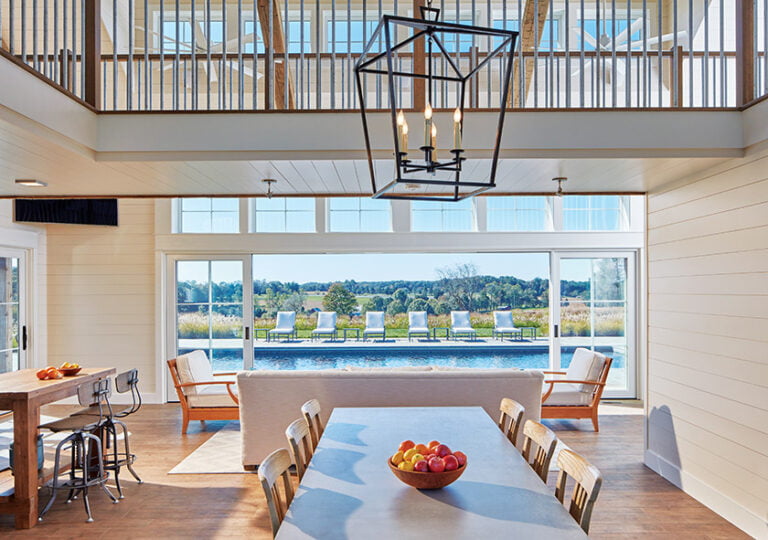
On a sylvan property in Sparks Glencoe, Maryland, bordering woods create a verdant cocoon, while a neighbor’s cattle graze off to one side. Amid such surroundings, it’s easy to forget that the city of Baltimore is only a stone’s throw away. And that was the whole idea when designer Stephanie Bradshaw and her partner, builder Brett Bernard, chose the one-and-a-half-acre parcel as the site for the custom hilltop home they now share with their eight-year-old son, Dallas.
“We were living in Baltimore but really wanted more space and quiet,” reveals Bradshaw. “We wanted a place where Dallas would feel safe, where we could create memories with friends and family, and where we’d be very connected with nature.”
Indeed, nature served as a muse every step of the way as the pair conjured their new nest, starting with the architectural style. “‘Modern Mountain’ was the look we were going for,” the designer explains. “We wanted the house to be part of the landscape and to feel very grounded.” Fiber-cement siding painted dark gray went a long way; warm cedar accents reinforce the alpine aesthetic. Bernard, who now operates his construction company from the basement of the property, oversaw the building process.
When it came to the home’s function and flow, the couple envisioned designated spaces rather than open ones. They asked architect Chester Bartels to synthesize their ideas and develop a blueprint. (Then a managing principal of a Missouri firm, he has since relocated and launched Steam Collaborative LLC, with offices in Annapolis and Alexandria.)
The 7,000-square-foot house consists of three volumes that form a horseshoe in the back. The main living core is flanked by the primary-suite wing on one end and the garage, with Bradshaw’s design studio above, on the other. On the first floor, a hallway with a series of parading arches stretches across the rear of the house, connecting the foyer to the kitchen/breakfast nook, dining room, great room and primary suite. Upstairs, Dallas’ bedroom and a guest room share a Jack-and-Jill bath. A playroom joins Bernard’s office/workshop on the lower level.
Sizable stretches of glass throughout capture the natural splendor outside. In the great room, a custom wall of windows follows the 25-foot pitch of the ceiling and lends a conservatory feel. It intentionally centers on existing oak and cherry trees. In fact, this desired view dictated the precise building location. “We positioned the house exactly in this spot so we would get the line of these trees coming this way through the window,” explains Bradshaw, replicating the graceful arc of the branches with her arm.
Along the way, the owners sought both to preserve and improve their scenic surroundings. They collaborated with landscape architect Kevin Gaughan to develop a master plan and create a four-season garden that would lean heavily on native perennials and grasses. “The site is gorgeous, so the key was to let nature be nature,” explains Gaughan. “We wanted the plantings to feel wild, but at the same time to be curated. There was a lot of discussion about forms, textures and colors that spoke to Stephanie’s aesthetic.”
Inside, the designer also stayed true to her style. She kept the architectural details spare, eschewing crown moldings and window casings for a cleaner look. “My vibe is a little more California than Maryland,” she acknowledges.
Nature, once again, came into play as Bradshaw selected finishes and furnishings. “Everything I chose—every surface, shape, fabric and piece of art—is meant to enhance, not fight with, what’s happening outside,” she affirms. For instance, she notes, the kitchen’s textured backsplash mimics tree bark.
In her thoughtful schemes, she mixed new with vintage, modern with organic. “I wanted the house to feel designed, elevated and sophisticated but also very approachable,” she reveals. A rattan chandelier hangs over the breakfast area’s mid-century-style, white-laminate table from IKEA. The dining room’s Wishbone chairs surround a vintage table that made the move from Bradshaw’s previous office. That space’s French doors open onto a covered porch that extends the entertaining area for the couple who host regular soirées.
The designer often channels a sophisticated-yet-not-stuffy spirit for client projects as well. Celebrating nature is a frequent through line. “A lot of our work is about bringing the outside in,” she discloses. “We design usable spaces for families, where the parents can be grown-ups and entertain, but there’s nothing too precious that the kids can’t jump on.”
Bradshaw started her namesake firm in 2008. She originally focused on wedding and event planning, while completing interior design projects on the side. In 2019, the entrepreneur decided to pivot to full-service interiors. Today, another side of her business provides brand development to commercial clients.
No doubt, Bradshaw and Bernard made an incomparable team as they crafted their new abode. Mulling over a suitable moniker for it, they ultimately landed on Wild Pines. The name nods to evergreens that line the property and encapsulates the duo’s dreams for Dallas’ childhood home—and their own adult roost. “It suggests a sense of adventure,” notes the designer, “but also feels strong and sturdy.”
The completed home and garden realize those dreams, providing the calm and contentment the couple was after. “None of it is lost on me,” says Bradshaw. “I’m so grateful for all of it.”
Architecture: Chester Bartels, Clockwork, Kansas City, Missouri. Interior Design: Stephanie Bradshaw, Stephanie Bradshaw, Sparks Glencoe, Maryland. Landscape Architecture: Kevin J. Gaughan, ASLA, PLA, FORM Garden Design, Baltimore, Maryland. Builder: Brett Bernard, PROCOR, Sparks Glencoe, Maryland. Exterior Photography by ANCHOR PICTURES
RESOURCES
FRONT FAÇADE
Exterior Siding: jameshardie.com. Exterior Wall Sconce: hinkley.com.
KITCHEN
Pendants: visualcomfort.com. Bar Stools: westelm.com. Backsplash: architessa.com. Wall Paint: Simply White by benjaminmoore.com.
BREAKFAST ROOM
Table: ikea.com. Chairs: amazon.com. Pendant: curreyandcompany.com. Wall Paint: Studio Green by farrow-ball.com. Pillows & Cushion: schumacher.com. Pillow & Cushion Fabrication: grandyork.com. Window Treatment: schumacher.com. Window Treatment Fabrication: leangsinteriors.com.
DINING ROOM
Dining Table: vintage. Drapery Fabrication: grandyork.com. Drapery Fabric: romo.com. Dining Chairs: amazon.com. Painting: laurenmycroft.com. Ceiling Paint: Green Smoke by farrow-ball.com. Wall Paint: Simply White by benjaminmoore.com. Chandelier & Table Lamp: visualcomfort.com. Buffet: fourhands.com.
HALL
Light Fixture: visualcomfort.com. Paint: Simply White by benjaminmoore.com.
FOYER
Mirror & Rug: vintage. Bench: custom. Light Fixture: visualcomfort.com.
GREAT ROOM
Sofa: leeindustries.com. Sofa Fabric: pierrefrey.com. Pillow Fabrics: schumacher.com; kravet.com. Sofa Console: rh.com. White Side Chairs: thayercoggin.com. Side Chairs in front of Window: leeindustries.com. Side Chair Fabric: kravet.com. Woven Stool & Coffee Table: vintage. Cabinet: fourhands.com. Painting over Cabinet: kristengiorgi.com. Floor & Table Lamps: visualcomfort.com. Drapery Fabric: romo.com. Drapery Fabrication: leangsinteriors.com. Area Rug: floors-etc.com. Paint: Simply White by benjaminmoore.com.
PRIMARY BEDROOM
Bed: rh.com. Nightstands: crateandbarrel.com. Paint: Edgecomb Gray by benjaminmoore.com. Art: kristengiorgi.com. Chandelier: visualcomfort.com. Roman Shades & Drapery Panels: grandyork.com. Drapery Fabric: romo.com. Dresser: vintage. Table Lamp: arteriorshome.com. Chair & Ottoman: americaneyewdc.net. Chair & Ottoman Fabric: romo.com. Bedding: rh.com. Duvet: parachutehome.com. Coverlet: antoniosalgado.com/en. Pillows: custom through grandyork.com.
CHILD’S ROOM
Headboard: onekingslane.com. Sofa: article.com. Dresser & Rug: vintage. Mirror: luckettstore.com. Bedding: parachutehome.com.
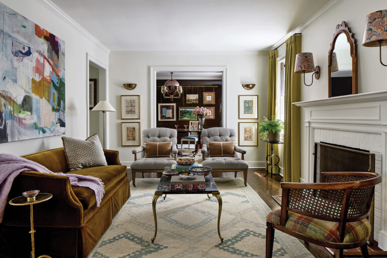
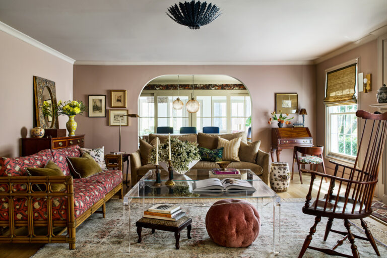
Anyone who’s ever strolled through Somerset, Maryland, has undoubtedly been seduced by its small-town feel and eclectic mix of architectural styles—two reasons why “For Sale” signs are a rare sight in the neighborhood which borders Washington, DC. When interior designer Marika Meyer learned of a 1949 center-hall Colonial coming to market from a friend of her mother’s, it felt like a gift from the real estate gods. But the elderly owner didn’t have email, so Marika put pen to paper explaining that her family was outgrowing their Bethesda digs and that she and her husband Michael were looking for a forever home where they could usher their sons, Grayson and Colin, through the teen years into adulthood. It struck a chord with the owner who herself raised two boys in the house, so she invited the family over. “I couldn’t believe the letter in the mailbox worked!” laughs Meyer. “The house was perfect—it had plenty of space, it just needed some love.”
Among the abode’s selling points were good flow and even better bones, but past renovations needed to be peeled back and rethought. In the early 1990s, the owners had blown out the rear of the house for an ill-conceived addition that contained an enlarged kitchen and great room, and later that decade a three-story L-shaped annex was put on to make room for an expanded basement, a main-level family room and a primary suite upstairs. After 30-plus years, those updates felt tired, so upon closing the deal, Meyer brought on architect Peter Miles of The Drawing Board, Inc., to address some of the more problematic areas and finesse the rest.
“For starters, if you are a lover of symmetry, the kitchen addition was awful,” avers Miles. “The cooktop was in the island, which was centered under the opening to the addition, so half the cooktop was in the old house and half was in the new space, and the ceiling height changed partway through.”
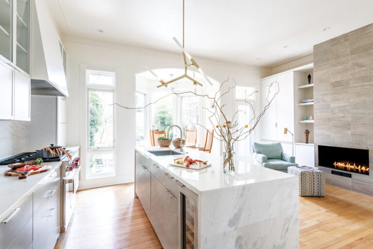
The awkwardly stitched-together “Frankenkitchen” had another problem: Because its shed-style ceiling sloped dramatically downward, the view outside was compressed to a sliver that didn’t do the scenery justice: Lush and private, the verdant rear yard borders the town’s tennis courts. “Peter understood right away that the whole back needed to be windows,” says Meyer.
“We needed to make it feel like you’re stepping out into the garden,” adds Miles.
Now a conservatory-inspired kitchen with a raised ceiling connects seamlessly to the outdoors. Enlarging the cook space also meant rethinking the layout. Meyer’s husband, a serious cook, wanted space for guests to congregate while he prepares meals. The new arrangement is an entertainer’s dream with an ample island and a cozy banquette for everyday dining.
Smaller changes throughout the home also yielded a big impact: Passageways were reoriented and enlarged; what was once the original tiny mid-century kitchen became a butler’s pantry; and utilitarian spaces such as a new powder room and coat closet were carved out of the main-level floor plan. White oak hardwood was installed to match the existing floors, which were restained. Future, longer-term projects currently on deck include updates to the library, upstairs bedrooms and baths.
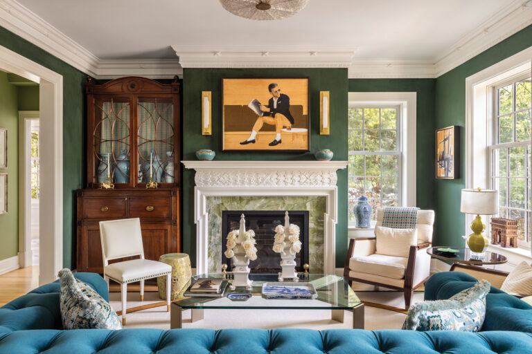
With the first-floor renovations mostly complete, it was time for Meyer to dress the spaces in her signature style. If many of the furnishings look familiar, it’s because they’ve migrated from her previous house, which was profiled in this magazine in 2022. Beloved treasures, such as a T.H. Robsjohn Gibbings palm frond coffee table, chinoiserie mirror, elephant garden stool and dining chairs backed with Schumacher’s Imperial Trellis fabric, reappear in the mix. “I love vintage pieces for many reasons, but for these houses that were built in the 1940s, it has a lot to do with scale.” Her affinity for timeless furnishings with a bit of patina runs in the family. “I was mostly inspired by my maternal grandmother, who was a decorator in Washington, and who was also named Marika,” she shares. “Her personal style was heavy on the classics. For this house, I loved the idea of a return to tradition, but in a way that felt fresh, light and updated.”
Of course, there’s always room for brand-new traditions to take hold, too. After surveying the living room post-renovation, Meyer wondered, “What can I do to make this room compelling?” The answer: Farrow & Ball’s Lotus wallpaper. A long-time favorite of the designer’s, the art nouveau-inspired paper wrapped the dining room walls in the old house. “It was exactly what this living room needed,” she observes. “I think that pattern has become our family’s love language. As soon as it went up, one of the boys walked in, smiled and said, ‘Now it really feels like home.’”
Interior Design: Marika Meyer, Marika Meyer Studio, Washington, DC. Architecture: Peter Miles, The Drawing Board, Inc., Washington, DC. Contractor: FineCraft Contractors, Inc., Gaithersburg, Maryland.
RESOURCES
DINING ROOM
Wallpaper: schumacher.com. Trim Color: Mizzel by farrow-ball.com. Dining Table: vintage. Side Chairs: vintage. Side Chair Seat Fabric: perennialsfabrics.com. Side Chair Back Panel Fabric: schumacher.com. Green Host Chairs: vintage. Chandelier: visualcomfort.com. Chandelier Fabric: marikameyer.com. Window Treatment Fabricator: JK Drapery; 703-941-3788. Window Panel Fabric: schumacher.com. Window Panel Tape Trim: fabricut.com.
LIVING ROOM
Wallpaper: Lotus by farrow-ball.com. Sofa: vintage. Sofa & Accent Pillow Fabric: schumacher.com. Chairs: vintage. Chair Fabric: cowtan.com. Existing Coffee Table: vintage Robjohns-Gibbons. Table: Custom by marikameyer.com. X-Bench: Vintage Dorothy Draper. Lamp: vintage. Lamp Shade: ballarddesigns.com. Portrait: vintage.
BUTLER’S PANTRY
Mirrored Cabinetry: Kevin Smith. Fabric Roman over Sink: pennymorrison.com.
KITCHEN
Ceiling Paint: Iceberg by benjaminmoore.com. Pendant Light: urbanelectric.com. Cabinet Maker: stuartkitchens.com. Range: bluestarcooking.com.
BREAKFAST ROOM
Banquette: livenupdesign.com. Grasscloth: thibautdesign.com. Tulip Table: allmodern.com. Chairs: vintage. Chair Fabric & Artwork: marikameyer.com.
POWDER ROOM
Wallpaper: Lee Jofa by kravet.com.
When Chris Boutlier made his first DC real estate purchase, his husband, David Cromer, asked him, “Are you insane?” The condo, occupying the top two floors of a 1910 row house in Columbia Heights, was a dated sea of yellow travertine, orangey terracotta and cherry wood, with a choppy layout that blocked sightlines.
“I told him, ‘I promise, it will be very cool when I’m done!’” the designer recalls with amusement.
He had a distinct vision that sprang from a particular source: a biography of New York art dealer Samuel Wagstaff, an intimate of Robert Mapplethorpe and one of the first collectors of fine art photography in the U.S. (Upon Wagstaff’s death in 1987, his collection went to the Getty Museum.) “I became interested in that 1980s period when Wagstaff lived in New York City,” Boutlier recounts. “Spaces were being redone to double as homes and art galleries. The gallery world was open, white-box spaces with black leather and chrome.”
Boutlier was excited to embrace that sleek, graphic aesthetic—but the 1,500-square-foot unit had been renovated badly in the 1990s and an intervention was in order first. He and Cromer “spent a lot of money redoing the internal components,” Boutlier says. “We installed new HVAC, water heaters and plumbing.” Trim, baseboards, doors and casings were all updated, and odd ceiling heights corrected. Switches, outlets and recessed lights were replaced.
Structural changes also took place. The entrance to the abode is accessed from street level via a staircase. To create a foyer and a sense of openness, Boutlier reorganized spaces: The powder room shifted locations to allow for a short hallway; it runs past a newly added laundry room and closets to a spare bath and a bedroom used by the couple as a home office. The hall provides a sightline to a back balcony, visible from the stair.
The once-outmoded kitchen, which anchors one end of the living/dining area, got an overhaul that retained its footprint while transforming it with fresh, contemporary custom finishes. Black-stained oak cabinets are paired with Statuario marble countertops and backsplash showcasing dramatic swirls of gray and taupe.
The upper floor is now a dedicated primary suite. On the street-facing end, Boutlier switched out a problematic beam for one of steel, bringing functionality to a disused room tucked into the eaves; it became a home gym accessed from the bedroom via French doors.
The primary bath was reimagined in hotel-spa style, with a marble-clad shower replacing the tub and an oddly angled toilet relocated inside a WC. Nero Marquina marble tops the black-stained vanity and clads the floor in hexagonal mosaic tiles. The closet, which connects the bedroom and bath, is lined with sleek, custom cabinetry made of dark oak.
According to the designer, the existing stair adjoining the main and second levels “was the one nice treat in the house.” He kept its basic steel structure and replaced the treads with white oak. Corehaus DC fabricated a black-steel louvered screen to replace a wall of glass that doubled as the stair railing. A half railing of the same material was installed on the upper level.
A graphic, black-and-white palette prevails throughout, warmed by white oak floors that replaced orange-hued planks. Boutlier applied a white limewash to exposed, red-brick walls. “I wanted the texture of the brick, but for it to feel light and airy,” he explains.
Against the backdrop of expansive, white walls, mid-century and contemporary furnishings in glass, chrome and shades of black were purchased to reflect the gallery-esque aesthetic Boutlier had envisioned. A Mies van der Rohe coffee table was placed before a DWR sofa in the living area, while vintage Italian leather chairs surrounded a glass-and-steel dining table. Upstairs, the primary bedroom featured a vintage Dunbar lounge chair, ottoman and nightstands and a Brutalist dresser. Throughout the dwelling, pieces were positioned to enhance bold, modern art and photography hung or leaning, gallery-style, along the walls.
While Boutlier and Cromer have since moved on to an abode in Georgetown, the designer remembers this first home with great fondness. “I never really thought my skills as a designer would afford me the opportunity financially to do the things in my own home that I was doing for clients,” he reflects. “While we lived there, I felt so lucky. This house was especially meaningful to me.”
Renovation & Interior Design: Christopher Boutlier, Allied ASID, Christopher Boutlier Interiors, Washington, DC. Renovation Contractor: District Contracting Group, Washington, DC. Photo Styling: Kristi Hunter.
Area designers submitted more than 105 entries to the 2025 Kitchen & Bath Awards, organized by the Baltimore-Washington Chapter of the National Kitchen & Bath Association (NKBA) and sponsored by Home & Design. Winners were announced on June 12 during a gala celebration at VisArts in Rockville. The 2025 jury included Lindsey Britten, Allied ASID, of BOWA; James McDonald of James McDonald Associate Architects; Dennese Guadeloupe Rojas of Interiors by Design; and NKBA chapter communications chair Kirsten Gable, CKBD. Links to all winning projects are listed below.
 | Large KitchensFirst Place: ODE Design. See More... Second Place: Jennifer Gilmer Kitchen & Bath. See More... |
 | Large BathsFirst Place: c|s DESIGN STUDIO LLC. See More... Second Place: Mint Interiors. See More... |
 | Medium KitchensFirst Place: Adam Greene Architect. See More... Second Place: Design: JD Ireland Interior Architecture + Design. See More... |
 | Medium BathFirst Place: Masseria Chic. See More...
|
 | Small KitchensFirst Place: The Kitchen Guru. See More... Second Place: TOBE DesignGroup. See More... |
 | Small Baths + Powder RoomsFirst Place: Wiedemann Architects. See More... Second Place: Christie Leu Interiors. See More... |
 | Specialty RoomsFirst Place: Black Salt Home Design. See More... Second Place: Shea Studio Interiors Inc. See More... |
 | Before + AfterFirst Place: Bethesda Contracting. See More... Second Place: Ella Lee Interiors. See More... |
CAFTAN CHIC Interior designer Meg Braff has teamed up with Sue Sartor on a capsule collection of summery block-print dresses and hand-loomed, embroidered silk caftans. In juicy shades of watermelon and chartreuse, the pieces effortlessly embody Palm Beach style. $695 each. suesartor.com
ARM CANDY Heritage design house Schumacher has joined forces with Pamela Munson for a series of limited-edition handbags using the brand’s iconic prints. Crafted of handwoven straw with embroidered details, the cheekily named Lady Bag will elevate any summer ensemble. $495. pamelamunson.com
GIVING SHADE Named for the iconic French actress, Krewe’s Brigitte sunglasses take a classic cat-eye silhouette and sass it up with a scallop-edged frame. Made of lightweight acetate, the handcrafted sunnies ensure you can go incognito in style—just like Bardot. $335 at Krewe Union Market; krewe.com
When Natalie Cheung was a child, her parents hoped she’d become a piano prodigy. After 11 years of private lessons, however, the diligent student was delighted when they decided she could call it quits. By then attending Falls Church High School, she had been given her first camera. “I was working in the wrong art field,” the photographer recalls, and has never looked back.
Meanwhile, her collection of about a hundred cameras—from Hasselblads to Kodak Brownies—resides in permanent storage. Having gone through the experience of lugging around the cameras, inserting and then rolling up film, she says, “I was like kids on Instagram, always looking through the lens wondering what photo to take. I couldn’t live in the moment.”
Cheung now practices camera-less art. Based in the darkroom, the technique combines two chemicals that become light-sensitive when mixed. Called cyanotype, it is one of photography’s earliest forms, notably used for old architectural blueprints.
Her art refers back to the experimental roots of photography, especially the work of mid-19th-century botanist and photographer Anna Atkins, whose books of blue-toned cyanotypes illustrate algae that had been placed on photosensitive paper. Cheung’s watery abstractions depart from Atkins’ scientific intent. As the modern-day artist explains, “The fascination for me is to make photography relevant at a time when everybody has a camera on their phones and can take a picture, and you don’t need any technical skills.” Her driving question: “How do I put my traditional darkroom photography into a contemporary context?”
The answer: “voodoo magic.” That’s how Cheung describes the cyanotype process unleashed in the darkroom, where success is never assured. “Even if all the conditions are correct to create my work,” she reflects, “I can be met with disappointment many, many times. When there’s a good image, it’s very exciting!”
In the best cases, results appear fluid and other-worldly, at once celestial and terrestrial with heavenly blues splashing against indistinct earthier tones. Imagery might be seen as starry cosmologies or oceanic depths, where willowy organisms reign. In this ethereal universe, streams surge and subside—the darkest blues representing areas in which the mix evaporated first, the whitest whites where it lingered longest. “It’s up to the chaos in nature how each piece turns out,” Cheung remarks about these encounters between light and chemistry.
With traditional black-and-white, silver-gelatin photography, just a few seconds up to a minute of light exposure is needed. By contrast, Cheung’s images require ultraviolet light over many hours in the darkroom. In some cases, she overlaps exposures before stepping in to stop the process by washing the paper in clear water. Titles of her cyanotypes, such as Intermediaries: 40 & 18 Hours, indicate the evaporation time each one takes.
Cheung majored in photography at Corcoran College of Art & Design, before earning a master’s of fine arts in photography from Tyler School of Art at Temple University. She now teaches digital-media design at GWU.
Cheung first discovered the cyanotype process in graduate school, where she learned all the things that could go wrong—if the intention were to make a traditional photograph. “I like all these mistakes. I’m going to keep making them,” the photographer pronounces. “In a way, my art exploits all those mistakes.”
Seated in her DC apartment, she retrieves an image from her student days. The early piece looks like an X-ray of a small pair of scissors between measuring tapes. It came about simply by placing the objects on photographic paper then exposing the paper to light. “It’s an example of a traditional darkroom photogram,” Cheung says of the image taken without benefit of camera, film or negative.
Three related black-and-white photograms hang on her apartment walls. Arranged in a row, they imply the movement of water, a glacier melting and comets bursting in space. “This is how I got to where I’m going,” Cheung says. “For me, trying to capture the uncapturable brings back the mystery at the beginnings of photography.”
In her apartment too, Cheung paints watercolors from leaves that she gathers on walks. Tipping the hat to Anna Atkins’ botanical cyanotypes, the artist compares these single-hued, ultramarine paintings to reimagined photographs. “I’m thinking about how one medium relates to another, and how one is influenced by another,” she observes.
Working in a DC darkroom, the artist recently started a new series called “Circadian.” It relates to circadian rhythms and “to the rhythms of life in general. How things come full circle,” Cheung notes. She uses a Japanese hake brush to paint the light-sensitive chemical in a circular motion on printmaking paper, which allows the mix to bleed in. She enjoys shaping the pattern with a brush—a measure of control that falls between the immediate results of watercolor and random chance of the blue cyanotype process. About this cyanotype variation, she effuses, “Blue forever! It never gets old, because it’s always different. Whether it is a failure or whether it is a success, the results are guaranteed always to be different.”
Natalie Cheung’s art is available through Morton Fine Art in Washington; mortonfineart.com. For more information, visit nataliecheung.com.
TAKE THE PLUNGE Interior designer Liz Potarazu of LP & Co recently outfitted her Rockville home with a gym and adjacent wellness room. The latter features a Finnleo sauna and a cold-plunge soaking tub by Plunge (pictured) for après-workout recovery. “The combination creates both calming and stimulating elements that allow me to keep my energy levels up and my mood lifted, even in the dead of winter,” says the busy mother of three. Floor and wall tile from The Tile Shop lends a spa-like ambiance. plunge.com
NORDIC STYLE The Aalto, part of Thermasol’s latest sauna collection, combines natural wood and glass for an open, airy feel. Featuring a powerful Harvia heater and LED color light therapy, it comfortably seats three or four. thermasol.com
GOING GREEN Living walls improve air quality, reduce stress and even boost productivity, says Marc Monroe of US Plants. The Virginia company installs and maintains more than a dozen types of vertical plant-wall systems in homes and commercial settings throughout the DMV. usplants.com
LIGHT MOVES Circadian rhythms, dictated by the body’s internal clock, are influenced by exposure to light. “Because of this, the lights in your home can directly affect your health and wellbeing,” says certified lighting consultant Jennifer Taxson of Illuminations in DC. “Blue light suppresses melatonin, the sleep hormone, so being exposed to blue light at nighttime can prevent you from getting sleepy. Meanwhile, warm, red-toned light closer to bedtime can help encourage melatonin production.” Bridge, an app from Philips Hue, connects any light fixture with bulbs that mimic natural light patterns. The smart lighting system helps users wind down by dimming lights at day’s end. philips-hue.com; illuminc.com