
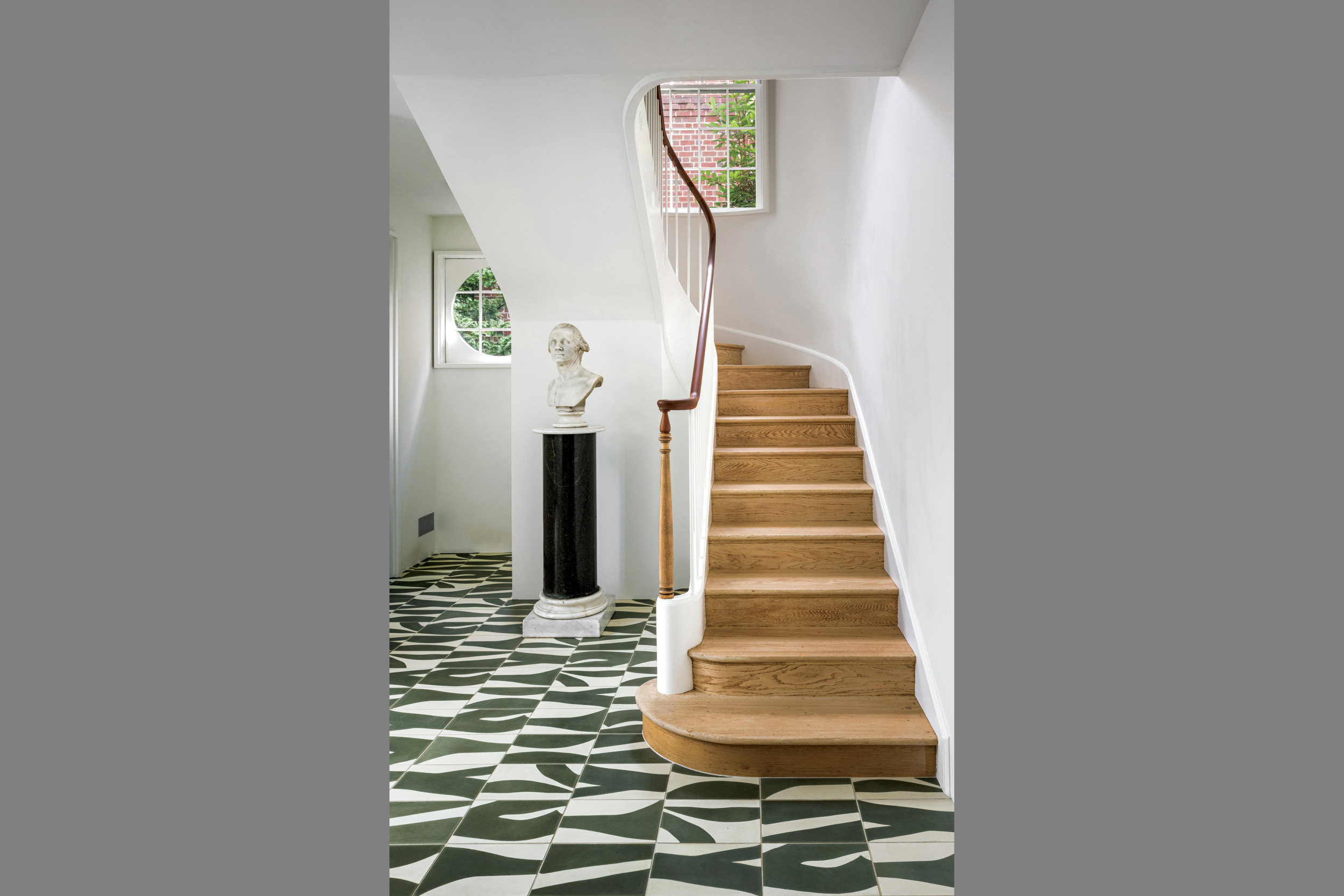
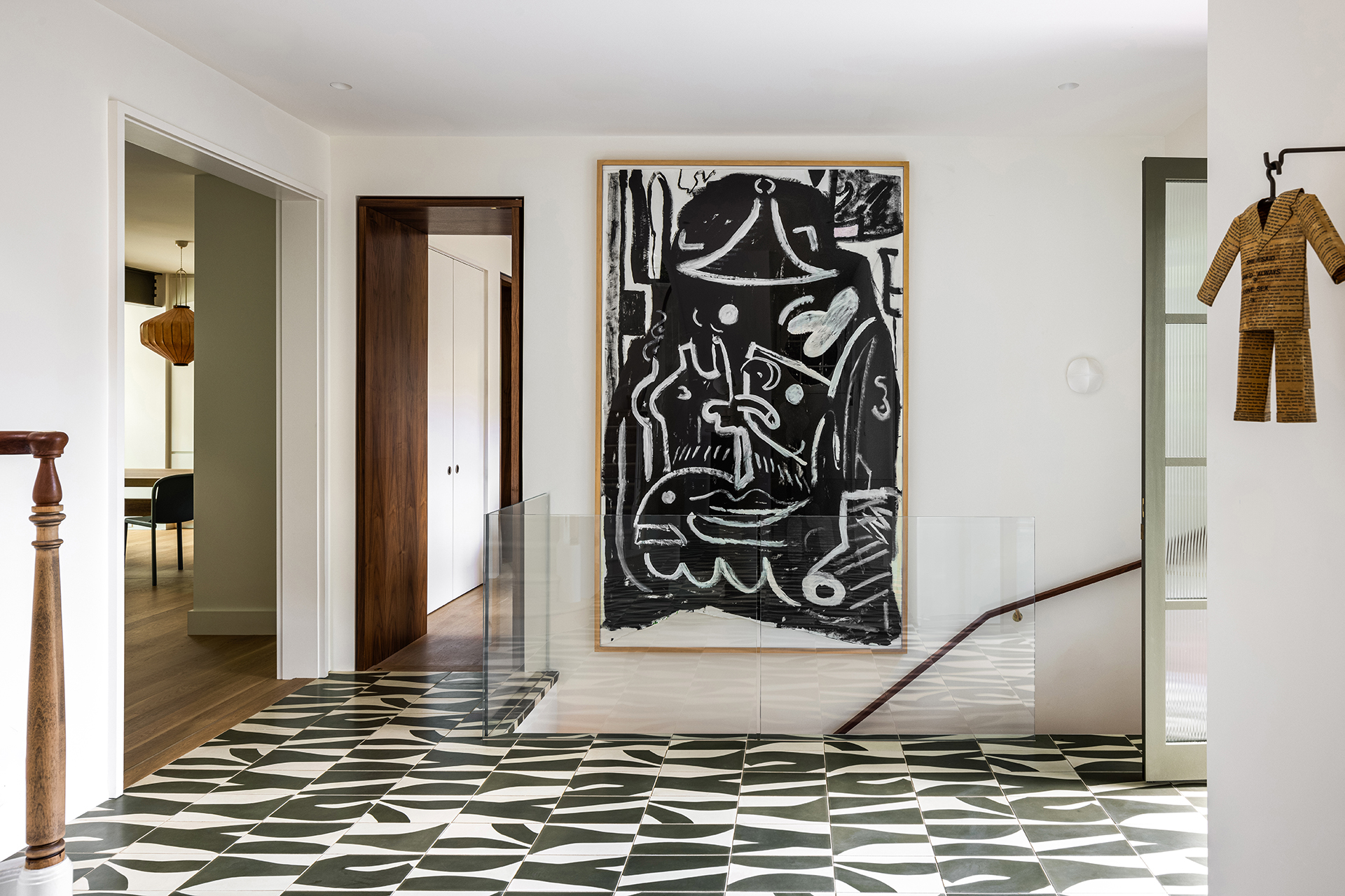
A bust of George Washington offers a cheeky counterpoint to the patterned tile.


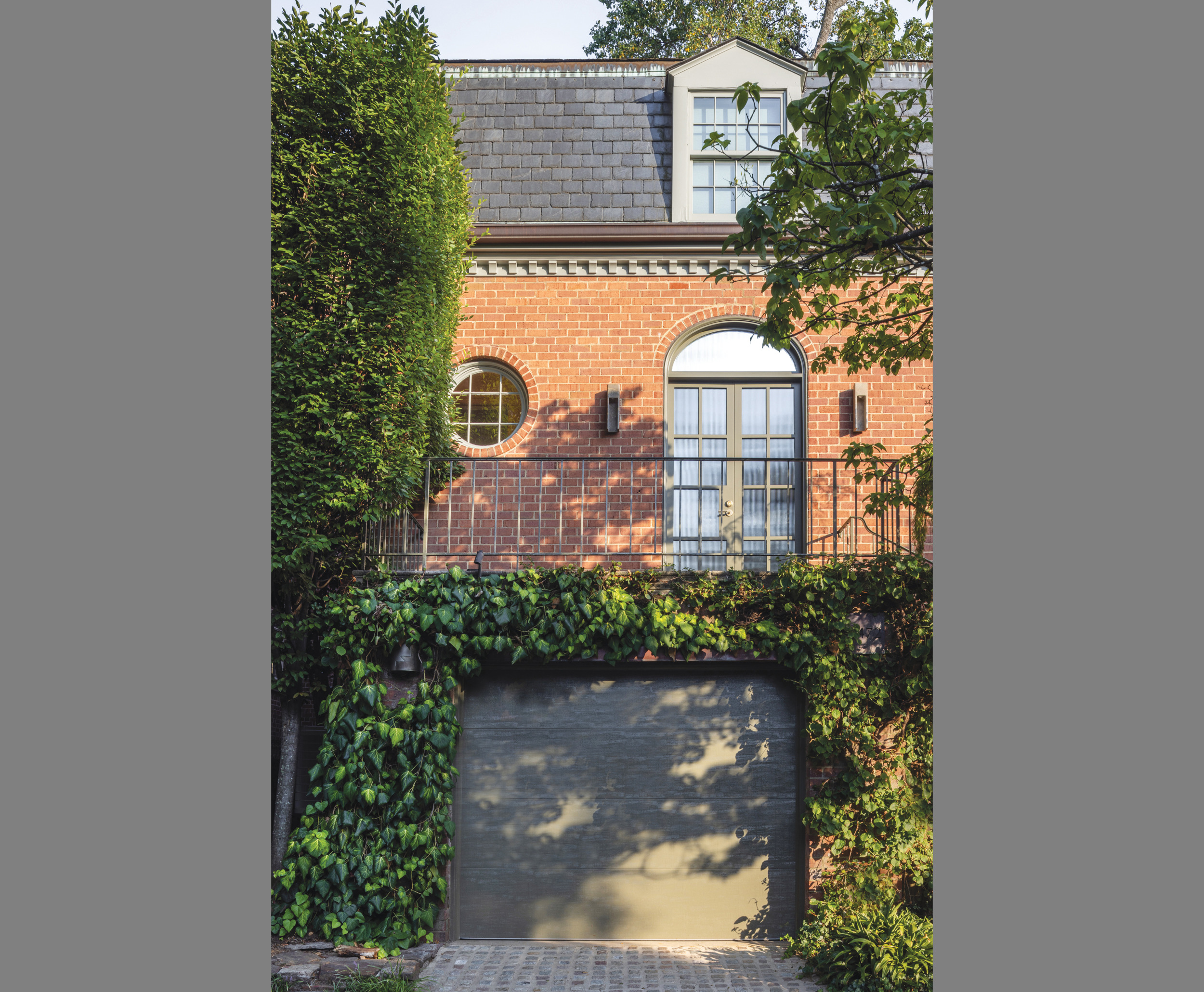
On a quiet, winding street facing Rock Creek Park in Kalorama stands a 1953 house that appears every bit as conventional as its neighbors. However, step inside or wander around back and you’ll soon realize that the buttoned-up façade is literally just a front for something less orthodox and far more interesting. “The meme of what one envisions as a DC home, which is more traditional, was not particularly what I wanted,” confesses the wife, who works in tech. “It was important to me that this house have more of my energy and be a place for art.”
Moving to the District from Brooklyn, the couple, who now have one young son and another on the way, felt like they won the real estate lottery when they began exploring their neighborhood. “This area is a gem within the city,” she enthuses. “You’re just steps from Dupont Circle, but you feel like you can find peace at the end of the day here.”
Having admired the work of Fowlkes Studio, the new owners engaged the firm to boldly reimagine their outdated abode. “It had a lot of glass shelves, fluorescent lighting and brass light fixtures,” relays architect VW Fowlkes. “If you can imagine a movie from the ’80s with a senator in a blue blazer in a fancy house, this was that house. The owners are a younger, hip couple; they wanted to take it in a different direction.”
Fittingly, that new vision starts with the entrance: “We redesigned the front arched doorway with reeded glass and brought in optic cement tile for the floor,” describes architect Catherine Fowlkes. “Both are evocative of Miami, where the wife is from.”
Opening up a wall and incorporating the stairs to the lower level gave the foyer a sense of grandeur that it had been lacking. Knowing the space would serve as a gallery for the owners’ art collection, they enclosed those stairs with a glass railing allowing for unobstructed views of a striking monochromatic painting by Shai Yehezkelli.
The foyer’s original stairs leading to the second floor were given new life, too. Featuring a different wood species than the rest of the railing, the newel post was left unstained to celebrate its incongruity with the finished, glossy handrail. Elsewhere, the house presented a fairly blank slate. “We retained some of the bones, but there wasn’t a lot to restore or salvage,” says Catherine. “Our goal was to simplify circulation and bring a hierarchy to the spaces.”
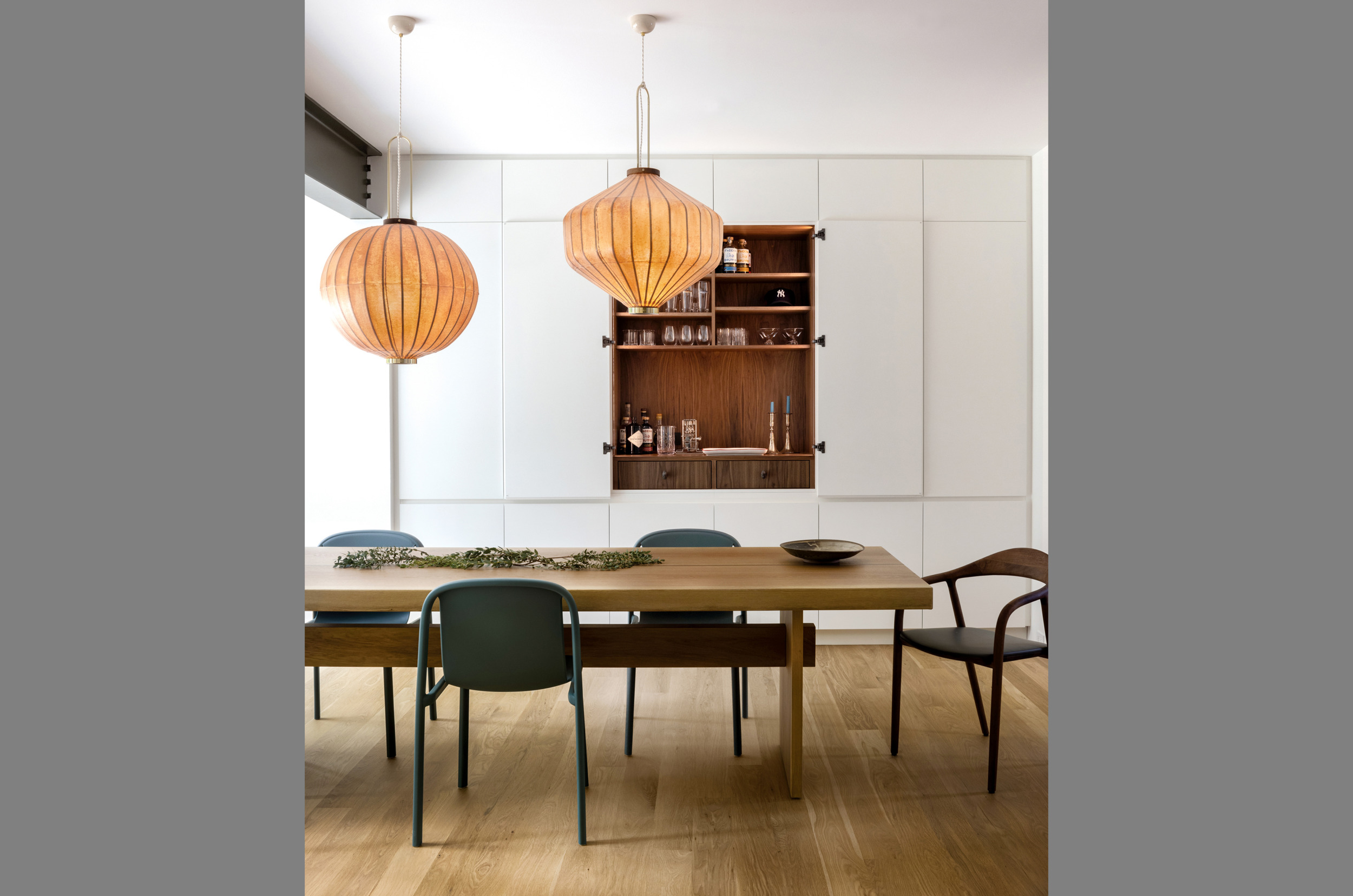
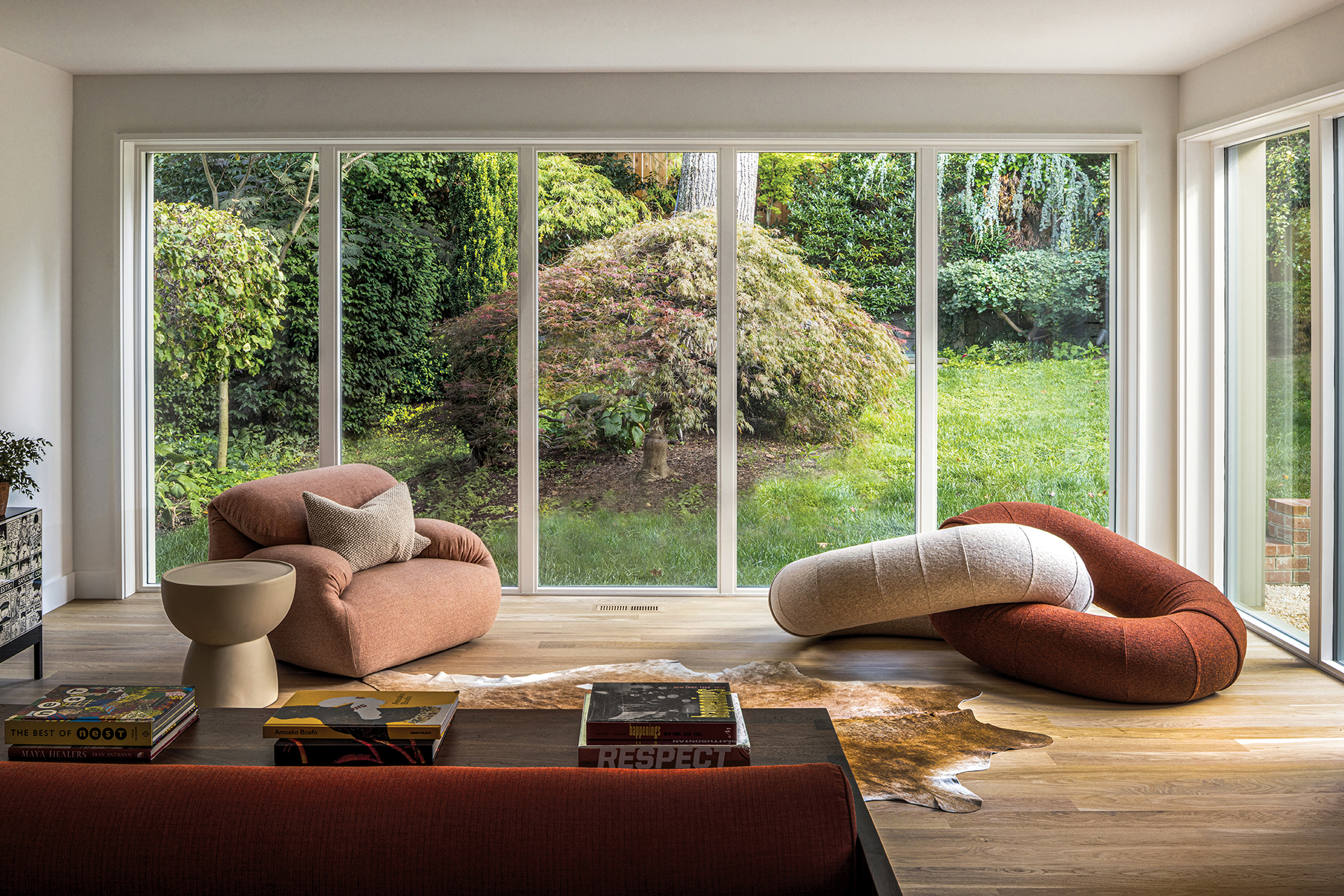
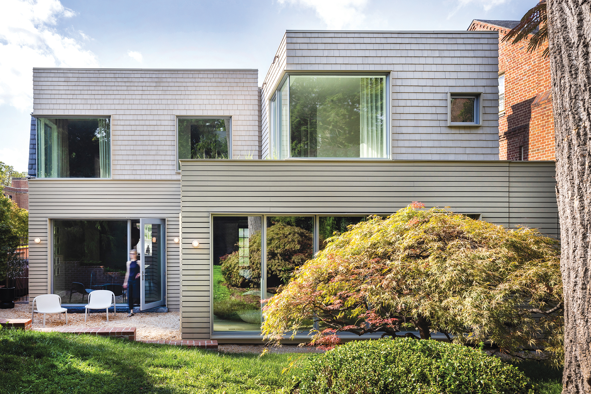
The most notable alterations occurred at the rear of the residence. “We expanded the back of the house out into the garden—in some cases only by a few feet—to create a proper dining room and a larger living room that spill visually into the backyard,” explains VW. With a flat roof and boxy volumes, the exterior of the modern addition references the International Style while still maintaining a warm domesticity thanks to the use of cedar shingles. All-new fenestration introduces a more meaningful indoor-outdoor connection.
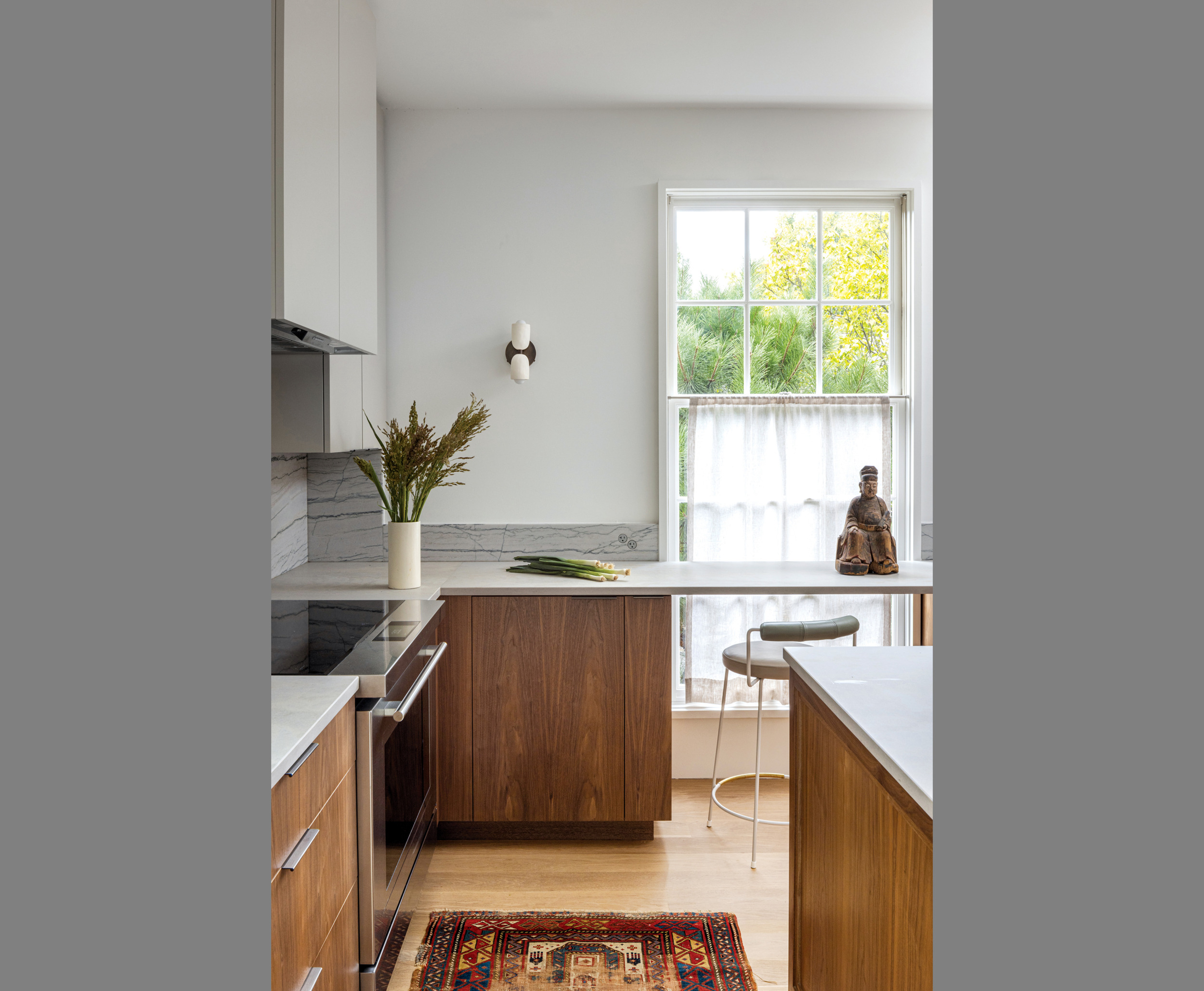
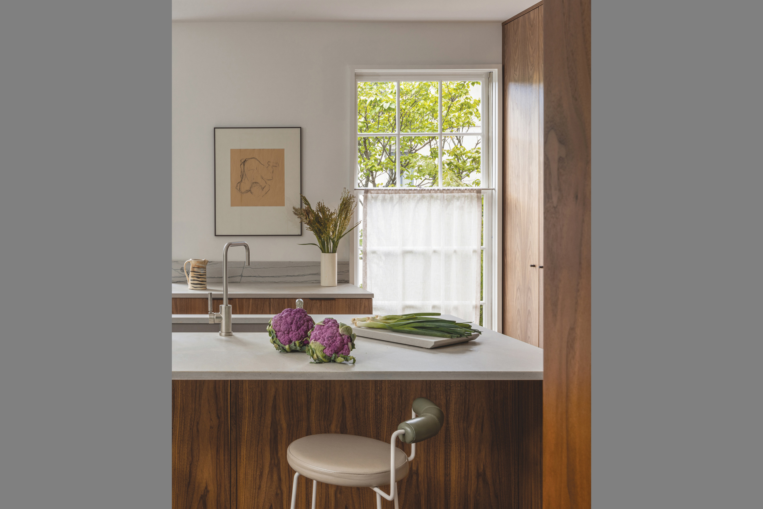
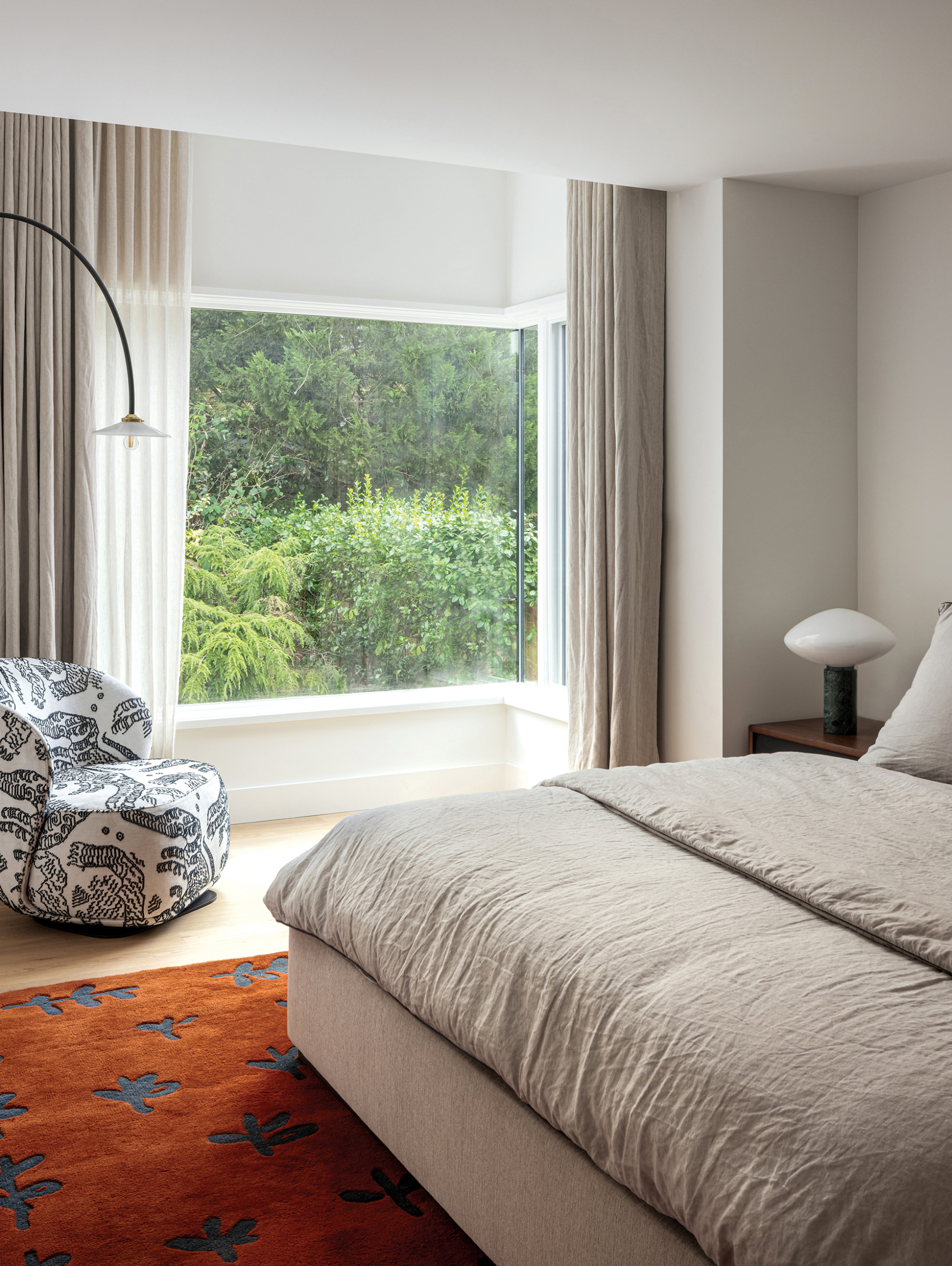
Interior changes to the main level include opening up the wall between the living and dining rooms for better flow, creating a single pass-through from the kitchen to the dining room lined with hinged walnut panels—they pivot to close off the cook space when entertaining—and reorienting the kitchen island. Upstairs, the addition captured more square footage for the primary suite and an office space that will become a second kid’s room.
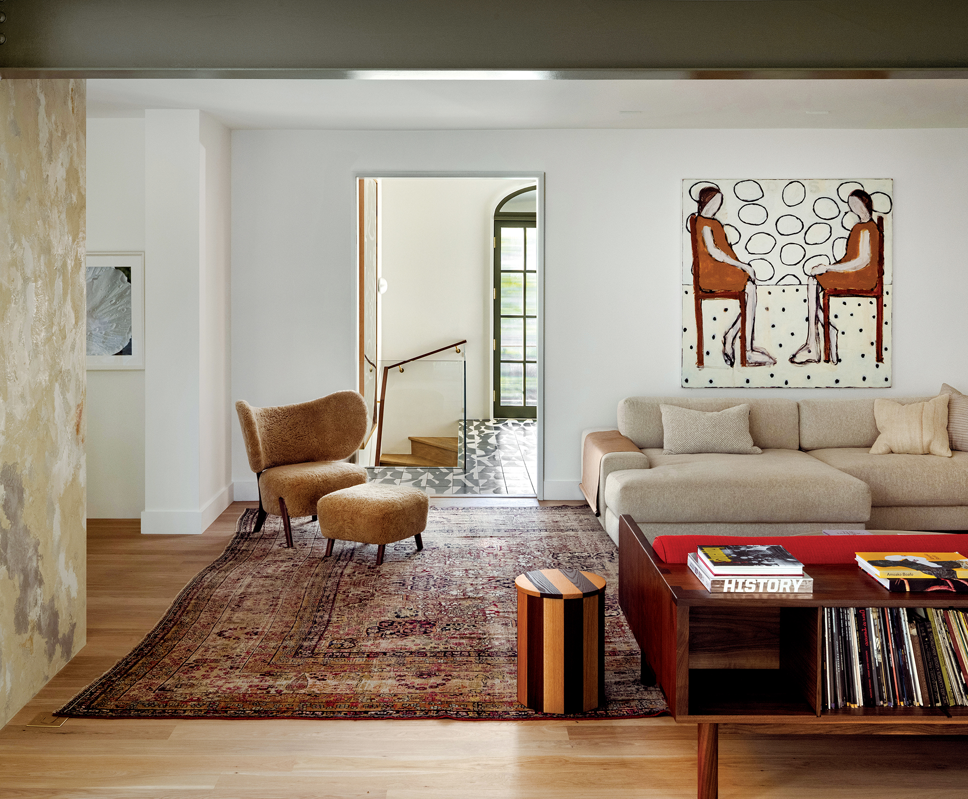
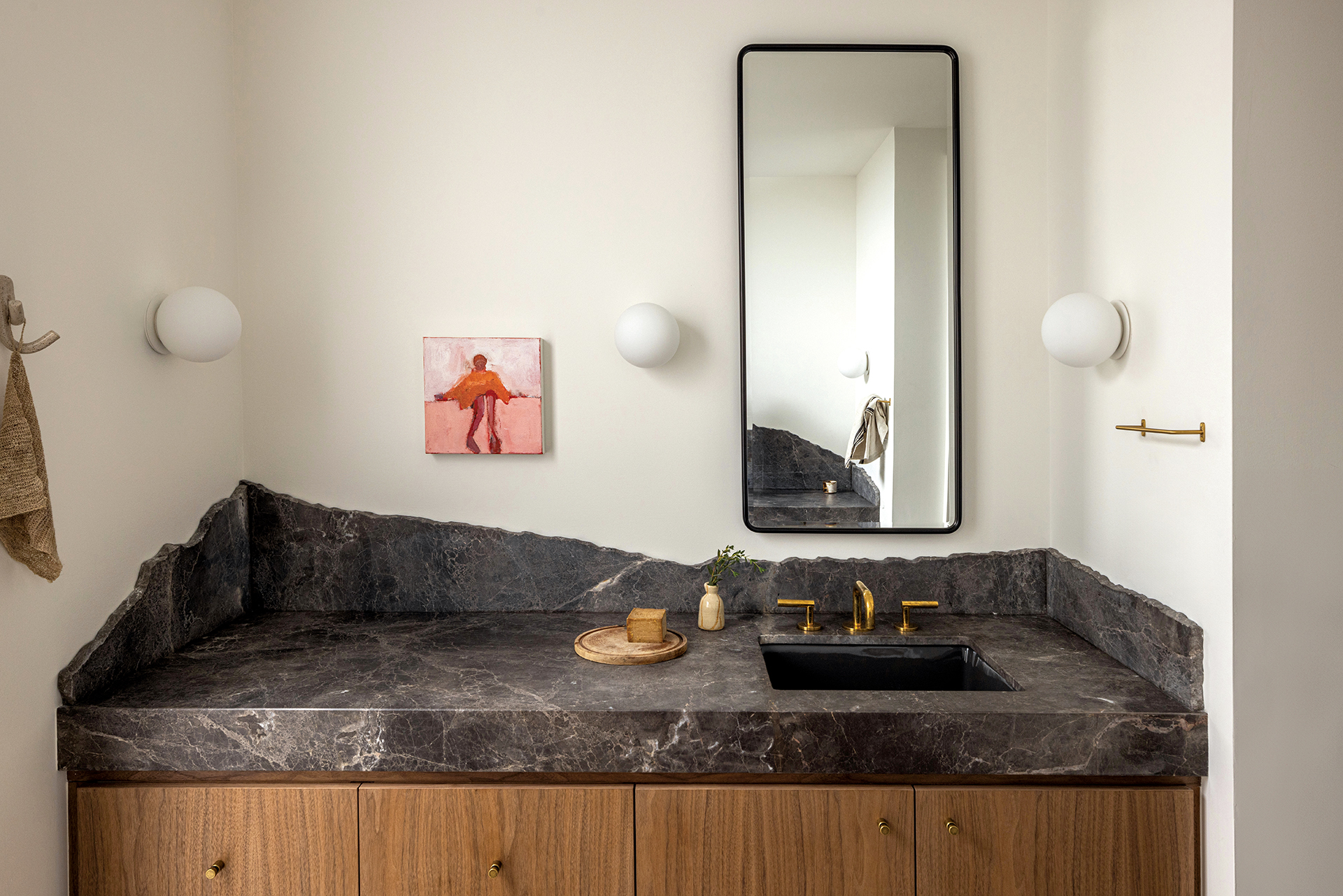
Throughout, refined and raw design elements are balanced for maximum impact—the latter often giving an air of nonchalant imperfection that belies the effort in their execution. Take the wall between the living and dining rooms: Designed to look like concrete that had been excavated during construction, its Venetian plaster finish is the result of artfully blending four different colors in the skim coat. “The materials and the spaces on the inside start out more dignified and formal in the front and become a bit more industrial as you move to the back,” notes VW.
“The client pushed us to be more daring, more rock and roll; the result retains elegance, but is a little funkier for that reason,” adds Catherine.
While the house is a showcase for the owners’ top-notch art, the furnishings are anything but precious. With a toddler, a baby on the way, not to mention a beloved 100-pound chocolate lab named Calvin, everything had to be durable. In the living room, two intertwined loops appear to be a fiber-art sculpture but are meant to be climbed on by the kids and the dog. Both arch and practical, the piece is just one example of how playfulness and comfort permeate every inch of this family home. Sums up the wife, “There’s nowhere else I’d rather be when I wake up, and that’s a really nice feeling.”
Architecture & Interior Design: VW Fowlkes, AIA, principal; Catherine Fowlkes, AIA, principal; Evie Soileau, RA; Fowlkes Studio, Washington, DC. Builder: Added Dimensions, Silver Spring, Maryland.
RESOURCES
THROUGHOUT
Drapery: rockvilleinteriors.com. Windows: windsorwindows.com through thesanderscompany.com. Plaster Work: twindiamonds.com.
FOYER
Tile: pophamdesign.com.
LIVING ROOM
Fireplace Surround: petrastonegallery.com. Seating: linkandloop.com through rawcolor.nl.
DINING ROOM
Light Fixture: taiwan-lanter.com. Cabinetry: ferriscabinetry.com.
KITCHEN
Countertops: petrastonegallery.com. Cabinetry: ferriscabinetry.com.
NURSERY
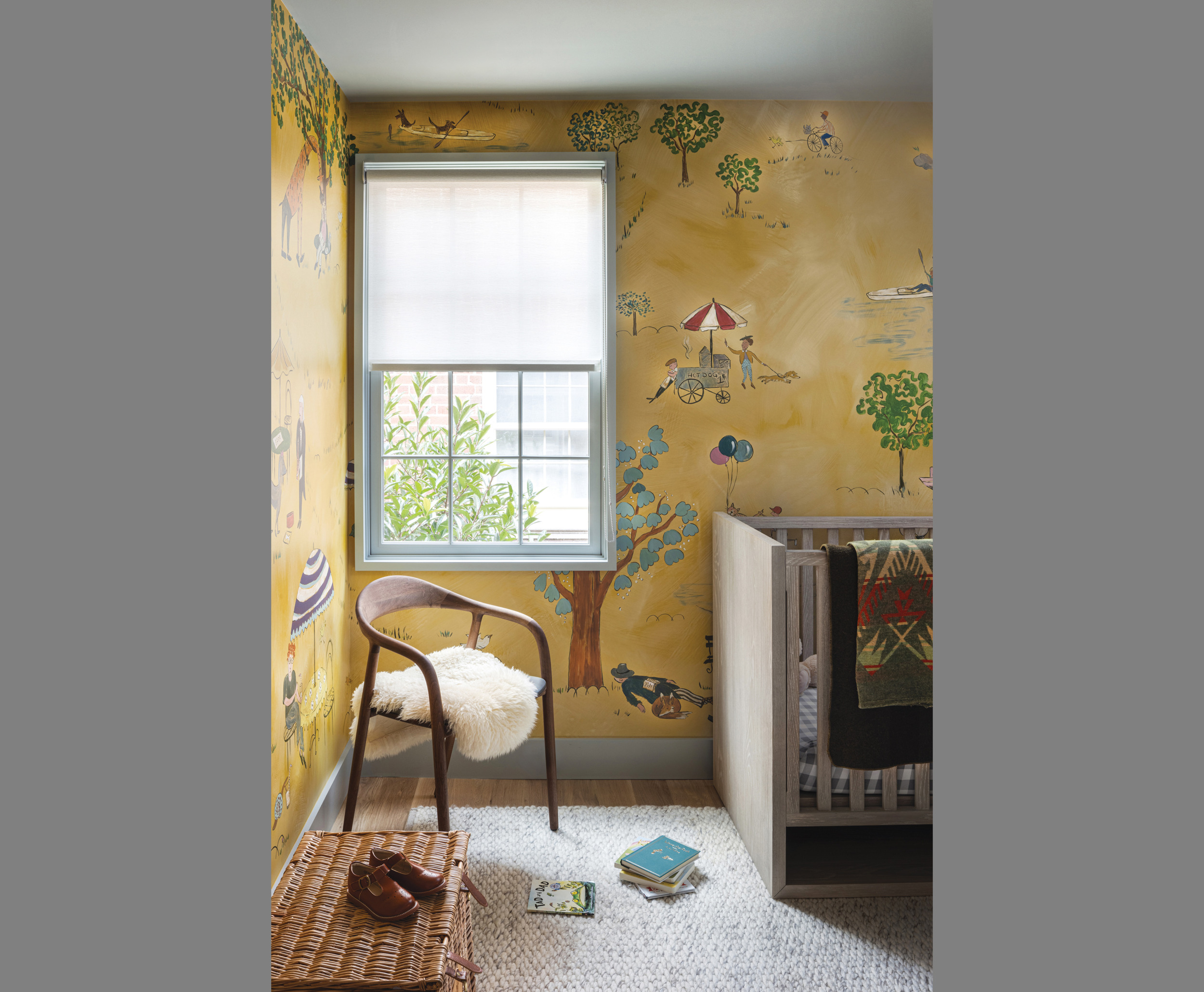
Wallpaper: thelawnco.com.