Laura Fox, Laura Fox Interior Design, LLC


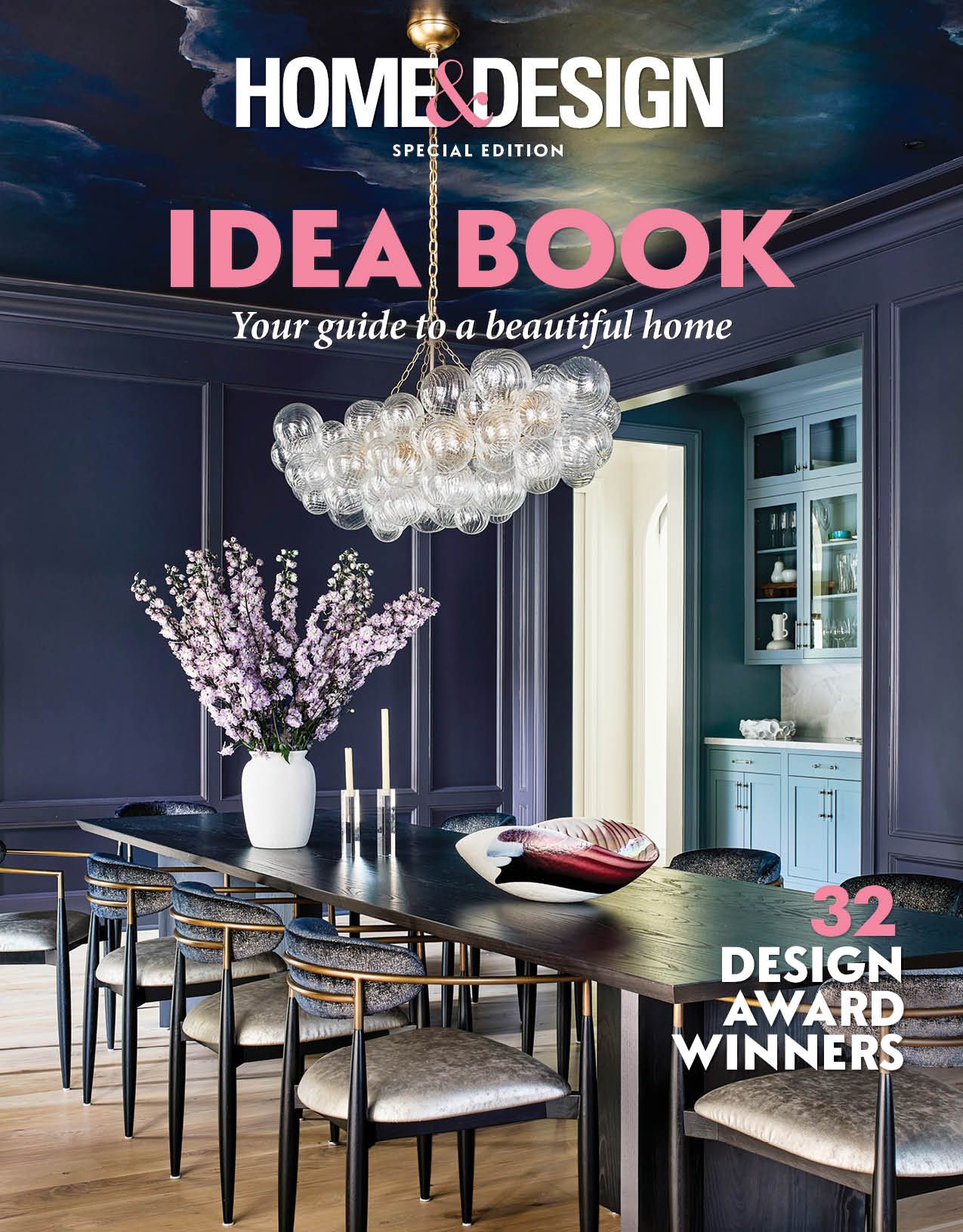
 If you want to be bold, do it with a color pop! Color adds spirit to a room and makes a fun statement. Keep in mind that balancing a bold color against quieter colors is key, since too much color can add confusion.
—Cathy Purple Cherry, AIA, Purple Cherry Architects
purplecherry.com, 410-990-1700
 To create a calm atmosphere, we select lighter colors or neutrals; to establish a cocoon-like space, we go darker. Meanwhile, bold colors can add excitement and whimsy to a space. We love to make a statement by adding a splash of bold paint inside a cabinet, behind a built-in, on the ceiling or even on a piece of furniture.
—Andrea Maaseide, Allied ASID,
Studio 320 Interior Design
studio-320.com, 571-459-2136
 You can really tell the personalities of our clients by the colors we choose for their homes. We love brighter colors for families who are particularly outgoing, and balance these hues with crisp, white trim to keep the overall look sophisticated.
—Jamie Merida, Jamie Merida Interiors
jamiemerida.com, 410-819-8666
 Depending on the objectives of the project, we typically choose warm or cool, neutral paint colors. If the project has ornate or interesting trimwork, we’ll highlight it in a different shade and sheen. We use bold colors sparingly. It’s easy to go overboard, so please consult a professional!
—Sarita Simpson + Jason Claire, Interior Matter
interiormatter.com, 202-900-3818
 Laura Fox, Laura Fox Interior Design, LLC
laurafoxinteriordesign.com
 Bonnie Ammon, Bonnie Ammon Interiors
bonnieammoninteriors.com, 703-778-5755
 Laura Hildebrandt, Interiors by LH, LLC
interiorsbylh.com, 571-334-6476
 Barbara Hawthorn, Barbara Hawthorn Interiors
BarbaraHawthornInteriors.com, 703-241-5588
 DuVäl Reynolds, DuVäl Design, LLC
duvalreynolds.com, 703-989-0521

Melanie Whittington, Whittington Design Studio
whittingtondesignstudio.com, 703-533-3705