Landscaping on the water presents its own unique challenges—and because each site is different, the impact of myriad county rules and regulations varies. The trick, say the pros, is knowing your property’s requirements before you start. Hiring an expert early is also key; as the dazzling projects below prove, the right plan makes all the difference.
A Strong Connection
A 1958 residence in Easton perches on a scenic slice of land overlooking Shipshead Creek, a tributary of the Tred Avon River. The 3.75-acre spread is fringed by mature beech and oak trees. The sprawling, white-painted abode gazes upon a picturesque boat house at the end of a dock; a swath of lawn separates the house from the water.
After purchasing the property, its new owner tapped McHale Landscape Design, which already maintained the lot, to improve its functionality while enhancing its connection to the water. “The client wanted a pool and pergola so he could do more outdoor entertaining,” recounts the lead designer and project manager, Chris Joseph. Protecting the surrounding mature forest was also a priority.
Joseph conceived a plan that sited the pool on the side of the house, anchored by a pavilion complete with a stone fireplace and vaulted ceiling; an attached pergola provides shade while paths link the house, dock and pool/pavilion. Creating those connections required some outside-the-box thinking: A drainage swale between the house and the creek couldn’t be moved and the trees had to remain intact. “We built a 50-foot-long bridge on pilings that goes over the drainage swale and ties into the existing grade,” the designer notes.
Irregular flagstone bordered by stone veneer defines the pool surround, paths and bridge. The same material crops up on the pavilion fireplace and on bluestone-capped retaining walls. “The irregular flagstone makes the landscape look like it’s always been there,” Joseph points out, “and the use of the veneer stone creates a cohesive feel.” The pavilion and pergola are made of dark-stained cedar.
Mature trees on the property dictated a multitude of plantings. “We were gifted this mature forest, but there were very few understory plants,” explains Joseph, who remedied the issue with flowering natives including Virginia sweetspire, spicebush, summersweet and azalea planted below the trees. Banks of hydrangea gracefully frame the house and anchor beds of ornamental grass on the lawn.
According to Joseph, the biggest challenge was the project’s proximity to the many canopy trees, since among other regulations, waterfront counties are strict about mitigation planting in the critical area. “We only took down two small ones,” he says. “But Maryland is the last bastion of environmental protection by the bay, and they take that very seriously.”
Waterfront Oasis
While construction was underway on a custom home nestled beside Whitehall Creek in Annapolis, Scapes was enlisted to transform the blank-slate, three-acre lot. “The owners requested an environment for outdoor entertaining that would take advantage of the property’s water views,” says Scapes principal and designer Jeff Crandell. “They wanted to have a sense of relaxation when they were spending time outside.” They also specified that the outdoor spaces complement their modern abode, designed by architect Stephen Terhune.
Crandell conceived a luxe landscape centered on an elaborate infinity pool replete with a swim-up bar and barstools; a sundeck and bubblers; and a water feature. Scapes designed and built a composite post-and-beam pavilion on one side of the pool that houses the bar—including a below-counter fridge and storage—plus a grilling station and a dining area. An existing lanai attached to the house spills out to the pool area from the other side, unifying the landscape plan and creating indoor-outdoor connectivity.
Along with the outdoor spaces, Scapes took on the job of cladding parts of the home’s exterior in Lake James veneer stone—including the lanai, where the team also installed a flagstone floor. To visually link the spaces, Crandell employed Lake James stone on the retaining walls, water feature and accents in the pavilion. The same roof shingles were used on both the house and pavilion, making them appear related; travertine decking surrounds the pool, bordered by flagstone coping.
A mix of evergreens, dwarf lilacs, Karl Foerster ornamental grasses and colorful seasonal perennials softens the landscape. At the owners’ request, palm trees are installed each year, then up-lit at night for a resort vibe. When it comes to planting by the water, Crandell recommends native species that can handle the salt in the environment. “We intersperse them with other pretty plantings,” he says.
For the Scapes team, the yard’s elevation turned out to be the project’s main challenge. “The vanishing edge of the pool required a five-foot retaining wall due to the steep grade,” explains Crandell, who turned the difficulty into a plus by creating a small, additional pool at the base of the wall, accessed via seven steps. “It’s an extra pool to hang out in that sits right above the creek. We even put in a bench.”
Braden Holtby began his illustrious ice hockey career as a goalie for the Washington Capitals. Over 10 years, he and his wife Brandi put down roots in the DC area, first residing in Old Town Alexandria where they welcomed two kids, now 11 and 13. After subsequent stints with the Vancouver Canucks and Dallas Stars, the couple opted to return to the Washington environs upon Braden’s retirement. “We realized we had a lot in common with the people here,” Brandi says. “Going other places made us appreciate this area.”
Contemplating a new chapter in 2021, the Holtbys, both Canadian, made a house-hunting visit—and quickly came upon a three-and-a-half-acre spread in McLean anchored by a massive elm tree beside a picturesque pond. “We loved the land. We walked out back and that tree pretty much sold us on the property,” Braden recounts.
The sprawling, circa-1985 abode left much to be desired; in fact, it was listed as a teardown, and the couple had to request the realtor find a key so they could tour it. “It was quirky, but we didn’t mind that,” Brandi remembers. “It just needed some love—it needed a redo.”
The 8,300-square foot structure with seven bedrooms and five-and-a-half baths encompasses four levels. The main floor offers dining, living and family rooms, plus a service wing with a pantry, laundry, mudroom and music room. Upstairs are the primary suite, daughter’s room and Brandi’s home office, while the third floor houses the son’s room, guest quarters and a playroom. Though not part of the redo, the basement includes a gym, TV room, spare bedroom and rec room.
The Holtbys enlisted Four Brothers Design + Build to address issues of functionality while infusing the abode with clean lines and mid-century flair. “The house had potential but felt dated, and some areas lacked flow,” notes project leader Stuart Pumpelly. “We needed to make it cohesive, intentional and welcoming.”
Architect Jeremy Tetreault began by reimagining the exterior. “It was not very attractive,” he observes. “The clapboard main volume and side structure with stone veneer each had its own architectural language, with misaligned windows that didn’t match each other.”
A plan to impose a clean, consistent aesthetic unified the disjointed façade. All-new windows were aligned and scaled to harmonize with the dormers. Black, standing-seam metal roofing complements graphite-hued fiber cement in alternating lap siding and board-and-batten. A portico improved the home’s entry, and an unappealing dining room bay made way for a streamlined bank of windows.
Inside, the front foyer heralds the transformation. A closed-off vestibule became open and airy when a shared wall with the adjacent stair was removed. And a dramatic new floating stair allows for a floor-to-ceiling glass wall that extends on the façade from the ground floor up to the third story.
Other alterations include a reconfigured primary suite and service wing. A Venetian plaster fireplace anchors the family room and walnut shelving lines the living room, where a beverage bar is tucked into one corner. White oak clads most of the floors, though terracotta tiles sound an earthy note in the mudroom and laundry area. The kitchen has been elegantly overhauled using custom walnut cabinetry paired with deep-gray quartzite counters.
The Holtbys collaborated with Four Brothers interior designer Kristen Mendoza on colors, fixtures and finishes. “We wanted an airy aesthetic that would bring nature in,” Brandi shares. “We’re both interested in design, so we went for a mix of our styles; Braden likes white walls and I like a bohemian feel with more color.” Walnut finishes predominate; they match the couple’s mid-century-style furnishings—a number of which were crafted by Braden, who took up furniture making in the last couple of years (he also redid the smaller bathrooms himself).
Pristine Acres masterminded the home’s outdoor spaces, featuring an infinity pool, spa and cold plunge; a pavilion containing a kitchen, bathroom and fireplace; and plantings and hardscape. “We worked alongside Four Brothers to ensure a seamless transition from inside to outside,” shares landscape architect Kevin Kurdziolek. “The design aesthetic matches the house.”
For Braden and Brandi Holtby, their remodeled home is the perfect spot for a post-NHL chapter. Asked what’s next, Braden replies, “I’m doing stuff around the house—and I’m busy with the kids, enjoying that while it lasts.”
Renovation Architecture & Contracting: Jeremy Tetreault, associate architect; Stuart Pumpelly, project lead, Four Brothers Design + Build, Washington, DC. Interior Design: Kristen Mendoza, Four Brothers Design + Build. Landscape Architecture & Contracting: Kevin Kurdziolek, PLA, ASLA, PPA, Pristine Acres, Great Falls, Virginia.
Square One
Q&A with Stuart Pumpelly and Jeremy Tetreault
Share techniques for improving a home’s exterior.
JT: Using different types of siding is impactful. You can run it horizontally versus vertically, or select wider planks on the lower level to ground a building visually.
SP: As with this project, window placement and alignment are huge. We also pay attention to porticos and rooflines.
What advice do you offer clients to prioritize their goals?
SP: Every project starts with how clients function in the house and how we can solve their issues. What’s behind the walls is crucial to ensuring quality, but it may not be what we talk about most.
How do you assess if a home is suitable for renovation?
SP: Ultimately, it comes down to feasibility, cost efficiency and design potential. A structurally sound home with upgradable systems is often a strong candidate. But in some cases, cost and complexity of rebuilding can approach or even exceed the cost of starting new.
Looming over the Potomac River as it winds around Washington, the legendary Watergate complex conjures an era—in more ways than one. Besides its infamous role in that eponymous scandal, the bold, modernist structure designed by Italian architect Luigi Moretti and completed in 1971 is widely recognizable for its curvilinear geometry and cantilevered concrete balconies with their signature saw-tooth railings.
Searching for a pied-à-terre in DC, a buyer was smitten with the building and its history. She purchased a 3,000-square-foot, 12th-floor unit, envisioning a complete overhaul of the dated space. The team she assembled for the job included BOWA Design + Build, with whom she’d collaborated previously, and architect and interior designer Nicholas Potts, who practices in DC and New York.
“The apartment held remarkable potential but felt disjointed and constrained by past renovations,” says BOWA project leader Steve Kirstein. “The owner wanted to reimagine it from top to bottom as a space that would embrace the best of the building’s period while also being highly functional for her lifestyle.”
Potts’ plan overhauled the unit, taking it down to the studs. It had begun life as two separate apartments that were combined during a 1980s renovation; the larger one became a warren of bedrooms while the smaller one housed the public spaces. “Because the building is curved, the width of the rooms changes as you move through them,” notes Potts. “We flipped the spaces to give the wider side to the public area.”
Those curves presented their share of challenges to both architect and builder. “Nothing is rectangular and the ceiling heights are low,” Potts points out. “Every millimeter of cabinetry, joinery and lighting had to be planned, and we introduced visual tricks and sightlines to give the sensation of expansive horizontality.”
The BOWA team meticulously orchestrated the process, collaborating with subcontractors and artisans to create a flawless, bespoke result. “We integrated lighting, introduced curved walls and reworked sightlines and radius ceilings that echo the Watergate’s arc,” says Kirstein. They executed Potts’ elegant solutions to intrusive pipes, chases and ductwork: curvaceous bulkheads that add grace and interest to flat ceilings.
The redo created airy, open public spaces encompassing a living/dining area and kitchen that focus on panoramic river views; off the foyer, a short hallway leads to powder and laundry rooms. The private wing houses a hall bath, home office, yoga studio and the river-facing primary bedroom, with its wall of sliders opening out to a balcony. Nodding to the building’s shape, Potts ingeniously designed the primary bath as a circle; it flows into a huge, luxurious closet inspired by the interior of a Prada boutique.
Potts quickly gleaned the owner’s wish to pay tribute to the Watergate. “She used the term ‘1970s apartment glamour,’” he recalls. “The brief was for a pied-à-terre that would feel as much like a three-dimensional artwork as a functioning residence.”
With his client’s input, the architect embraced rich materiality in a host of opulent, yet carefully curated surfaces. “It’s maximalist, but also restrained,” he comments. “If you go overboard, you can’t read the materials and things get lost in the clutter.”
The foyer sets the tone, with the front door facing a wall of translucent Onice Gioiello onyx punctured by vertical slats that let in light while concealing the river views that await around the corner. Sumptuous okoume wood panels clad gently curved walls, then continue throughout the apartment to unify the spaces. The okoume, an exotic African hardwood, was milled from just two logs, so its grain evolves in book-matched segments, cropping up on the kitchen cabinets, on built-ins in the dining area, and on a wall in the living area where it incorporates shelving. In the bedroom, the material covers one wall, doubling as a headboard. All pocket and regular doors were crafted of the same wood.
More luxurious stone surfaces abound. In the kitchen, a slab of Onice Arco onyx forms a dramatic backsplash and Verde Antigua marble tiles cover the floor; the same marble frames sections of travertine flooring as well as the matte-finished mahogany floor, laid out in a radial pattern. Verde Antigua also clads the primary bathroom walls and floor and is paired with Lilac Reale marble in the guest bath.
Bespoke touches rule, from luminous, burnished-plaster walls and ceilings to hand-forged metal cabinet pulls and sculptural door hardware. Vintage and custom fixtures illuminate rooms furnished with chic pieces found at auction or commissioned for the space. Comfortable, low-slung seating in earth tones threaded with gold ensures the views take center stage.
Working together harmoniously, the design team made a challenging, 14-month process seamless—and the owner is thrilled with the results. “As much as the apartment appropriates a museum-quality level of finishes,” says Potts, “it is also livable.”
Award: Entire House over $750,000. Renovation Architecture & Interior Design: Nicholas Potts, AIA, Nicholas Potts Studio, Washington, DC, and New York, New York. Renovation Contractor: Steve Kirstein, project lead; Eddie Mejia, project manager, BOWA Design + Build, McLean, Virginia. Styling: Tessa Watson.
Q+A with the team
What advice do you give homeowners embarking on a condo renovation?
Eddie Mejia, BOWA: You should meet with the builder for a pre-construction walk-though. And be sure to ask them to open up walls before they start so there are no surprises.
What is your philosophy on using high-end materials?
Nicholas Potts: We put a huge amount of thought into how we use materials. We have great respect for what is being mined from the earth or created by a maker. We want to make them their best selves and don’t want to waste anything.
How do you help clients decide where to splurge?
Nicholas Potts: First, the infrastructure has to work, so don’t cut costs on the contractor. As far as spending, you get more bang for your buck on things you interact with daily, like doorknobs and hardware. You can cut cost on things you don’t see or touch as often.
More and more,” Frank Lloyd Wright once declared, “it seems to me that light is the beautifier of the building.” The renowned architect’s words reflect an overarching ambition for a well-designed mid-century home: to utilize natural light and architecture together in creating open spaces connected with the outdoors. For lesser mid-century residences out there, the philosophy still applies—though some might need a little help realizing their true potential.
This was the case for a mundane, 1956 split-level in Chevy Chase, Maryland. Shay and Sasha Knaani, a private security entrepreneur and government employee respectively, purchased the dated, 3,000-square-foot dwelling with immediate plans to renovate. “I found the house very claustrophobic,” Sasha recalls. “The ceilings were low, and the layout was dark and closed off.” The home’s situation on a fairly busy street meant that maintaining privacy while also bringing in light might be a challenge.
The couple quickly discovered a simpatico collaborator in architect Colleen Healey, whose portfolio of modern projects matched their aesthetic. She embraced the home’s split-level architecture, focusing on daylighting and simple forms to update the nondescript dwelling per the Knaanis’ wishes. “The building just screamed clerestory windows to me. It was clear they were the strategy for giving Shay and Sasha the ceiling height and airiness they wanted,” she recounts. “The single-story main floor had so much potential. It allowed us to play with ceiling heights and light in the public rooms where they spend their time.”
Healey’s plan removed the existing low-pitched roof and installed a band of clerestory windows with a new, flat roof above—thereby raising the ceiling from eight to 15 feet in the living/dining area. Six skylights were strategically placed throughout the house. New front and rear windows create a connection to the outdoors, framing vignettes of the wooded yard.
In addition to light and openness, the Knaanis had other practical needs. They specified a large kitchen, a two-car garage, five bedrooms and five-and-half baths—enough for themselves, their two young kids and a third child on the way. To accommodate their wish list, Healey conceived two additions. A single-story add-on houses a spacious kitchen with a large island that separates it from the open-plan living/dining area. “The kitchen allowed us to forge a new pathway to the backyard from the main level,” Healey notes. “We put in a patio just outside where Shay can grill.”
The second, two-story addition at the other end of the house replaced an outmoded carport with a two-car garage; two ensuite bedrooms are tucked in above. “We set the garage at a lower grade to keep the height of the addition close to that of the surrounding homes,” observes Healey.
Originally, the main entrance was located on the side of the house, accessed from the carport. Healey shifted it to the front, where she was able to create “a real front entry,” she says. Now, visitors enjoy a direct sightline up the original split level staircase to a seating nook with a picture-window view of the wooded backyard. The nook, she points out, “feels like it’s part of the public portion of the house, but it actually belongs to the primary suite.” It can be closed off by a wide pocket door.
Existing upper-floor spaces—part of a rear addition that replaced a previously constructed one—were reconfigured. The reimagined primary suite now boasts a spa-like bathroom and spacious closet. The staircase down leads to a lower level complete with an ensuite bedroom, laundry and a family room that opens to a second patio. And another flight down, the basement was finished as a rec room/gym.
Healey also took on the challenge of elevating the home’s mid-century profile. The front entrance now heralds its provenance with surfaces that crop up inside and out—a common feature of the era. Black-stained brick walls, some original, continue outdoors, while slate-look porcelain grounds both the entry hall floor and front stoop. Subtle reveals on baseboards and trim are a modern touch.
A graphic palette of black, white and gray ensures the interiors feel streamlined and uncluttered. The kitchen features black and white cabinetry sourced last minute at IKEA (due to covid-related delays) and enhanced by custom detailing and Caesarstone countertops. Mid-century-style furniture and lighting were selected by Sasha and Healey.
The renovation added 1,000 square feet of airy living space to the Knaanis’ home—and they are thrilled with the results. “We were able to give them what they wanted,” notes Healey. “It feels like a new house now.”
Renovation Architecture, Interior & Kitchen Design: Colleen Healey, AIA, Colleen Healey Architecture, Washington, DC. Renovation Contractor: Abel Canizalez, Llaveroes Services, LLC, Germantown, Maryland.
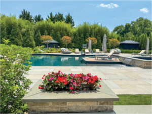 | Flower PowerBold blooms and vibrant greenery imbue a once-uninspired McLean garden with color and life |
 | Garden SpotA small DC property goes big on resort-style family fun |
 | Lush LandingElegant outdoor living spaces beckon family and friends |
 | Sleek ExpanseSculptural foliage and clean lines complement a modern Vienna abode |
Elaborate pavilions, swimming pools and expansive hardscaping are all very well—fabulous, in fact—but nothing packs a punch like a garden festooned in bright, seasonal color. McLean homeowners understood this truism when they hired McHale Landscape Design to work its magic on their two-acre lot.
“The plantings had a limited color palette and lacked continued visual interest,” recounts landscape architect Anthony Cusat. “The clients wanted an impactful garden rich in color and texture.”
The whole-property makeover involved reinstalling existing plants as well as adding many new ones. “The gardens were not thriving; they’d been planted too deep and then piled on with mulch during subsequent seasons,” Cusat explains. “We carted out tons of soil and mulch and replanted large species, including evergreen trees, above grade.”
The once-sparsely adorned driveway is now bordered by Green Giant arborvitae and colorful blossoms. A terraced front garden features holly, boxwood, Knock Out roses and allium. Annuals and bulbs bring swaths of color. In back, an existing pool area was softened by perennial and annual beds, which conceal pool equipment and create transitions between zones.
A Bermuda grass pickleball court—inspired by a trip to Wimbledon—nestles beyond the pool. “We constructed it like a golf green, with drainage beneath the turf,” Cusat explains. At either end, storage structures complement the home’s architecture. An adjacent stone patio provides a perch for viewing the action.
Award: Grand for Complete Landscape Master Planning. Landscape Architecture: Anthony R. Cusat, PLA; Architectural Design & Construction: Sam Dusenbery, McHale Landscape Design. Architecture: Purple Cherry Architects. Builder: Joy Design/Build.
In Northwest DC, where lots are often small and houses large, landscape designers learn how to pack an ambitious agenda into a diminutive space. Case in point: The owners of a grand, traditional home, newly built on less than a quarter acre, envisioned a backyard oasis complete with a swimming pool, a multi-level patio and a play lawn of artificial turf.
“The lot was wide but shallow,” relates Matt Gryskevich of Wheat’s Landscape, the firm tapped for the job. “We were able to situate the pool off to one side and fit the play area beside it.”
Due to the sideways slope of the yard, extensive terracing and stairs were required for accessibility between the pool area and turf, which lies at a lower level. “We wanted to bring the outside in, so we connected the pool to an existing patio beside the house,” Gryskevich says. Retaining walls of white-painted brick match the house. Perimeter plantings of magnolia, hornbeam and arborvitae create privacy and make the lot feel bigger than it is.
Wheat’s also beautified the front yard. “The clients wanted the house to fit into the neighborhood as if it had always been there,” notes Gryskevich. “We used mature plant material such as hydrangea and boxwood to get that effect.” A line of crape myrtles “brings down the scale of the house,” he adds. And a bluestone path leads to the front door.
Award: Honorable Mention for Complete Landscape (Design Build). Landscape & Contracting: Josh Dean, landscape architect; Matthew Gryskevich, design director; Pedro Ferreira, project manager; Wheat’s Landscape. Architecture: Anne Decker Architects.
Easy entertaining was the order of the day for a McLean couple who tapped Plusen Landscape Architects and Planted Earth Landscaping to transform their mundane, one-acre property. “We expanded the usable space with durable, year-round features for an active family,” says Chris Vedrani of Planted Earth, who oversaw installation and maintenance.
Jeff Plusen conceived a versatile master plan. “We created a series of spaces that would promote outdoor living,” recounts the landscape architect, whose concept featured a pool and pool house; an event lawn complete with underground tent anchors; a kids’ play zone; and vegetable and herb gardens. In the front, hornbeams elevate the arrival court and layered plantings foster privacy. From the front court, an arched breezeway provides access to the backyard, fringed with evergreens.
The backyard previously sloped towards the 2015 abode. “We regraded and addressed changes in elevation with stone retaining walls,” Vedrani notes. The pool was sited on a central axis to the house with the lawn to one side; wide, buff limestone steppers lead to the play area. Bordering the pool on the other side, the chic pool house encompasses living and dining areas and a full kitchen; the structure opens up via walls of sliders for indoor-outdoor flow.
In the side yard, a wrought iron fence separates the front and back, while a breezeway off the drive frames stately evergreens beyond.
Award: Grand for Residential Outdoor Living Area. Landscape Design: Jeffrey Plusen, PLA, ASLA, Plusen Landscape Architects. Landscape Installation & Maintenance: Chris Vedrani, principal; Carlos Pina, project manager, Planted Earth Landscaping. Pool House Architecture: Mark R. Sullenberger Architect.
Homeowners turned to Surrounds, Inc., to transform their blank-slate, one-and-a-half-acre property into a multi-faceted landscape in keeping with the crisp look of their white-painted brick, modern farmhouse-style residence. “The home had no outdoor living spaces or plant life,” says landscape architect Chad Talton. “Our job was to enhance curb appeal and create an entertainment space in back.”
The existing front yard was flat and empty, bisected by a bluestone walkway. The Surrounds team leveled the ground, adding an expanse of lawn bordered by neat rows and clusters of Pennisetum, boxwood, Carpinus and Liriope. “We planted an evergreen front yard for year-round structure that emphasizes
the simplicity and modern tones of the home,” Talton notes. An allée of maples lines the drive.
The once-equally bare backyard saw the most dramatic alterations. Because the terrain sloped towards the house, the ground had to be regraded to accommodate new terraced levels. Interior spaces flow out through two sets of glass-paned doors to a spacious patio, accessed via a wide bluestone stoop that wraps around the corner of the house. Surrounds designed and built an attached brick pavilion with a white oak ceiling; it shelters a grilling area and seating around a stucco fireplace. An adjacent paver patio offers al fresco dining.
Wide grass steppers lead down to the lower yard where a boulder wall at the rear fence line elevates a stand of screening trees to create privacy. Dogwood, hydrangea and Liriope soften the scene.
Award: Grand for Outdoor Living (Design Build). Landscape Architecture & Contracting: Chad Talton, PLA, Surrounds Landscape Architecture + Construction.
Though she’s resided in Annapolis for the last 43 years, architect Cathy Purple Cherry has had a lifelong love affair with the mountains. “My whole childhood was visiting Skyline Drive,” she shares. “It’s always been about the mountains for me.”
When she decided to build a second home, there was no question about the location. For five years, she and her husband, retired yacht broker Mike Cherry, searched for the right property, eventually choosing a forested, 57-acre parcel in the Blue Ridge Mountains near Afton, Virginia.
She teamed with longtime collaborator Doug Croker of ILEX Construction on the project. The first order of business: siting the house on its hilltop perch. “It required some vision to picture what kind of views it could have,” Purple Cherry recounts. “I wanted a 195-degree view from everyday rooms where we’d spend the most time.” To make that panorama possible, she cleared eight acres and situated the house perpendicular to the south-facing hills, conceiving a glassy great room at one end. From there, she explains, “We can see the sun rise above the mountain range to the east, then it travels all the way around and we can see it set on the western side.”
The exterior embraces an agrarian vernacular. “I’d say Cathy wanted to create a home that would honor the mountain environment in a humble and natural manner,” Croker says. A board-form concrete foundation supports vertical hemlock cladding, chosen for its resistance to wood-boring bees that infest the region. The Corten steel roof has already weathered to a rust hue that blends into the surroundings.
With Purple Cherry and her husband in their mid-60s and -70s respectively, the 6,000-square-foot abode’s layout was designed for aging in place. The main floor “is totally flush, with not a single step,” the architect points out. The foyer is a hyphen that opens to the outdoors via steel-framed glass entry doors accessing front and back. To one side, a three-car garage/workshop is topped by a two-bedroom, two-bath apartment. Complete with a kitchen, it’s intended to host the couple’s grown children and their families.
On the other side, a hallway leads past the primary suite, laundry, powder room and back kitchen to arrive at the great room, with its vaulted ceiling and reclaimed white oak beams. Living and dining areas and the front kitchen flow together, anchored by a fireplace. In the middle of it all sits a glass-walled art studio where Purple Cherry plans to paint when she has time—a second love “after architecture,” she says. The dramatic, 195-degree panorama unfolds beyond floor-to-ceiling windows and sliders that spill out to a covered porch and wrap-around deck.
In lieu of a second floor, a lower level was built into the natural slope of the land. There, another self-contained zone for visiting family members features two ensuite bedrooms, a gym and a rec room with a full kitchen. “Even when we’re all here, everyone can do their own thing,” says Purple Cherry.
This is where the animals come in. The couple’s daughter, who checks into the lower level, brings four cats and two ferrets on her visits, while their son (who is allergic to cats) and his wife lodge above the garage with three large dogs. Purple Cherry and her husband have five dogs of their own. “I’m not a fancy person,” avers the architect, who tiled the whole main level in wood-look porcelain and used poured, sealed concrete on the lower level for obvious reasons. “If something breaks, it’s not precious to me.”
Despite her avowal, the vibrant interiors of this mountain retreat feel carefully curated in what the architect calls bohemian style. Bursts of bold color, pattern and texture abound in fabrics, throws and vintage rugs. The back kitchen is blue while the downstairs kitchen cabinets pop in a vivid marigold hue.
An eclectic array of furnishings was gleaned from various sources. “I had no time, so I didn’t work with my team,” Purple Cherry explains. “I didn’t buy for specific locations; it was fun seeing where everything ended up without knowing ahead of time that I was going to assemble it that way.” Comfortable seating is slip-covered and wood pieces from hutches to farmhouse tables add warmth. Lighting from Visual Comfort in a range of styles adds drama.
While the property remains mostly untamed, Campion Hruby Landscape Architects surrounded the residence with greenery and planted a field of wildflowers that unfurls beyond a fenced expanse where the dogs run free.
Purple Cherry’s growing firm opened a Charlottesville office in 2018, and its busy founder completed her family retreat in 2023. With both office and home now functional, she hopes to spend more time in the Blue Ridge. For now, though, “The house is really a place to run away to,” she admits. “Because of the views and how it connects to its setting, it really feels like an escape.”
Architecture & Interior Design: Cathy Purple Cherry, AIA, LEED AP, principal, Purple Cherry Architecture & Interiors, Charlottesville, Virginia; Annapolis, Maryland; and New York, New York. Builder: Doug Croker, ILEX Construction, Inc., Charlottesville, Virginia. Landscape Architecture: Kevin Campion, PLA, ASLA, Campion Hruby Landscape Architects, Annapolis, Maryland. Landscape Installation: Planted Earth, Sykesville, Maryland.
RESOURCES
Main Level
Pendant Lights, Sitting Area Light & Hall Light: visualcomfort.com. Sofa, Blue Sofas & Chairs by Window: themtcompany.com. Round Pedestal End Table: madegoods.com. Kitchen Countertop: classicgranitemarble.com. Counter Stools & Wood End Table: centuryfurniture.com. Ottoman: ciscohome.net. Steel Framed Window/Door: clarkhalldoors.com. Planters: schwung.design. Area Rug: asiaminorcarpets.com.
Dining Area
Table & Dining Chairs: centuryfurniture.com. Chandelier: visualcomfort.com.
Pantry
Cabinet & Studio Cabinetry Fabricator: bargercustomcabinets.com. Backsplash: classicgranitemarble.com.
Studio
Cabinetry Hardware: anthropologie.com. Center Worktable: Antique through schwung.design. Ceiling Pendants & Wall Sconces: visualcomfort.com.
Lower Level
Tufted Chair: rh.com. Coffee Table & Tall Glass-Front Cabinet: centuryfurniture.com. Ceiling & Pendant Light: visualcomfort.com. Woven Lattice Pieces, Dining Table & Chair: Antique through schwung.design. Mirror: madegoods.com. Silk Flowers: newgrowthdesigns.com. Cabinet Maker: bargercustomcabinets.com. Dining Table & Chairs: Antique through schwung.design.
Primary Bedroom
Bed & Bed Fabric: Custom through themtcompany.com. Juju Hat over Bed: etsy.com. Side table: centuryfurniture.com. Branch Lamp: visualcomfort.com. Window Bench: madegoods.com. Orange Throw/Bedspread: vintage through alokahome.com. Bed Pillows: vintage through alokahome.com; homegoods.com. Dresser: centuryfurniture.com.
Primary Bath
Tub: waterworks.com. Vanity: rh.com. Storage Cabinet: Antique through schwung.design.
Julia and Craig Feldman and their son Henry had lived in their 1952 brick rambler for 12 years when they decided it was time for an overhaul. In addition to being cramped and outdated, the nondescript abode was a duplicate of several others on their modest Arlington block. “We love architecture of all kinds and always knew we were going to want to do something with this house,” relates Julia, who is a vice president at a health and humanitarian nonprofit.
While on a home and garden tour, she and Craig, a vice president at a commercial bank, spotted a modern residence by architect Yuri Sagatov boasting a butterfly roof and sleek, organic interior finishes. “It was a bridge between mid-century and modern, but not in a futuristic way—homey but current and architecturally stunning,” Julia recalls. “I said, ‘This what we have to do.’”
The couple immediately gelled with Sagatov and decided to take the plunge. The architect’s overhaul would eventually gut the original plan, reconfiguring and bumping out the main level by eight feet in back and adding a second story. The home went from 1,200 to 2,800 square feet. “We didn’t want something palatial; we wanted to still be able to find each other,” says Julia.
“There were a lot of constraints, which I always love because they require us to be creative in our approach,” Sagatov observes. “With a limited budget and space, our goal was to maintain the heart of the house while bringing in amazing light, playing with shadow and being a little nostalgic. We needed to be pragmatic and strategic.”
Set on a quarter-acre lot, the completed residence feels proportional to its surroundings but lends drama to the neighborhood with its white, stucco-like HardiePanel cladding and butterfly roof with fir accents beneath its soaring, angled overhangs. A narrow porch—requested by Julia—overlooks the street.
Inside, Sagatov’s plan transformed a compartmentalized layout on the main floor into an airy, open plan with a Scandinavian emphasis on simplicity and natural light. The ground level encompasses the living and dining rooms and kitchen, with a short hall leading to an office and powder room. The original chimney became the centerpiece of the revamped space; it faces the dining area while delineating a new living room—part of the eight-foot bump-out—behind. The sleek, functional kitchen designed by Sagatov brings in light through an expansive picture window.
Upstairs, the chimney remains a dominant feature. “We highlighted it by cutting an opening around it into the second floor to create a gallery with skylights overhead,” explains Sagatov. “It makes the chimney a work of art within the space as the light hits both levels throughout the day.” On the second level, Henry’s room and a guest room share a Jack and Jill bathroom. There’s also a laundry room and primary suite, complete with a luxe bath.
Throughout the house, Sagatov explored creative ways to balance the budget while maximizing the footprint and elevating the interiors. “We call this house a jewel box because it’s small but has so many creative elements,” he says. A wall of white oak slats by the front door defines the foyer while bringing in light; custom built-ins stand in for a coat closet. The stair to the second floor combines a wood frame with cable rails for a contemporary feel; several white oak risers wrap around to become open shelving along the stair wall. Strategically placed windows create unexpected light sources—in the kitchen, for example, a sliver window runs from countertop to ceiling and illuminates the middle of the house. Large-scale picture windows abound, bringing the outdoors in.
Julia Feldman worked with Sagatov on finishes and lighting. “They ran with my ideas and then helped me refine them or showed me other options that might fit the bill,” she recalls. “I gravitated towards Scandinavian design—everything open and bright with distilled warmth.”
She eschewed reflective surfaces, so fixtures and tile in the bathrooms and kitchen are all matte, conveying a natural, textural feel. Modern light fixtures animate the dining room and the primary bedroom. And furnishings lean into a clean-lined, mid-century aesthetic that pays tribute to the original home.
The Feldmans are thrilled with their redo—as is their architect. “This is one of my favorite projects I’ve ever done,” Sagatov avers. “Not just because of what we created, but because of the process—I got to go on this journey with an amazing family and to make
a great space for them.”
Renovation Architecture & Contracting: Yuri Sagatov, principal architect, ODE Design, Falls Church, Virginia. Kitchen & Interior Design: Yuri Sagatov.
Washington’s Logan Circle boasts a storied past. Part of Pierre L’Enfant’s original 1791 city plan, it remains a hub in Northwest DC, presided over by a statue of Civil War general John Logan and surrounded by late-19th-century manses.
Among these venerable landmarks, an 1882 Italianate residence in red brick fairly gleams. It was designed by Prussian architect Emil Sophus Friedrich for diplomat Dwight Partello, who requested grandly scaled rooms adorned with heavy cherry millwork, elaborate ceiling medallions, handcrafted stained glass and 10 fireplaces.
Until recently, the dwelling was dingy and dilapidated, untouched since a 1979 makeover. Yet even in this sad state, it caught the eye of architect Bill Bonstra and his wife, pastry chef Penny Karas, who were then living around the corner. In 2014, the couple knocked on the door. “We told the owner we’d like to buy his house,” Bonstra recounts. “He said it wasn’t for sale.”
Undaunted, they knocked again the following year, and then every year after that—until 2019, when their persistence finally paid off: The owner knocked on their door and finally announced he wanted to sell.
Bonstra and Karas were ready. Once they owned the property, they jumped right in, embarking on a painstaking, three-year restoration that would modernize the home while preserving its history. Contractor John Allen of AllenBuilt Inc. collaborated on the project.
The imposing, 7,600-square-foot residence now spans five stories. The couple resides on the first and second floors (the latter contains the primary suite and guest room). The third level harbors a two-bedroom in-law suite complete with a kitchenette and a loft. The garden-level basement was overhauled to create two one-bedroom rental properties.
Bonstra tried to salvage as many original elements as possible when updating the home’s front areas, which encompass the entry and a double parlor. The irregular-width, heart-pine floors were sanded and refinished and abundant cherry millwork revived. Plaster cornices and ceiling medallions were preserved and stained-glass windows—imported from Germany when the house was built—were cleaned. Dual 10-foot-tall, paneled cherry pocket doors separate what’s now the living/dining area from the stair hall.
Structural alterations took place at the rear—starting with the original dining room, which is now an expansive kitchen perfect for a pastry chef. Bonstra and Karas worked with kitchen designer Andrea Finn to create timeless style via marble surfaces and navy-blue cabinetry. The tiny former kitchen became a mudroom leading out past an elevator to a new back deck.
Despite its Victorian character, the house reveals some modern surprises. One is a 50-foot-high atrium at its center, illuminated by a massive skylight. The atrium was created during the 1979 redo, which replaced the second floor in that spot with a wooden bridge that channels light to the ground level while connecting the second floor sleeping areas; apertures in existing walls carry light into the stair hall on two levels. In Bonstra’s iteration, the bridge is made of frosted glass supported by reclaimed heart pine beams found in New England. He also incorporated a three-story air shaft into the interior, making room for a chic wet bar at atrium level.
The couple worked together on finishes and fixtures. In the kitchen, limestone-look floor tile is laid in a herringbone pattern, and Grigio Venato marble tops peripheral cabinetry as well as the wet bar. The island countertop and backsplash are made of marble-look Italian porcelain. Upstairs, Carrara clads the primary bathroom, which was enlarged during the remodel, while terrazzo imparts a modern feel to the hall bath. When it came to furniture, “we kept everything we had and reused it throughout the house,” Karas says.
Now that the abode is finished, the duo is thrilled with the outcome. “I pinch myself every day,” Bonstra enthuses, pointing to a host of architectural elements that now look fresh. “It’s magical.”
Karas adds, “We feel we are stewards of this house. We are grateful to live here and that we could preserve it for the future.”
Renovation Architecture: William J. Bonstra, FAIA, LEED AP, Bonstra | Haresign Architects, Washington, DC. Renovation Contractor: John Allen, AllenBuilt Inc., Bethesda, Maryland. Kitchen Design: Andrea Finn, CKD, CLIPP, AHF Designs, Kentlands, Maryland. Automation: Chase Systems, Rockville, Maryland.
In the early 20th century, many Washington and Baltimore residents beat the summer heat by removing to the shores of the Chesapeake Bay. Abundant creeks, rivers and inlets created destinations galore, and small waterfront resorts soon sprang up.
One such scenic retreat broke ground in Annapolis around 1915. Nestled into a peninsula along the Severn River, the enclave on 467 acres encompassed 341 summer cottages around a golf course, general store, marina and other amenities. It’s thriving today—with surprisingly few changes over its long lifetime. By community mandate, there are still 341 homes nestled into wooded lots overlooking watery scenes. But most are teardowns or have been renovated to create year-round abodes.
A DC-raised investment banker with fond memories of idyllic summer sojourns in this family-oriented spot always aimed to return. After stints in New York and Baltimore, he and his wife, who is also in finance, bought a circa-1920s cottage and moved there in 1997 to raise their three kids. Over the years, they added onto the house haphazardly. By the time the nest was empty, the couple was ready for a home that would better suit their next chapter.
They hired architect Jay Huyett to mastermind a new dwelling on the site. “We demolished the existing house, which had run the course of its usable life,” relates Huyett, who collaborated with Bayview Builders on the project. Baltimore designer Courtney Otenasek joined the team during the construction phase.
From the get-go, challenges abounded, from critical area restrictions to variances for the sloped site, which drops a steep 22 feet in back to a picturesque creek. The community’s board also gets a say. “The character of the homes must be modest and subservient to the forest landscape, with a cottage vernacular,” Huyett explains. All are painted in dark shades to blend with the woodsy surroundings.
He conceived what he terms “a modern cottage” boasting interiors that lean contemporary to match his clients’ tastes. The 4,850-square-foot, four-bedroom, four-and-a-half-bath structure spans three levels, with only two visible from the front approach. “The scale was a big deal,” Huyett comments. “They didn't want a gargantuan house from the street, so we built the upper level into the dormers, which provide a huge amount of space.” In back, expansive windows on all three floors frame the lush tree canopy and overlook the creek. A spacious deck was situated on the lower level so it wouldn’t impede water views from the main floor. “The creek is below, so it doesn’t show in pictures,” the architect notes.
Public rooms on the open-plan main floor flow out via a folding-glass wall to a screened porch clad in fir and made airy by a soaring, gabled ceiling. Designed by Huyett, the pristine white kitchen is sleek and modern, lined with custom cabinetry; a pantry resides behind the range wall. A main-level guest suite offers an option for aging in place. The basement level contains two bedrooms, a gym, TV and laundry rooms and a family room. The upper level, tucked into the dormers, is dedicated to the owners’ suite, which boasts a luxe, light-filled bathroom. The husband’s home office, complete with built-in desk and shelving, also occupies the third floor.
Tapped to help the homeowners navigate finishes, furniture and lighting, Otenasek embraced their preference for interiors “that would blend in with nature and the spectacular view,” she recalls. “They wanted the clean lines of mid-century style in a livable house where they could use every space.”
The designer took cues from a material palette selected by Huyett, combining white oak in floors, beams and trim with black-framed windows and accents of white, nickel-gap siding. She selected streamlined, mid-century-style furniture in earth tones, modern light fixtures, stone-look porcelain tile for the bathrooms and textural wall coverings in the powder room and home office. “We kept things simple,” she observes.
Orderly yet naturalistic, the grounds by DC Landscape Group are heavily terraced, providing pathways that connect every level of the home. In fact, the steeply sloped terrain created useful opportunities for meeting the owners’ storage needs—a key project goal. Huyett devised a two-level storage shed that complements the home’s architecture and serves double duty as a barrier from close neighbors on one side; a pergola connects it on its upper level to the house and screened porch. The structure accommodates equipment for outdoor sports, from biking and tennis to fishing and boating (the family keeps a power boat at the community marina).
Huyett also added a half-basement below the home’s lower level. And tucked into the front of the house but invisible from the street, he found room for a fish-cleaning station that is the husband’s pride and joy.
The owners are thrilled with the completed project and avow that they utilize every inch of their new abode. Says Huyett, “Throughout the process, they were thinking, ‘How are we going to use these spaces? How will they supplement the way we live?’ It was an ongoing conversation—and it brings me joy to see that they use this house so well.”
Architecture: Jay Huyett, AIA, Studio 3 Architecture, Annapolis, Maryland. Interior Design: Courtney Otenasek, CO. Design LLC, Baltimore, Maryland. Builder: David Carlisle, Bayview Builders, Annapolis, Maryland. Landscape Design & Installation: Allen McGuigan, DC Landscape Group, Edgewater, Maryland.
About 15 years ago, a visit to Frank Lloyd Wright’s iconic Fallingwater instilled Ali Manesh with a fascination for modern architecture and design. Later, the dentist, who had put down roots in the DC area, began to consider building a home of his own. “I envisioned something basic because I thought that’s what my budget would allow,” he recalls. “Then my practice grew, and I found I could afford to be creative.”
Manesh purchased a one-third-acre property in McLean, intending to replace the nondescript, 1955 abode on site with a dynamic, contemporary home. He discovered architect Zahraa Alwash, whose firm, Zee Design, leans modern. The two turned out to be a potent team. “I showed Zahraa pictures of favorite projects, including Mies van der Rohe’s Barcelona Pavilion and the Kaufmann house in Palm Springs by Richard Neutra,” Manesh relates. “I tapped into something emotional in this process. I really didn’t know how interested I’d be.”
He described his vision for the property as “hard and closed-off outside but open and expansive inside.” With this in mind, Alwash devised a modernist structure characterized by clean geometry, indoor-outdoor flow and soaring spaces. Because the lot backs up to a bucolic slice of county-owned land, she was able to open the rear elevation to a courtyard while keeping the front private.
Easy-maintenance, cream-colored porcelain slabs and contrasting dark-metal vertical panels clad the exterior. “We wanted massive windows beside the three-story stairwell,” Alwash notes. “But the stair faces the street, so we installed wood-look aluminum slats that let in light but ensure privacy.”
At 7,200 square feet, the six-bedroom, six-and-a-half-bath abode “aligns with the clean, minimal look Ali wanted, with a focus on connecting with nature,” the architect notes. Twelve-foot ceilings on the main floor impart airiness, while thin-profile windows, spare baseboard reveals and flush trim contribute to a sense of simplicity. Large-format, concrete-hued porcelain tiles ground the main-level floors.
The home’s open plan encompasses the foyer, dining and living zones, and a sleek kitchen. A spare bedroom and bath lie off to one side, while a sculptural, three-story stair made of steel and reclaimed white oak occupies center stage in the foyer; it was designed by Alwash and fabricated by Gutierrez Studios. Floor-to-ceiling sliders line the living and dining spaces, beyond which a pool and patio await.
The second floor houses a luxe primary suite and three more ensuite bedrooms. A glass-railed balcony overlooks the dining area, which boasts a soaring, double-height ceiling. The basement level is anchored by a glass-enclosed gym; a home theater, bedroom, bath and sauna are also part of the mix.
In the kitchen, cabinetry by the German brand Leicht combines dark-gray lacquer and walnut veneer, topped with thick Dekton counters that mimic the color of the floor tile. “It was important to simplify the palette,” Alwash explains. “And get everything tucked away for a cleaner look.” A walk-in pantry and adjacent mudroom keep surfaces clear of clutter.
When it came time to furnish the home, Manesh specified mid-century classics. “I originally fell in love with that era, but I ended up going contemporary on the architecture,” he points out. “It seems like with Mid-Century Modern furniture I am bridging the two.” Though Alwash and colleague Mariana Duarte Leo veered away from the mandate in the living room with Roche Bobois’ Mah Jong sectional wearing playful Missoni fabric, most of the furnishings are a salute to iconic mid-century designers, from an Eero Saarinen dining room set and Womb Chair to Marcel Breuer’s Cesca counter stools.
In the courtyard, a grotto-like swimming pool creates a soothing, serene refuge. It required some finessing, says Alwash, who first made sure to address backyard grading so the pool would sit on level with the house. “It needed to be elevated so as to be seen and to flow from indoors,” she explains. The patio—hosting loungers and diners with ease—is grounded by porcelain pavers that resemble the indoor tiles, reinforcing the indoor-outdoor connection.
Manesh thoroughly enjoyed the home-design process and hopes for another opportunity in the future—but is thrilled with his current residence. “I am more and more appreciative of this space,” he observes. “I do root canals every day, looking through a microscope with a narrow perspective. I wanted my environment to feel large and expansive.”
Architecture, Interior & Kitchen Design: Zahraa Alwash, AIA Associate, NCARB; Mariana Duarte Leo, interior design assistant, Zee Design, Vienna, Virginia. Styling: Kristi Hunter.
RESOURCES
KITCHEN
Island Stone Top: cosentino.com. Cabinetry: leicht.com. Appliances: mieleusa.com. Cooktop: pittcookingamerica.com. Counter Stools: knoll.com. Island Faucet: kohler.com. Art: linaalattar.com.
EXTERIOR
Materials: emilamerica.com.
DINING AREA
Table & Chairs: knoll.com. Chandelier: vibia.com/us/usa.
FAMILY/LIVING ROOM
Sectional & Coffee Table: roche-bobois.com. Blue Chair: knoll.com. Fireplace: flarefireplaces.com.
SITTING AREA NEAR KITCHEN
Striped Chair: bebitalia.com/en-us. Built-In Fabrication: ar2designstudios.com.
STAIRWELL
Stair Fabrication: gutierrezstudios.com.
PRIMARY BATH
Tile: tilebar.com. Faucets: kohler.com through grofusa.com. Soaking Tub: badeloftusa.com.
PRIMARY BEDROOM
Wallpaper: elitis.fr/en. Round Sconce: hennepinmade.com.
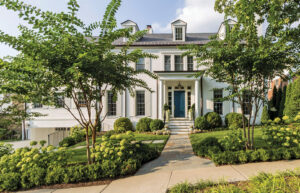
While scouring Washington, DC, for a vintage row house to buy and remodel, a young couple came across a 1911 dwelling in Mount Vernon Square that fit the bill. “We were going for a Parisian aesthetic, where the walls are all original, but everything is modern inside,” recalls the wife. “We were looking for high ceilings and light.” The chosen abode had undergone a builder-grade remodel in the 1990s and was sorely in need of an update—but architectural flourishes remained.
Architect VW Fowlkes of Fowlkes Studio guided the duo in their search, then tackled the design process along with colleague Josh Eager. “We wanted modern elements that would feel like they were lifted in, not battling with the original bones of the architecture,” Fowlkes explains.
The project’s original scope was limited to the main level, but partway through the design phase, the wife discovered she was pregnant with their second child; she and her husband, a business strategist, decided a more extensive redo was in the cards. The 3,355-square-foot finished home boasts a reconfigured first floor containing dining and living rooms and the kitchen. The second level houses the nursery, husband’s office, their three-year-old’s bedroom and two baths. The primary suite occupies the third story. A carriage house on the property features an in-law suite with a kitchen and bath.
To achieve functionality and a chic, modern sensibility, Fowlkes Studio and contractor Triumph Custom Homes gutted much of the interior while retaining walls embellished with moldings and trim. Weather Shield windows were installed throughout. The main floor’s drab wood and tile flooring made way for wide-plank white oak. Plumbing, electrical and HVAC systems were replaced and spaces reconfigured.
On the main level, the kitchen was relocated from the back of the house to the middle, with the dining room in front and the living room at the rear. “Since everyone hangs out in the kitchen, this design activates the center of the home,” the architect observes.
A marble-topped waterfall island dominates the room, lined with custom oak cabinets. A walk-in pantry keeps sleek surfaces clear.
A short, wide passage connects the kitchen and living room, delineated by arched openings that echo the home’s Victorian-style front windows. The passage overlooks the brick-walled side yard and provides access to the powder room and pantry. “We indulged in more modern detailing in back,” relates Fowlkes, “so the trim disappears, the window surrounds are sleek and a big window wall in the living room faces the courtyard.” An integrated door opens out to a minimalist patio and grassy yard, with the carriage house beyond.
On the second floor, door locations shifted to accommodate a laundry room. The remodel overhauled the third-floor primary suite, enlarging the bathroom by taking space from former closets. “A pop-up wall in the bedroom now conceals a walk-in closet behind it,” Fowlkes notes. A glass-and-steel partition creates the entrance to the room; it channels light from an existing picture window over the stairwell while maintaining an acoustical barrier.
The design team not only retained but also enhanced the home’s architectural details. “It’s not infrequent for us to create a fiction of the backdrop so it looks even more period than it is,” Fowlkes says. Playing off built-up moldings and trim, the husband, who was born in Italy, worked with architect and principal Catherine Fowlkes on furnishings and finishes, sourcing contemporary Italian pieces and mid-century classics.
Now a family of four, the owners are thrilled with their home’s transformation. “It’s a completely different house,” the wife comments. “It absolutely fulfilled our vision. We love it—and the space it provides us to be with friends and family.”
Renovation Architecture, Interior & Kitchen Design: VW Fowlkes, AIA, principal; Catherine Fowlkes, AIA, principal; Josh Eager, AIA, project manager, Fowlkes Studio, Washington, DC. Renovation Contractor: Triumph Custom Homes, Bethesda, Maryland. Landscape Design: Jennifer Del Guercio, Pine Design, Washington DC.
After raising four kids in a sleepy Chevy Chase, Maryland, enclave, Jodi Macklin was ready for city living on a smaller scale. When her youngest went off to college, the designer approached a real estate agent: “Find me a dump in Georgetown,” she requested.
A year later, the agent delivered with an 1890 row house that had just been gutted in the heart of the venerable DC neighborhood. “I opened the door and there was literally no drywall and barely any floor. I texted my husband, ‘We’re done,’” Macklin laughs. “We hadn’t looked or really even talked about moving yet!”
With buy-in from a surprised Rodd Macklin, a financial analyst, the designer was ready to go; she’d always envisioned doing her next house from the ground up, and this was her chance. “I didn’t want to pay for someone else’s kitchen that I didn’t like but they’d just done,” she explains. “I wanted to do it all myself.”
A dream team was quickly assembled for the job. Architect Anne Decker had worked with Macklin on numerous projects, while builder Richard Zantzinger had constructed her previous house. Campion Hruby Landscape Architects would tackle the dilapidated yard. As Macklin tells it, she’d been planning this project for years. “I knew what I wanted before I ever saw the house,” she avers.
“Jodi’s view was modern, and we love that juxtaposition of old and new,” Decker relates. “We distilled the body of the house to simplify its lines and bring the outside in. And we tried to create a grander scale. We wanted the house to live larger than it is.”
Now complete, the 2,800-square-foot dwelling features an open-plan, main-floor living/dining area elevated by 11-foot ceilings. A wide, cased opening to the kitchen with pocket doors delineates the spaces while fostering easy flow and sightlines to the backyard. Interior doors extend to the ceiling. A reveal replaced traditional baseboards; doors and windows are unadorned by trim.
Natural light pours in via a skylight above the sculptural, glass-and-white oak stair. Floor-to-ceiling, glass-and-steel doors in the kitchen spill out to the backyard. A four-and-a-half-by-nine-foot panel of glass in the dining area overlooks the side garden. “We took a big bite out of the wall to bring light into the heart of the house,” the architect explains. The glass expanse frames an up-lit magnolia nestled in pea gravel for a picturesque tableau.
Macklin envisioned a kitchen outfitted with black cabinetry and dramatic swaths of Nero Marquina marble—black with strong swirls of white—for the countertops and backsplash. “Black was the perfect choice,” enthuses Decker, who designed the space with marble-framed niches for the sink and range. “The walls recede and your eye immediately goes out to the back.” The palette continues in the moody powder room, clad in textured, black wallpaper.
A staircase with a landing was removed in favor of a stairway that runs straight up, making room on the second floor for a spare guest room. The serene primary bedroom flows into a luxe bath, which Macklin calls “a little slice of heaven.” It boasts a frosted glass-enclosed shower and a custom vanity. Nero Marquina marble adorns the floor and vanity. An ensuite bedroom across the hall awaits their son’s visits from college.
The existing basement was small and dark, with low ceilings. An extensive excavation created a welcoming lower level that utilizes the whole footprint. Media, laundry and guest rooms, plus a bathroom and exercise zone, are part of the mix.
When it came to furniture and finishes, Macklin channeled her minimalist design philosophy. “I gravitate towards ‘less is more,’” she says. “It makes me feel like I can breathe.” She and Decker repeated the same color and material elements throughout—white oak floors and Nero Marquina marble, which crops up again as a sleek surround on twin fireplaces in the living and dining areas. A palette of black, white and gray on the main level is warmed by earthy accents on upholstery and rugs. The designer bought everything new for this fresh chapter, from the white sofa and swivel chairs in the living area to the velvet-upholstered dining chairs.
On the main level, four mirrored cabinets designed by Decker and fabricated by Atrium Interiors ingeniously solve home-organization issues. “Thanks to Anne, I have a lot of storage in a house that has no closets,” Macklin declares. Each freestanding unit plays a unique role: a coat closet, a TV cabinet, a walnut-paneled bar.
Landscape architect Amber Phaire, who has since left Campion Hruby to launch her own firm, mirrored the home’s clean lines in her backyard design. “The lot jogs out sideways to meet the footprint of the garage,” she recalls. “This configuration created an upper dining terrace beside the garage and a lower rear terrace by the back door.” In the side yard, ornamental trees nestle in pea gravel. Hardscape and plantings balance airiness and warmth.
These days, Macklin is enjoying her downsized abode, perfectly tailored to her vision. “I’m so happy here,” she says. “Our previous house had gotten too big. In this one, we use every inch.”
Renovation Architecture: Anne Y. Decker, AIA, principal; Amanda Mosher, AIA, project manager, Anne Decker Architects, Bethesda, Maryland. Interior Design: Jodi Macklin, Jodi Macklin Interior Design, Washington, DC. Renovation Builder: Richard Zantzinger, Zantzinger, Inc., Washington, DC. Landscape Architecture: Amber Phaire, ASLA, PLA, Campion Hruby Landscape Architects, Annapolis, Maryland. Landscape Contractor: Somerset Stoneworks, Bethesda, Maryland.
RESOURCES
THROUGHOUT
Stonework: imaginesurfaces.com through rbratti.com.
DINING ROOM
Light: siemonandsalazar.com. Chairs: cuffstudio.com. Chair Fabric: hollyhunt.com. Dining Table & Fireplace Surround: Custom through oldtownwoodworking.com. Art on Walls: robinroseart.com; cushnerama.com. Mirrored Cabinets: Custom through atrium-interiors.com.
LIVING ROOM
Sofa: custom through gretcheneverett.com. Rug: interiors.hollandandsherry.com. Club Chairs: aneesupholstery.com. Coffee Table: atrium-interiors.com. Side Table: andriannashamarisinc.com. Fireplace Surround: oldtownwoodworking.com. Art on Walls: colbycaldwell.com; andyfriedman.net. Mirrored Cabinets: Custom through atrium-interiors.com.
STAIRWELL
Art: ellsworthkelly.org.
KITCHEN
Cabinets, Millwork & Island Stone: atrium-interiors.com. Counter Stools: bakerfurniture.com. Light over Island: apparatusstudio.com.
POWDER ROOM
Sink: atlasplan.com/en-us. Faucet: brizo.com through build.com. Sconces: articolostudios.com. Wallcovering: gregoriuspineo.com.
GUEST BEDROOM
Bed: roomandboard.com. Bed Linens: matouk.com. Pillow Fabrics: romo.com; fabricut.com. Bedside Table: crumpandkwash.com. Hanging Reading Light: alisonbergerglassworks.com.
PRIMARY BEDROOM
White Boucle Chair: suiteny.com. White Boucle Chair Fabric: romo.com. Window Treatments Fabrication: gretcheneverett.com. Window Treatment Fabric: otistextiles.com. Wall Reading Sconces: apparatusstudio.com.
PRIMARY BATHROOM
Soaking Tub: signaturehardware.com through fergusonhome.com. Sconces: articolostudios.com. Vanity: gilmerkitchens.com.
BACKYARD
Sitting Area: tribu.com. Dining Table & Chairs: dedon.de/en-us; janusetcie.com. Exterior Paint: Iron Ore by sherwin-williams.com.