Kerra Michele Huerta (pictured) replaced a drab fireplace surround with cement tile from Clé.


When called upon to overhaul a 12-foot-wide, 1870s-era house in DC, designer Kerra Michele Huerta summoned “every trick in the book” to make the finished interiors appear larger. She also opened up the choppy floor plan, reconfigured the kitchen and master bath and added a powder room on the main floor. “From there,” she recalls, “I added architectural detail because often when people blow out the walls in a historical home and make it super-modern, the character is lost.”
Her clients, government consultant Patrick Carberry and Elizabeth Carberry, founder of arts management agency ArtSee, were expecting their first child, so a nursery was also part of the plan. “I tried to mix the historical aspects of the home with the young, fun art-world couple living there,” Huerta explains.
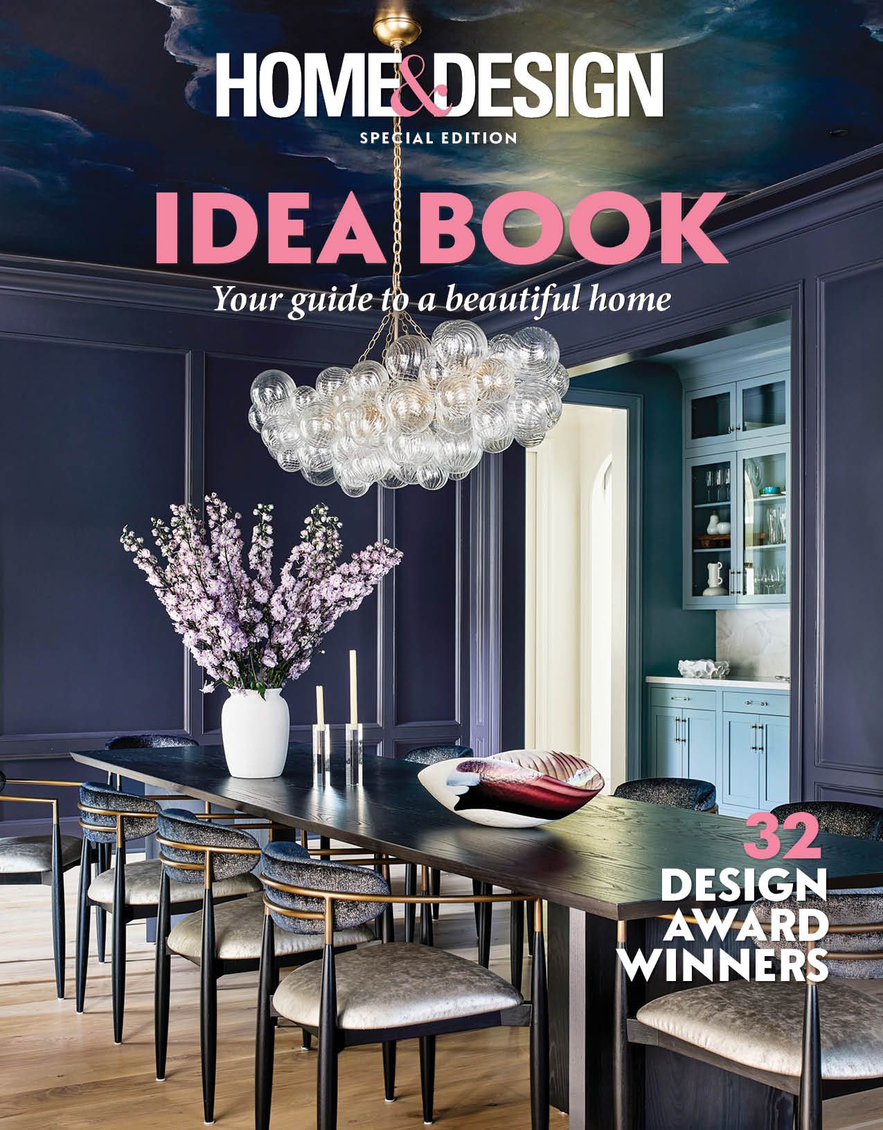
The designer blended classic materials and practical furniture with playful accessories and art. Custom features abound, including a dining room mural of hexagons—a recurring motif in the home—and a shower door with an iron frame that conjures an industrial vibe.
Finished in time for the arrival of the couple’s son, Cannon, the redo was a resounding success. “Everything works for them functionally,” says Huerta. “They are just so happy.”
HOW DID YOU PAY TRIBUTE TO THE HOME’S PAST?
To respect the home’s history, I added architectural details like latticework
on the main wall that runs from the front to the back and up the stairs. I also exposed little pockets of original brick in the kitchen and dining room so the house wouldn’t feel like a blank, white modern box.
DID YOU TURN ANY FLAWS INTO ASSETS?
When we opened up the living and dining rooms, there was one structural beam that had to stay, but it wasn’t pretty. I had it wrapped in wood, then added a few more so it looked like they were supposed to be there. This also eliminated having one solid ceiling surface from the front to the back of the house.
WHAT TRICKS MAKE THE LIVING ROOM APPEAR LARGER?
The latticework adds depth and movement to space. Since we didn’t have room for a sofa, I chose two swivel chairs from Room & Board and a chaise that’s open on one side. And the enormous mirror from Anthropologie makes you feel like there is more space than there actually is.
HOW DID YOU ACCESSORIZE THE BUILT-INS?
I painted the cabinets white and changed the fireplace tile to create depth. Then I sourced items from as many places as possible, including vintage and antique shops. I always pick a color palette first so everything feels cohesive, and layer in natural elements like metals, stone, and wood because using all manmade elements can feel flat.
HOW DID YOU INTEGRATE THE KITCHEN INTO THE OPEN PLAN?
I like kitchens to feel like an extension of the rest of the house. Because it’s a historic home, I picked classic white cabinetry. To punch things up, I added leather cabinet pulls and walnut trim around the upper cabinets to give them a little bit more detail.
WHAT’S YOUR SECRET TO MIXING FABRICS?
I take patterns that are otherwise completely unrelated but in the same color palette and pick the ones I like, along with a couple of solids. I call it “power-clashing.” DC tends to be obsessed with symmetry, but I prefer balance. A lot of my spaces will have an odd number of pillows to make things more interesting and a little quirkier.
HOW DO YOU MARRY MASCULINE AND FEMININE STYLES?
Patrick is into leather furniture and lodge-type items, while Elizabeth is very fashionista and into the modern art scene. In the bedroom, I went with a duvet set that is menswear-inspired—a lightweight flannel that feels like a dream—and layered it in pink, blue and metallic pillows.
HOW WILL THE NURSERY WORK POST-BABYHOOD?
I’m a believer that the permanent elements in a room should be neutral and sophisticated. I focus on accessories that are easier to change as a child gets older. In Cannon’s room, the wallpaper will be classic forever; we added elements like the sheep and vintage chest to make it feel whimsical.
DESIGN PET PEEVE?
TVs above fireplaces! If you can avoid it, do.
SECRET TO A WELL-DESIGNED SPACE?
Balance. I try to mix an equal number of organic and graphic patterns with natural and manmade elements to craft a warm, lived-in feeling.
WHY IS ART IMPORTANT?
Art is a reflection of the homeowners and personalizes a space. Without it, even a beautifully designed home can feel generic.
IS IT OKAY TO MIX METALS?
Mix with abandon! I feel the same way about metals as I do about color; decide from the get-go on what kind of look you want, then commit.
MISTAKE TO AVOID?
Using small furniture in small spaces. Rooms feel more spacious when you use fewer, larger pieces rather than lots of small ones.
RENOVATION & INTERIOR DESIGN: Kerra Michele Huerta, Kerra Michele Interiors, Washington, DC. PHOTOGRAPHY: Laura Metzler.