Architect and designer Carmel Greer.


Architect Carmel Greer has a knack for enhancing projects with stylish, creative interiors. A charming brick Victorian in DC’s LeDroit Park proved to be a perfect vehicle for her talents. When its owner purchased the home, “it had been badly renovated and was a hodgepodge of different visions, eras, and tastes,” Greer recalls. “And things were sloping that shouldn’t have been sloping.”
Tasked with an overhaul in the original footprint, Greer restored the front parlor and dining room, which boasted 11-foot ceilings and elaborate crown moldings. Completely reorganizing the back rooms, she removed a wall that separated the kitchen and family room; relocated the powder room; created a mudroom; and got rid of a butler’s pantry and dated spiral staircase to enlarge the kitchen. Upstairs, a master suite now features an adjoining office that was carved out of an adjacent bedroom. The owner, an international business consultant, is thrilled with the results. “I am really happy with how it turned out,” she says. “It works well for me and the way I live.”
WHAT WAS YOUR VISION FOR THE UPDATE?
I always try to do what’s appropriate, and this house is so spectacular I thought it should be allowed to be what it wanted to be. I tried to limit “invasive” changes to places where the house had already been meddled with, like the back area.
HOW DID YOU ENSURE THE FRONT AND BACK WOULD FLOW TOGETHER?
We opened a door between the dining and family rooms. The owner wanted to keep the definition between rooms, which I think is appropriate in an older house. We also added complementary crown moldings in the family room but made them smaller as the ceiling is lower, about nine feet high.
HOW DID YOU SALVAGE THE FLOORS?
The floors are mostly original, and where we patched we tried to make them look original. They are the heart of pine, which can have an orange cast to it. To avoid that, we added a coat of stain topped with polyurethane that creates a strong sheen.
[metaslider id=39460]
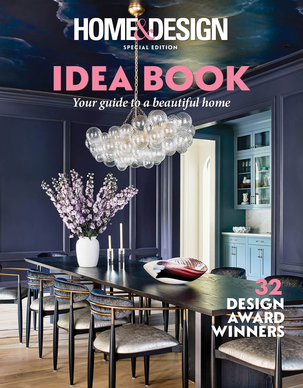
WHY DID YOU PAINT ONE ROOM DARK BLUE WHILE THE OTHERS ARE NEUTRAL?
I think every house should have one surprise room in an intense, dark color. One dark room feels special among light rooms and the light rooms feel lighter by contrast. Here, the dining room is painted Benjamin Moore’s Dark Harbor.
HOW DID YOU APPROACH THE KITCHEN?
The goal was for it to fit the house. Everything in it is new, but it suits an older home. The owner and I both like kitchens without a lot of upper cabinets, so we put on a ledge along the wall above the stove where she can keep things. We created a wall of cabinetry on the other side to accommodate storage.
WHAT FEATURES MAKE THE KITCHEN FEEL UNIQUE?
There was a fireplace niche on one wall that used to hold the stove. We uncovered the brick behind it. Because of the way we reoriented the kitchen, the stove is now on a different wall. It’s a fun stove from Big Chill that’s the same color as the dining room walls.
WHERE DO THE BEAMS COME FROM?
In opening the space up, there was one structural beam that had to stay. We put in others to add interest; otherwise, it’s just a plain expanse of a ceiling. I painted the beams the cabinetry color because white beams would look awkward intersecting with the cabinets.
HOW MANY FIREPLACES ARE THERE?
This house has seven fireplaces, most of which are decorative, however, we were very keen to do fireplace makeovers so we converted the one in the living room to gas. We kept the wood mantels and marble surrounds intact but added honed-granite hearths that modernize them. They are a plausible material for space.
DID YOU CHOOSE THE FURNITURE?
The owner had all the furniture and art. It was amazing stuff and my job was to create a backdrop for it with color, lighting, and materials.
HOW DID YOU DETERMINE THE OWNER'S TASTE?
During our conversations, it became clear that she didn’t want all one thing; she preferred to be eclectic. She’s done a lot of traveling, especially in China, and has wonderful Chinese artwork and furniture.
HOW DID YOU ALTER THE MASTER SUITE?
With the bedroom and bath configurations in old houses, you have to make major changes. Here there wasn’t a proper master with a closet. I took the middle bedroom, which opened onto the hallway, and made it a walk-in closet and a little office off the bedroom with built-ins. It was what the client needed and didn’t impinge on the integrity of the house. A small room that might have been a nursery at one time became the master bath.
DESCRIBE THE THIRD-FLOOR BATH.
We ripped it out and started over with the same intention as the kitchen: that it should not feel like a jarring disconnect from the home. Like the other baths, it has marble elements and a timeless feel.
WHAT IS YOUR FAVORITE DESIGN TASK?
I like the phase where I look at pictures and figure out what clients like and how we can marry that to the house.
ARE THERE TRENDS YOU CAN'T STAND?
I am pretty white marbled-out in the kitchen. It’s always beautiful, but I’ve done it a lot. Also, I’m bored with stainless steel. I love colorful appliances.
WHAT IS YOUR DESIGN PET PEEVE?
The notion that when you move into a new house, you get rid of everything and start from scratch. Without those oddball furniture pieces, it feels a little canned. This also applies to architecture. I don’t like ripping out things that have merit.
DO YOU HAVE ANY KITCHEN-DESIGN TIPS?
Be judicious with using glass cabinets. Things should look uncluttered—and you don’t want to show the Cheerios.
HOW DO YOU MELD CONTEMPORARY AND TRADITIONAL LOOKS?
I think art and lighting can bridge the divide. The living room in this home would feel very different from a traditional chandelier.
Renovation Architecture & Interior Design: Carmel Greer, AIA, LEED AP, District Design, Washington, DC. Builder: Precision Capital General Work, LLC, Takoma Park, Maryland.