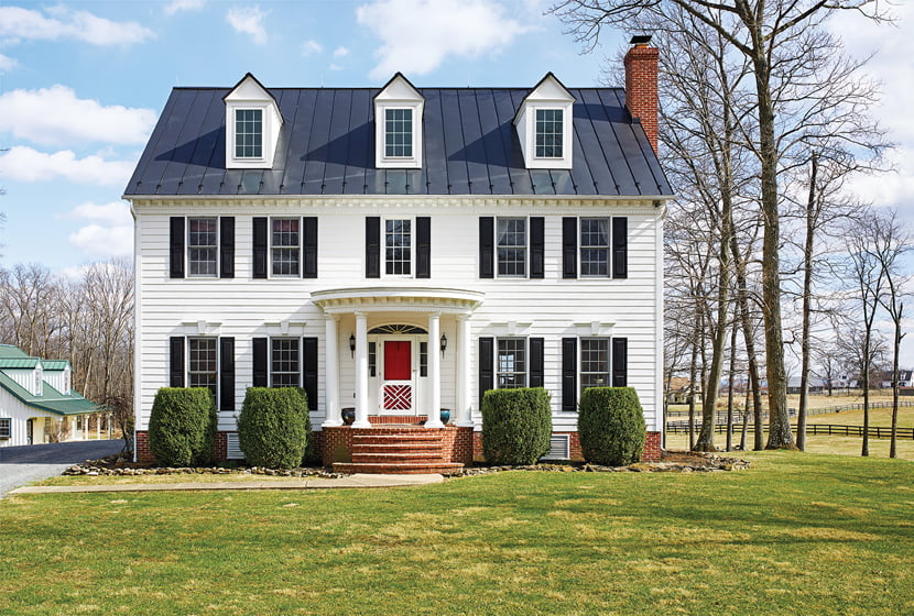
From the outside, the traditional home on rolling pastureland has a stately bearing.


Thirty rolling acres in tiny Bluemont, Virginia, lured a couple with young kids and a passel of horses, dogs and cats. (Learn how they introduce the dog with cat) The property included a 1996 center-hall colonial, which they hastily furnished before the birth of their second child. “We said, ‘Let’s just get it done,’” recounts the wife. “But I always felt it looked like my grandmother’s house.”
Five years later, the husband, a CEO, and the wife, a stay-at-home mom, contacted Paul Miller for an update. “The original layout harkened to a formal lifestyle that the clients discovered wasn’t true to them,” Miller explains. “They wanted a more youthful vibe.”
The designer opened up the ground floor, removing a wall separating the kitchen from the dining/living room to create an L-shaped space. “The open floor plan was huge,” he recounts. “They wanted all the spaces to feel useful and connected.” He retained a traditional look but freshened things up with a relaxed vibe and happy colors. And he took the remodeled kitchen in a more streamlined direction.
The result, says the wife, “is clean, bright and warm. Paul figured out how we live and made the house both pretty and functional.”
How is the house laid out?
PM: It looks like a four square from the outside, but the kitchen and dining area span the back. The front foyer, with a center staircase, is open to the living area on one side and a small office on the other, which we didn’t work on.
Describe the structural alterations.
The wall between the kitchen and dining room was replaced by a wide peninsula with storage facing the dining area. The opposite wall in the kitchen was moved to downsize a disproportionately large, adjacent laundry room and add two feet to the kitchen. We also replaced two small windows over the sink with three larger ones that take better advantage of an important view of pastureland beyond.
What changed in the kitchen’s layout?
To create the peninsula, we relocated the fridge to the wall perpendicular to it and flanked it with pantry cupboards. The laundry-room wall now holds a wet bar with a sink and wine refrigerator.
What’s special about the kitchen finishes?
The backsplash is a handmade glazed-ceramic tile with lovely irregularities. You can see the texture; it almost looks like water and makes the grout lines seem to “swim” a little bit. The peripheral countertops are a quartz product that looks like Carrara marble and there’s a big piece of granite on the island. The white cabinetry was customized for the space.
How did you update the traditional millwork?
The dining room wainscoting was high quality, so we didn’t want to rip it out. But we didn’t want to emphasize it, as it was more formal than the clients were going for. So we minimized the contrast between millwork and walls with white trim and walls in Benjamin Moore’s Alaskan Skies.
What furniture did you purchase?
The dining room furniture belonged to the owners, but we purchased the living room sofas and had the draperies made by Nestology, our custom-furnishings company. Everything is made in America—that’s a big part of our ethos and vision. The cocktail table is by Charleston Forge, an American manufacturer.
How did you convey a youthful sensibility?
I use color to create a joyful and exciting palette. In a big, open space like this, I find soft neutrals work best with colorful textiles and art. Here, I went with very modern art—high-contrast pieces with sharp color that break up expectations in this traditional environment. The colorful pillows are from Thibaut.
Can you elaborate on the art?
Karen Ventura Fraser did the piece above the mantel. Her art has a lot of energy. I chose the piece over the console by Keith Patterson because it made me think of someone taking a walk through the woods in winter. There’s so much nature around the house, it seemed to really connect with it.
How did you select the rugs?
They are wool with a sisal weave. They’re intended to modernize the traditional house. When there’s a simple texture instead of an elaborate Persian rug, it’s not what you expect to see. It feels calmer, more relaxing—almost like a vacation spot. I think it’s fun when rooms feel a little resort-like when you come home to them.
Talk about your lighting choices in the dining room.
The lighting is from Arteriors. The sconces lean a little industrial but I didn’t want to make those choices uniformly throughout because there’s a lot more polish to the house than that. So I chose the elongated shade on the chandelier because it softened that feel.
Did the floors change?
Yes, the original flooring was that narrow-strip, you’ve-seen-it-a-thousand-times oak. We switched it out for an engineered walnut with a dry finish that reveals the grain of the wood. It modernized the whole house.
What trends do you embrace?
I’m glad more clients want to use color. We’ve had an era of design that photographs well on Instagram, that’s easy to produce for content—simplicity, with everything white. Now clients are not so interested in that.
What advice do you offer homebuyers?
One of my passions is that a house should fit you and your life. All the rooms should be useful. When buying a house, think about getting the size right, with no nonsense or concept rooms.
What new product are you excited about?
I’m excited about Revolution Performance Fabrics, which we’ve folded into our collection. They’re sustainable and recyclable, made in America. They’re good for the marketplace and the environment.
Do you have a favorite low-end find?
The best low-end finds are often vintage pieces from flea markets. Art, accessories and sometimes even furnishings may just need repairs or new fabric to be relevant today.
Interior Design: Paul Miller, IDS, MakeNest Interiors, Winchester, Virginia.